Despite broad browser support, container queries remain an underutilized cornerstone of modern web design, often misunderstood as mere alternatives to traditional media queries. While media queries have served as the industry standard for responsive design for over a decade, the shift toward component-based architecture has exposed their structural limitations. By allowing developers to style elements based on the dimensions of their parent container rather than the global viewport, container queries enable a higher degree of modularity and fluidity in web development.
The Evolution of Responsive Design
The concept of the "responsive web" was codified in 2010 when Ethan Marcotte introduced the fluid grid, flexible images, and media queries. At the time, the primary challenge was ensuring that websites adapted to the burgeoning diversity of mobile and tablet screens. Media queries were designed to solve a specific problem: how to restructure an entire page based on the width of the browser window.
However, the web has matured from monolithic page layouts to systems of reusable components. As interfaces grew more complex, developers began to notice a recurring issue: components developed for a specific viewport width often broke when placed into narrower sidebars, cards, or grid cells. This discrepancy between the global viewport and the local component context became a significant hurdle for design systems.
A Timeline of Adoption and Stagnation
The CSS Working Group began discussing container-relative queries as early as 2016, identifying them as a "holy grail" feature for front-end developers. After years of drafting and prototyping, the feature reached broad interoperability in late 2023. As of early 2026, the feature boasts approximately 94% browser support across all major engines, including Chrome, Edge, Safari, and Firefox.

Despite this technical readiness, adoption has been unexpectedly sluggish. Data from the 2025 State of CSS survey reveals a profound gap between awareness and implementation: while 86% of developers report being aware of container queries, fewer than 42% have integrated them into their production workflows. Industry experts, including prominent CSS educators, have characterized this adoption rate as a failure to transition from legacy mindsets to component-driven thinking.
Technical Disconnect: Media Queries vs. Container Queries
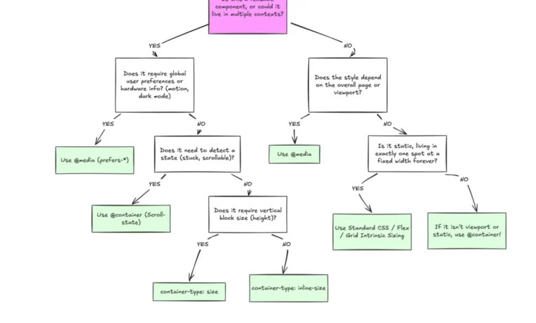
The primary reason for the slow adoption appears to be a conceptual overlap. Because both syntaxes involve query conditions, developers often treat them as interchangeable. A media query asks, "What is the width of the browser window?" whereas a container query asks, "How much space is available to this specific element?"
When a developer uses a media query to hide an element on a mobile device, they are making an assumption about the entire page layout. If that same element is later moved into a dashboard widget on a desktop browser, the media query may erroneously trigger, causing the component to display improperly. Container queries resolve this by decoupling the element from the viewport. By defining a container using the container-type property, the component becomes self-aware of its immediate environment.
The Macro-Layout and Micro-Layout Distinction
In modern professional web development, it is helpful to categorize layout logic into two distinct tiers:
- Macro-Layouts: These define the global structure of a page, such as the main navigation, the footer, and the primary content columns. For these elements, media queries remain the correct tool, as they are inherently tied to the browser’s overall dimensions.
- Micro-Layouts: These include individual components like cards, sidebars, buttons, and input forms. These elements should remain agnostic of the viewport, reacting only to the constraints of the container that houses them.
By adhering to this distinction, teams can create "self-contained" components that are truly portable across different areas of a complex application, reducing the need for redundant code and "magic numbers" in CSS files.

Data-Driven Responsive Logic
The necessity for container queries is underscored by the fragmentation of device sizes. With over 2,300 unique viewport sizes currently in circulation, attempting to manage layout states through hard-coded media query breakpoints is mathematically unsustainable.
Furthermore, container queries unlock capabilities previously reserved for JavaScript, such as flexbox wrap detection. Previously, developers required a ResizeObserver to determine if a flex container had pushed items to a new row. With container queries, a component can now detect when its internal container exceeds a certain width and adjust its layout accordingly, all within the CSS layer. This shift significantly reduces the performance overhead of executing JavaScript for purely aesthetic layout adjustments.
Challenges and Implementation Considerations
While container queries offer superior flexibility, they are not without technical caveats. First, they cannot currently be queried against custom CSS properties (variables), as the browser must resolve the cascade before evaluating the query, creating a potential for infinite loops.
Second, a container cannot query itself. This requires developers to restructure their HTML to include a wrapper element. While this might appear to be an increase in DOM bloat, it is a standard trade-off for the decoupling of styles. Finally, developers must be cautious when using container-type: size, which can collapse a container’s height to zero if the content within it is not constrained by fixed dimensions, as the browser treats the container as an isolated entity.
Implications for the Future of Web Development
The industry-wide failure to fully embrace container queries points to a deeper inertia in front-end practices. For years, the "mobile-first" paradigm, while successful, cemented the viewport as the singular source of truth for all layout decisions. Moving forward, the professional standard is shifting toward "component-first" design.

The implications for developers are significant: cleaner code, more predictable layouts, and a reduction in technical debt. As design systems grow increasingly modular, the reliance on viewport-based breakpoints will likely diminish. Organizations that successfully transition their codebase to leverage container queries report greater efficiency in design maintenance, as components behave consistently regardless of whether they appear on a massive desktop display or a compact mobile screen.
In conclusion, while the learning curve for container queries is non-trivial, it is a necessary investment for the modern web. The transition from querying the browser to querying the component represents a fundamental maturation of the craft. By respecting the separation of concerns between macro and micro layouts, developers can build interfaces that are not only more responsive but also more resilient and maintainable in an increasingly fragmented digital ecosystem. The technology is stable, the support is global, and the architecture of the modern web demands a shift in perspective.