The strongest visual concepts don’t begin in design software; they emerge from a rigorous exploration of foundational questions. This article delves into the critical pre-concept phase of brand identity design, a crucial stage where teams meticulously research brand context, unearth unspoken assumptions with stakeholders, and translate shared strategic direction into a robust visual framework before any initial design concepts are even sketched. This meticulous groundwork is paramount to preventing the most common pitfalls in branding projects, which often stem from an ill-defined strategy rather than a lack of creative execution.
When branding initiatives falter, the root cause is frequently found not at the logo design stage, but much earlier, within the strategy phase. This is where ambiguous terms like "modern," "trustworthy," "premium," "friendly," and "disruptive" are left undefined. The inevitable consequence is a chasm between the intended brand message and the designer’s brief, a gap that the author terms the "pre-concept phase."
Typically, designers receive a wealth of initial inputs: a project brief, summaries of stakeholder discussions, competitor references, and perhaps a mood board or a list of desired adjectives. From this, they are expected to conjure visual concepts that resonate. However, the very definition of "right" becomes elusive when the team has not first established a shared understanding of what the brand is intended to communicate.
Consider a health tech company that expressed a desire to appear "modern," "trustworthy," and "disruptive." Initially, "disruptive" might suggest a bold, unconventional aesthetic. However, deeper dialogue revealed that for this particular company, disruption had to remain credible within the conservative healthcare sector. Their clientele comprised large government medical institutions, for whom an overtly rebellious or visually loud brand could erode trust. Consequently, their interpretation of "disruptive" leaned more towards a sophisticated, perhaps even traditional, presentation than the word might initially imply.
The issue wasn’t the client’s choice of language, but rather the inherent breadth of those terms, which proved insufficient to guide design decisions. Before a designer can translate strategy into a tangible visual concept, these abstract descriptors must be refined. What specific kind of modern is desired? Trustworthy in what way? Disruptive in relation to whom? And how far can the brand deviate from category expectations before alienating its target audience?
This article focuses on this pivotal pre-concept phase – the work undertaken after the project kickoff but before the initial visual explorations. While the broader brand identity process for digital products encompasses strategy, concept development, implementation, and the creation of assets for consistent product development, our attention here is on the foundational work that makes the first viable concept possible: in-depth research into the brand’s context, the diligent uncovering of stakeholder assumptions, and the critical process of transforming shared direction into a concrete visual foundation. This phase acts as an essential bridge, connecting what the brand needs to signify with how it might begin to manifest visually.
The initial construction of this bridge typically commences with a brand workshop, a setting where broad discovery efforts are distilled into a clearer comprehension of the brand’s context.
Stage 1: Researching the Brand Context
A brand workshop naturally covers standard discovery topics: the business’s objectives, its products or services, the competitive landscape, and the target audience. While a comprehensive list of every question a designer should ask is beyond the scope here, a valuable starting point can be found in structured toolkits designed for such conversations. The focus here, however, is on a select set of questions that are easily overlooked but are exceptionally beneficial before any visual work commences. These questions are less about factual data collection and more about clarifying perception. They help the team understand what the brand needs to instill in its audience, where it must establish credibility, and which industry conventions it should either align with or challenge.
Perception lies at the heart of brand discovery, as a brand ultimately resides in the minds of others. As Marty Neumeier aptly stated in "The Brand Gap," "A brand is a person’s gut feeling about a product, service, or company." If a brand’s existence is defined by perception, then the workshop must prioritize clarifying the specific perception the team aims to cultivate.

The perception-focused questions employed here are designed to reveal the underlying assumptions behind opinions, rather than merely accumulating more subjective viewpoints. The significance of these questions lies in the fact that brand attributes can often sound aligned until their nuances are truly understood. For instance, a stakeholder might state that the brand should feel "premium," and this statement might be met with general agreement. However, one individual might interpret "premium" as refined and editorial, another as exclusive and expensive, and a third as clean, quiet, and minimalist. The word itself appears shared, yet it can lead to three entirely divergent visual systems.
As illustrated by the health tech example, the client’s desire for the brand to be "disruptive" could easily have led to a bold, loud, or unconventional visual direction. However, given their audience of conservative government medical institutions, disruption needed to be conveyed through clarity, efficiency, and confidence, rather than rebellion. A literal interpretation of "disruptive" could have resulted in a visual approach that undermined the very trust their clients required.
In another instance, a fintech company sought to project a "bold" image without sacrificing credibility. This single word presented a valuable tension. "Bold" could suggest vibrant colors, oversized typography, and an expressive visual system. However, within the financial sector, it also had to communicate security, control, and competence. The critical question wasn’t whether the brand should be bold, but rather what form of boldness would remain trustworthy.
When a team can articulate the contextual meaning of these attributes, the designer transitions from working with broad adjectives to addressing a more clearly defined design problem. While strategically chosen questions can illuminate the verbal layer of brand identity, words alone are rarely sufficient. To bridge the gap between language and visual direction, exercises that encourage stakeholders to think through images, associations, and relative perceptions are invaluable.
Jake Knapp, in GV’s "Three-Hour Brand Sprint," emphasizes a similar principle: "The point of these exercises is to make the abstract idea of ‘our brand’ into something concrete." The following exercises are instrumental in translating stakeholder discourse about the brand into tangible material that can inform look and feel, design principles, and concept development.

Crucially, these exercises foster active stakeholder participation. When clients are merely presented with a strategy, they can remain passive, potentially agreeing to recommendations without recognizing their own embedded assumptions. However, when they are tasked with positioning competitors on a map, selecting images, or explaining the credibility of specific references, they become active contributors. Their attitudes, beliefs, and any underlying disagreements become apparent before they have the opportunity to derail the initial concept review.
The process typically begins by examining the external landscape – the category – and then shifts inward, focusing on the brand itself.
Exercise 1: Competitor Perception Mapping
Prior to the workshop, screenshots of competitor brands, websites, product interfaces, social media visuals, and other brand touchpoints are gathered. During the session, the client team is invited to position these competitors on a simple two-axis map.
This exercise is not about judging the aesthetic quality of competitor designs. Instead, it aims to understand how the client perceives the competitive landscape: what feels credible, what appears generic, what seems overly conservative, what reads as too experimental, and where potential visual white space exists for the brand. The axes chosen for the map should reflect the core tensions the brand aims to address. For example, a health tech company aiming for innovation while serving conservative medical institutions might use axes such as "Traditional to Progressive" and "Corporate to Human." A fintech brand seeking to differentiate itself without compromising trust might employ "Understated to Bold" and "Accessible to Exclusive."
Often, the most valuable outcome of this exercise is not the final map itself, but the disagreements it generates. One stakeholder might perceive a competitor as progressive, while another views it as generic. One may interpret a brand as premium, while another sees it as cold. These disparities highlight how different individuals define trust, innovation, credibility, and differentiation – precisely the ambiguities that must be resolved before design work can commence.

Exercise 2: Visual Brand Driver
Following the discussion of the competitive category, the conversation turns inward. The "Visual Brand Driver" exercise involves each stakeholder selecting images for a series of unrelated categories: transport, typeface, activity, furniture, mood, object, animal, architecture, and drink.
A key instruction is that the images should represent the company, not the individual’s personal taste. For instance, if the company were a mode of transport, would it be a silent electric car, a high-speed train, a private jet, a bicycle, or a delivery van? If it were a piece of furniture, would it be a plush lounge chair, a precise modular desk, or a substantial boardroom table?
After selecting images, each participant provides four to five adjectives to justify their choices. The justification is often more revealing than the image itself, as the same object can hold different meanings for different people. A train might evoke speed, structure, reliability, mass accessibility, or a fixed route. A lounge chair could suggest comfort, calm, informality, or a lack of urgency.
This exercise cultivates a deeper layer of brand perception by encouraging participants to think through metaphor and association rather than direct description. Patterns and contradictions emerge. One stakeholder might perceive the brand as refined and calm, while another sees it as energetic and experimental. One might describe the company as precise and structured, another as warm and flexible. These differences are not problematic; they are valuable insights that reveal areas requiring clarification before the visual concept phase begins.
This exercise also effectively separates brand perception from aesthetic preference. A stakeholder might personally favor a particular image, but if it doesn’t accurately describe the company, it’s excluded. This distinction is crucial throughout the branding process, shifting the focus from "Do we like this?" to "Does this express the right thing about the brand?"

Once the workshop has illuminated key assumptions, the subsequent client meeting can translate this shared understanding into a visual foundation. This stage still precedes the first identity concepts but acts as a crucial intermediary between strategy and design. Here, the client can provide feedback on perceptions, visual principles, and early asset directions before the designer invests significant time in full-fledged concepts. This meeting is typically structured around three interconnected layers:
Look and Feel
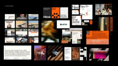
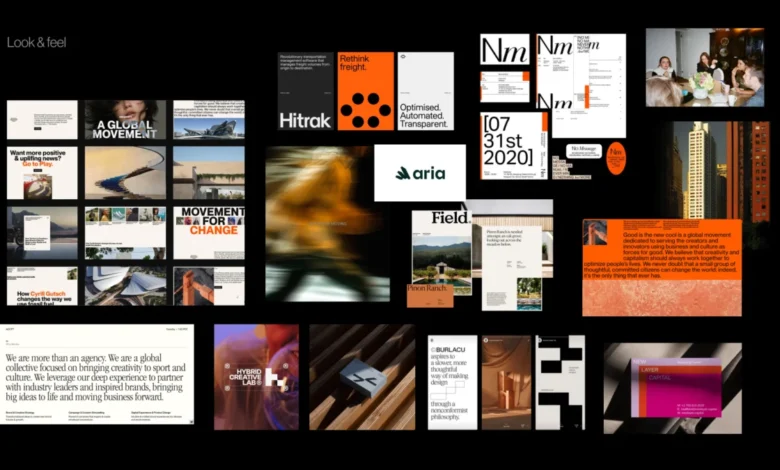
"Look and feel" boards are not merely collections of visuals the team finds appealing. They are perception boards. The designer curates references based on the workshop outcomes, including desired perception, category tensions, competitor visual codes, stakeholder disagreements, and the core brand character.
If a brand needs to exude trustworthiness, modernity, and humanity, the board should facilitate discussion on the appropriate nuances of these qualities. Is the brand calmly institutional or warmly accessible? Is its modernity derived from precision or from a more expressive editorial tone? The objective is to allow the client to respond to these perceptual elements before reacting to a logo, color palette, or fully realized visual system.
Design Code
"Design code" further refines the direction by translating key brand ideas into actionable visual principles. For a German parenting app, "personalized support for your unique journey" might translate into organic shapes, handwritten lines, and softer compositions. "Parenting is messy and magical" could inspire soft gradients, layered imagery, and playful irregularity. "Research-backed support for real life" might incorporate elements like doctor consultations, data snapshots, infographics, and editorial layouts to enhance credibility.
For a PR agency specializing in prop tech, "momentum in motion" could be represented by lines, arrows, ripple effects, or motion blur. "Springboard" might suggest a lift-off moment and elastic visual energy. "Building blocks" could manifest as modular shapes or stacked compositions. At this stage, the team is testing the resonance of visual metaphors, not finalizing the graphic expression.

Brand Assets
The final layer brings the conversation down to the fundamental building blocks of identity: typography, color, logo style, photography, illustration, and overall graphic language. At this juncture, the team can address questions such as:
- What is the desired tone of the typography (e.g., approachable, authoritative, elegant)?
- How should color be used to evoke specific emotions or signify brand attributes?
- What are the general guidelines for logo application and style?
- What photographic style best aligns with the brand’s personality (e.g., candid, staged, illustrative)?
- What illustrative approach will complement the brand’s message?
This process provides the designer with defined boundaries without predetermining the final identity. The subsequent step remains concept design, but the team is no longer starting from vague adjectives or unvoiced expectations.
Pre-Concept Checklist
Before embarking on the first concept, it is beneficial to verify that the team possesses sufficient shared direction. This checklist is not intended to pre-empt every decision but to ensure that the designer is not working from ambiguous language, hidden assumptions, or unresolved disagreements.
Before creating the first concept, confirm that the team has:
- Clearly articulated and agreed-upon brand attributes: The meaning of key descriptors like "modern," "trustworthy," or "disruptive" is understood contextually.
- A defined perception map: The team has a shared understanding of where the brand sits within its category and relative to competitors.
- Established visual drivers: The metaphors and associations that will inform the brand’s visual language are identified.
- Agreed-upon design principles: The core visual themes and approaches that will guide concept development are outlined.
- Defined boundaries: A clear understanding of what visual directions should be avoided or are inappropriate for the brand.
This last point is particularly valuable. A robust pre-concept phase not only informs the designer on what to explore but also clarifies what to steer clear of – directions that might be too expected, too cold, too playful, too conservative, too loud, too generic, or too far removed from what the audience can trust. When these boundaries are clearly articulated, evaluating the initial concept becomes more objective. The conversation shifts from a subjective "I like it" or "I don’t like it" to a more pertinent "Does this express the brand we agreed upon?"

The First Concept Should Not Be A Guess
The initial concept should not feel like a speculative guess or a surprise reveal. Instead, it should represent a logical progression of a direction that the team already understands. This approach does not eliminate intuition, experimentation, or creative risk from the branding process. Rather, it provides these elements with a more sharply defined problem to solve. When the team has clarified the brand character, tested visual perceptions, translated ideas into design principles, and discussed the foundational elements of the identity, the designer can proceed with greater confidence.
The pre-concept phase does not aim to make the final identity predictable. Its purpose is to make the conversation surrounding it more meaningful. Instead of questioning whether the work aligns with an individual’s private expectations, the team can engage in a more productive dialogue: Does this visual direction effectively express what the brand needs to become?