Rethinking Data Visualisation: Bridging the Gap Between Analytical Design and Operational UX

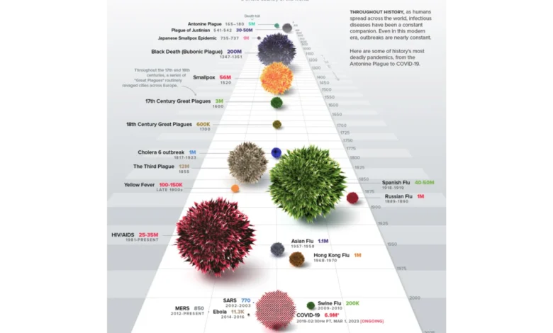
Data visualisation sits at the intersection of two disciplines that rarely communicate effectively: raw data analytics and user experience design. While modern organizations have achieved unprecedented access to granular datasets, the prevalence of dashboards remains a point of friction. Many of these tools are technically precise but communicatively inert. They function as passive repositories for metrics—sales figures, operational throughput, or product performance—yet they frequently fail to trigger decisive action or organizational change. This systemic failure often leads to a cycle of stagnation where stakeholders nod during reviews but leave without a clear roadmap. The resolution of this issue requires a shift in methodology: moving from a data-first approach to a human-centric, UX-driven design strategy.
The Disconnect Between Metrics and Action
In the contemporary corporate landscape, the availability of data has outpaced the ability to interpret it. Departments from marketing to operations are flooded with real-time performance decks. However, a recurring trend in quarterly reviews reveals a consistent lack of follow-through. When a presentation fails to produce a decision, the common reflex is to blame the quality of the data—citing insufficient granularity or incomplete datasets.

Statistical history suggests this is rarely the case. In 1973, statistician Francis Anscombe demonstrated through his famous quartet that four datasets could share identical statistical properties—mean, variance, and correlation—while exhibiting radically different visual patterns. This remains the foundational lesson of the field: raw numbers hide truths that visual representation exposes. Yet, the current industry crisis is not one of statistical visibility, but of communication. A chart built without a specific question in mind is merely noise. The transition from passive charts to functional intelligence requires that designers and analysts begin with the human user rather than the database.
The Architectural Foundation: The 80% Rule
The high-leverage work in data visualisation occurs before any software tool is opened or any dataset is queried. Roughly 80% of a dashboard’s success is determined by three upstream decisions: defining the specific operational goal, understanding the audience’s cognitive constraints, and identifying the intended post-viewing action.
Most projects fail because they invert this process. They anchor on the data already present in internal tools, building charts around what is available rather than what is required. For instance, an e-commerce team attempting to optimize a checkout flow might default to a broad dashboard tracking clicks, scroll depth, and device types. A more effective, context-first approach begins with a specific inquiry: "At which exact step of the checkout process do users abandon the purchase?" By constraining the design to answer this single, vital question, the team replaces a chaotic dashboard with a clean, functional funnel chart that highlights a specific bottleneck.

Audience Literacy and Cognitive Load
Data design must account for the specific literacy and accountability levels of the end user. A high-density path-exploration graph, while invaluable to a data scientist debugging a user journey, serves as a barrier to an executive who needs to make a swift budget allocation decision.
There is no universal standard for "simplicity" in data design. Instead, designers must calibrate the "density dial" based on the user’s role. A senior stakeholder requires a synthesised, high-level overview that facilitates immediate commercial decisions. Conversely, an analyst conducting a diagnostic audit requires the granularity to interrogate individual behavior nodes. Misaligning these needs leads to the "information-insight gap," where data is presented as an alarm system rather than a guide. A dashboard that simply tracks a 15% drop in bookings without contextualizing it against marketing spend or traffic sources triggers unnecessary panic. A dashboard designed for insight, however, segments that drop, allowing the team to distinguish between a technical failure and a shift in user acquisition strategy.
Case Study: Implementing UX-Driven Data Strategy
A significant example of this shift occurred within a B2B SaaS platform specializing in enterprise talent management. Faced with an immense, unorganized archive of user activity, the design team moved away from creating a "data graveyard." Instead, they architected a tool centered on the mechanics of performance.

The project team first discarded the vanity metric of "time spent in-app," recognizing it as a proxy for presence rather than proficiency. They pivoted to tracking competency scores, certification completion, and performance trajectories. By mapping these dimensions using a radar chart—which allows for the instantaneous visual recognition of balanced versus skewed skill profiles—the team transformed raw telemetry into a narrative of growth.
The results were statistically significant. Post-deployment, weekly active engagement on the platform’s analytics suite increased. More importantly, the nature of the communication between managers and individual contributors changed. Managers reported that the dashboard allowed them to intervene with coaching before performance gaps turned into critical project failures. The transition from reactive reporting to proactive guidance underscores the efficacy of applying UX principles to analytical structures.
Broader Implications and Strategic Shift
The implications for the wider industry are clear: the future of data visualization lies in the integration of design thinking into the engineering lifecycle. As organizations continue to scale their data infrastructure, the competitive advantage will go to those who can translate vast datasets into human-readable, actionable intelligence.

Key principles for this transition include:
- Defining the Intent: Every element on a screen must serve a specific business question. If an element does not lead to a decision, it should be removed to reduce cognitive load.
- Standardizing the Language: Color-coding and visual hierarchies should be established early in the branding process and embedded into the data model. This ensures that the user is not learning a new visual language each time they open a report.
- Prioritizing Pacing: Dashboards should guide the viewer through a narrative arc, moving from the macro overview to specific, actionable insights.
The Future of Dashboarding
As we move further into an era of automated reporting and AI-generated insights, the role of the designer becomes increasingly critical. Automation can generate charts, but it cannot inherently understand the context or the political and operational reality of the person reading them.
Industry analysts suggest that the next wave of dashboard development will focus on "self-correcting" visual models that adapt to the user’s role in real-time. By utilizing machine learning to filter data based on past user behavior and specific job functions, companies may soon be able to provide highly personalized, proactive insights that require less manual configuration.

However, the core challenge remains unchanged. Whether the interface is static or AI-driven, the fundamental goal is to close the gap between the message the data carries and the decision the user needs to make. By treating data visualisation as an upstream architectural choice—an essential component of the product’s user experience rather than a final formatting step—organizations can transform their analytics from passive, historical logs into powerful, forward-looking strategic assets.
In summary, the transition from data-heavy displays to functional, decision-enabling dashboards is not merely a design preference; it is a business imperative. As the volume of data continues to grow, the ability to distill it into meaningful, actionable information will remain a primary driver of operational efficiency and strategic clarity across all sectors of the modern economy. Organizations that prioritize the human experience at the heart of their data strategy will be better equipped to navigate the complexities of an increasingly data-driven future.