
Navigating the Digital Landscape: Deciphering the Nuances Between Modals and Pages for Optimal User Experience
The seemingly simple decision of whether to present information or a task within a modal window or on a separate page can have profound implications for user experience, task completion rates, and overall error frequency. This critical UX choice, often overlooked in its finer details, demands a strategic approach to ensure digital interfaces are both efficient and user-friendly. The distinction between these UI elements, while subtle to the casual observer, significantly impacts a user’s flow, their ability to retain context, and their overall interaction with a digital product.
At its core, the debate revolves around how to best present information and guide users through workflows without causing unnecessary disruption or cognitive overload. This article delves into the strategic considerations for choosing between modals and pages, when to actively avoid modals, and how to ascertain the appropriate level of interruption or navigation required for a given task. This discussion is informed by established UX principles and practical examples, aiming to provide a clear framework for designers and developers.
Understanding the Spectrum of Overlays: Modals, Dialogs, Overlays, and Lightboxes
While the term "modal" is frequently used as a catch-all for pop-up UI elements, a deeper understanding reveals significant nuances between various overlay types. Modals, dialogs, overlays, and lightboxes, though often grouped together, possess distinct characteristics and serve different purposes. Recognizing these differences is the first step toward making informed design decisions.
As highlighted by user experience expert Anna Kaley, overlays are frequently implemented at inopportune moments, interrupting users during critical tasks. This disruption is often compounded by poor linguistic choices and a disregard for the user’s current flow. Overlays, by their very nature, are interruptive. When deployed without a compelling necessity, they can escalate user frustration significantly.
The effectiveness of these elements hinges on their design and implementation. For instance, a modal is typically designed to require user interaction before they can return to the underlying content, effectively freezing the main interface. Dialogs, on the other hand, can sometimes be less restrictive, offering options that don’t immediately block all user interaction. Overlays, a broader category, can encompass various elements that appear on top of existing content, including banners, notifications, and tooltips. Lightboxes, specifically, are designed to obscure the background content and focus attention on a single, often media-rich, element.
The research from Nielsen Norman Group (NN/g) underscores the critical nature of this distinction. Their studies indicate that many pop-up implementations, often classified as modals, suffer from poor timing and an overreliance on disruptive tactics. This can lead to a negative user experience, particularly when the interruption is not justified by the importance or urgency of the information being presented.
In scenarios where the user’s action has significant consequences, a deliberate pause or interruption might be warranted. However, for the majority of use cases, non-modal interfaces offer a more subtle and user-friendly approach to conveying information. The principle of defaulting to less intrusive methods is often the most effective strategy, reserving modals for situations where their interruptive nature is a deliberate and beneficial design choice.

Modals: The Domain of Single, Self-Contained Tasks
While designers often harbor a negative perception of modals, viewing them as intrusive and annoying – and indeed, they often are – they retain significant value when applied appropriately. Modals excel in scenarios where a user needs to perform a single, self-contained task without losing their place or context within the primary interface.
A key strength of modals is their ability to preserve the user’s current context. This extends beyond mere visual elements; it includes retaining edited input, scroll positions, the state of accordions or filters, and sorting preferences. This ability to maintain the surrounding environment is crucial for tasks that require a quick confirmation or a focused interaction. For example, applying filters or making a minor adjustment might be best handled within a modal, allowing the user to confirm their selection and immediately return to their previous view.
Modals are particularly effective for:
- Confirming critical actions: For example, asking a user to confirm they wish to delete an item or submit a form. This prevents accidental irreversible actions.
- Preventing data loss: Modals can alert users if they attempt to navigate away from a page with unsaved changes, prompting them to save their work.
- Performing minor edits or configurations: When a small change is needed, such as adjusting a setting or entering a brief piece of information, a modal can be more efficient than navigating to a new page.
- Displaying alerts and notifications: For urgent messages or important updates that require immediate user attention.
The advantage of modals lies in their focused nature. They compel the user to address the presented task before returning to the broader interface. This can be beneficial for high-priority, short interactions that demand immediate attention. However, it’s crucial to ensure that the modal provides a clear and straightforward exit strategy, such as a prominent "Close" button, the ESC key functionality, or the ability to click outside the modal area.

When Modals Prove Beneficial:
- Preserving context: Modals allow users to maintain their current view and any ongoing work, which is invaluable for complex interfaces or tasks that require referencing previous information.
- Preventing irreversible errors: For actions with significant consequences, such as deleting data or making a final purchase, modals serve as a crucial confirmation step, reducing the likelihood of user error.
- Minimizing disruption for critical tasks: When a user needs to perform a high-priority, short-duration task, a modal can provide the necessary focus without the overhead of navigating to a new page.
When to Exercise Caution with Modals:
- Difficulty in comparison and copy-pasting: The inherent nature of modals can make it challenging for users to compare information across different parts of the interface or to copy and paste data.
- Potential for confusion: If not designed carefully, modals can be disruptive and confusing, especially if they appear unexpectedly or contain unclear instructions.
- Interruptive by design: Modals are inherently interruptive. Their use should be reserved for situations where this interruption is a necessary part of the user flow or enhances task completion.
Pages: The Foundation for Complex, Multi-Step Workflows
While modals are suited for focused, self-contained tasks, standalone pages are the superior choice for complex, multi-step workflows. Attempting to cram intricate processes into modals, even with wizards or tabbed navigation within them, often leads to a suboptimal user experience. Such nested structures can become cumbersome, especially when users need to reference or compare data from previous steps or other parts of the application.
In enterprise-level applications, where complexity is often inherent, side panels or drawers frequently offer a more manageable solution for sub-tasks that are too involved for a simple modal but don’t necessitate a full page navigation. These elements provide a dedicated space for interaction without completely obscuring the primary content.

Pages are ideal for:
- Multi-step processes: For instance, a checkout process, a complex form submission, or an onboarding sequence that involves multiple stages.
- Tasks requiring significant user attention: When the task demands the user’s full focus and reference to the previous screen is not critical.
- Displaying extensive information: When a large amount of data needs to be presented, a dedicated page offers more space and better organization.
- Scenarios where users need to compare or reference data: Standalone pages allow users to open multiple tabs or windows, facilitating comparison and data retrieval.
When to Avoid Modals Entirely:
- Error messages: While important, error messages should typically be presented in a less intrusive manner, perhaps as inline feedback or a non-blocking notification.
- Feature notifications: Announcing new features or updates can often be done through banners, tooltips, or dedicated sections within the interface rather than disruptive modals.
- Onboarding experiences: A lengthy or complex onboarding process is better served by a series of guided steps on separate pages or within a dedicated onboarding flow.
- Complex, lengthy multi-step tasks: As discussed, these are best handled by dedicated pages or structured navigation.
- Multiple nested modals: Stacking modals upon modals creates a disorienting experience and should be avoided by opting for sequential navigation or alternative UI patterns.
- Auto-triggered modals: Unless the situation is critically urgent and absolutely necessary, modals that appear without user initiation can be highly disruptive and are generally perceived negatively.
The Case Against Both: Optimizing for Repeated Tasks
For applications with complex, task-heavy interfaces, users often find themselves performing the same actions repeatedly. In such scenarios, both modals and new page navigations can introduce unnecessary friction. Each interruption, whether a pop-up or a page transition, breaks the user’s flow and can necessitate re-gathering information or re-orienting themselves within the application.
This can lead to a fragmented experience, characterized by constant confirmations, exaggerated warnings, verbose instructions, or a lack of readily available reference points. As noted by Saulius Stebulis, in these high-frequency task environments, more integrated solutions such as expandable sections or in-place editing are often superior. These methods keep the task anchored to the current screen, reducing the cognitive load and improving efficiency.

The reality of many complex workflows is that users do not operate in isolation. They frequently need to look up data, copy and paste values, refine entries across different parts of the application, or compare similar records as they progress. Overlays and drawers, by maintaining access to background data, are significantly more effective in supporting these contextual needs. This ensures that the primary context remains accessible for reference or manipulation. Therefore, modals and page navigations should be reserved for situations where the interruption genuinely adds value, particularly in preventing critical mistakes or ensuring user comprehension of high-stakes actions.
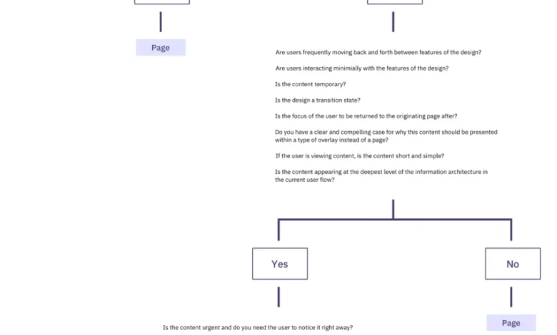
A Decision Framework: The Modals vs. Pages Decision Tree
To navigate these complex choices, a structured decision-making process is invaluable. Ryan Neufeld developed a comprehensive guide that provides a clear framework for designers to choose between modals and pages. This guide, often presented as a visual cheatsheet and a detailed spreadsheet, breaks down the decision-making process into several key sections, guiding users through a series of questions to determine the most appropriate UI pattern.
The core of this framework emphasizes a hierarchical approach to UI presentation. It posits that, by default, pages should be the preferred choice. Modals are then considered for specific use cases where an interruption is intentional and beneficial, primarily to focus attention and prevent errors.
The decision tree typically follows a logical progression:

- Is the task critical and does it require immediate attention and focus? If yes, a modal might be considered.
- Does the task involve a single, self-contained action? If yes, a modal could be appropriate.
- Does the user need to reference or compare information from the underlying page while performing the task? If yes, a modal is likely unsuitable, and a page or alternative component (like a drawer) would be better.
- Is the task part of a longer, multi-step workflow? If yes, a dedicated page is generally preferred.
- Does the task involve a significant amount of information or require extensive user input? If yes, a page provides more space and better organization.
This structured approach helps to move away from an ad-hoc use of modals and towards a more strategic and user-centric design methodology. The aim is to ensure that every UI element serves a clear purpose and contributes positively to the overall user experience.
Concluding Thoughts on Interface Design
In the pursuit of optimal user efficiency and speed, the inclination should be to avoid modals whenever possible. Their primary utility lies in scenarios where the design objective is to slow users down, to consolidate their attention, or to proactively prevent errors. As Therese Fessenden of Nielsen Norman Group has noted, unsolicited interruptions are rarely welcomed by users. However, when an interruption is deemed necessary, it is paramount that the value it provides demonstrably outweighs the cost of the disruption.
Alternative UI patterns can often achieve the same goals with less intrusiveness. Partially obscuring the UI with a floating dialog that still allows for navigation, scrolling, and copy-pasting, or presenting modal content within a side drawer, can offer a more flexible and less disruptive user experience. In cases where extensive detail needs to be conveyed, transitioning the user to a separate page is often the most effective solution.
The overarching principle is to design interfaces that are intuitive, efficient, and respectful of the user’s time and cognitive resources. By carefully considering the nature of the task, the importance of context, and the potential for disruption, designers can make informed choices that lead to superior digital products.

Embracing Smart Interface Design Patterns
For those seeking to deepen their understanding of these and other critical interface design patterns, resources like "Smart Interface Design Patterns" offer comprehensive guidance. This video course, featuring hundreds of practical examples from real-world projects, delves into a wide array of UI elements, from mega-dropdowns to complex enterprise tables. It provides a structured approach to designing effective and user-friendly interfaces, with a particular focus on practical application and strategic decision-making. The availability of free previews and discount codes further democratizes access to this valuable knowledge, empowering designers to elevate their craft.
Related posts:


