The Crucial Pause: Why Realistic Login Experiences Are Paramount in Financial Prototyping

In the intricate world of user experience (UX) testing, particularly within the high-stakes domain of financial products, a subtle yet critical moment often dictates the validity of an entire session. It’s the pause at the login screen. A participant types their credentials, then glances up, a fleeting look of uncertainty crossing their face, a silent question of "Am I doing this right?" This momentary hesitation is a beacon, signaling that the user has already recognized the prototype for what it is – a simulation, not the real, robust application they interact with daily. Consequently, all subsequent data gathered from that point forward is subtly, yet significantly, filtered through this awareness of artificiality.
The implications are particularly acute in financial product testing. Users of banking and investment platforms are conditioned to possess a keen eye for discrepancies. A balance that doesn’t quite add up, a field that inexplicably accepts any input, or a security process that feels flimsy—these are not minor glitches but rather red flags that trigger immediate distrust. When a banking prototype omits crucial authentication steps, participants don’t merely disengage; they often halt the session to explicitly point out the deficiency. The result for the development team is a wealth of findings that reflect user behavior in a demonstration environment, rather than their authentic interactions with a live, secure product. This gap between simulated experience and real-world usage can lead to costly misinterpretations and misguided design decisions.
The solution, while seemingly complex, is often surprisingly focused. The key lies in identifying the precise moment where participant trust is established and ensuring that this specific interaction is rendered with absolute fidelity. For a banking application, this pivotal moment is unequivocally the login process. It is the digital handshake, the gateway to sensitive information and financial transactions, and its authenticity is non-negotiable for a genuine user experience.
A comprehensive tutorial developed using ProtoPie, a leading prototyping tool, demonstrates how to construct a login experience that mirrors a shipped product. This includes functional credential validation, dynamic error states that mimic real-time feedback, and a sophisticated biometric animation that feels seamlessly integrated, all achievable without writing a single line of code. This approach is not merely about aesthetic fidelity; it’s about building a foundation of trust that allows for accurate and actionable user feedback.
Building a Login Experience That Resembles a Deployed Product
The tutorial outlines the creation of a realistic login flow for "Pie Bank," a hypothetical mobile banking prototype. This integrated system features functional text input fields, a securely masked password field, robust credential validation, a dynamic error state for incorrect inputs, and a Face ID animation meticulously timed to be indistinguishable from its native iOS counterpart. This level of detail transforms a static mockup into a dynamic, interactive experience that elicits genuine user reactions.
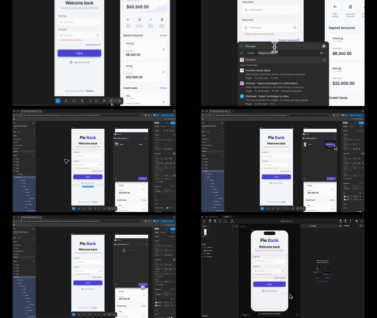
The foundational requirement for this advanced prototyping is a design meticulously prepared in a vector-based design tool like Figma. The process begins with exporting the login frame from Figma to ProtoPie. Crucially, the "Scene" export option must be selected, rather than "Flattened." Flattening collapses all design elements into a single image, rendering individual components untargetable. Conversely, exporting as a "Scene" preserves the layer hierarchy, ensuring that each element—buttons, input fields, text labels—arrives in ProtoPie as a distinct, manipulable layer. This granular control is essential for building complex interactive elements.
Step 1: Precision in Design Import and Layer Renaming
Before importing into ProtoPie, a critical preparatory step involves meticulously renaming every layer within the Figma design. Vague labels such as "Rectangle 14" or "Group 3" will inevitably lead to confusion and wasted time later in the prototyping process. Instead, layers should be descriptively named, such as "Input Username," "Password Field," or "Login Button." These clear, semantic names are vital for referencing layers accurately within ProtoPie’s formula-based logic and interaction triggers. This practice not only streamlines the prototyping workflow but also enhances collaboration, ensuring that all team members understand the function of each design element.
Step 2: Transforming Static Fields into Interactive Inputs
ProtoPie’s native "Input" layer is the cornerstone for creating functional text fields. Unlike static text layers that merely display placeholder text, the "Input" layer allows users to type actual characters directly into the field using their keyboard. To implement this, a new "Input" layer is added to the canvas and nested within the designated username field group in ProtoPie. This new input layer is then visually styled to match the original design—adopting the placeholder text "Username," background fill, and font characteristics.
Upon previewing the prototype and clicking on this field, the user can now type. This simple interaction marks a significant departure from passive depiction to active simulation, making the prototype feel more like a functional application. This input layer is then renamed "Input Username" for clarity.
Step 3: Implementing Secure Password Masking
To create a secure password field, the "Input Username" layer is duplicated. This duplicate is then nested within the password field group. The placeholder text for this new layer is changed to "Password," and its "Type" property is set to "Text Password." ProtoPie automatically handles the masking, displaying entered characters as dots or asterisks without requiring any custom logic or scripting.
A quick preview of both fields at this stage reveals the immediate impact. The username field accepts and displays typed text, while the password field masks it. This functional distinction, achieved with a single property change, significantly enhances the perceived realism of the login screen, laying the groundwork for a more convincing user experience.
Step 4: Establishing the Destination Scene Prior to Navigation Wiring
A common sequencing error in ProtoPie is attempting to wire navigation responses before the target destination scene has been created. To circumvent this, the next step involves adding a new scene, even if it’s initially a blank canvas. This serves as the placeholder for the screen users will be directed to upon successful login, such as a dashboard or account overview. Creating this destination scene first ensures that the subsequent navigation triggers have a valid target.
Step 5: Basic Login Button Functionality
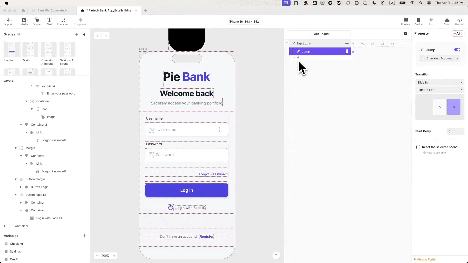
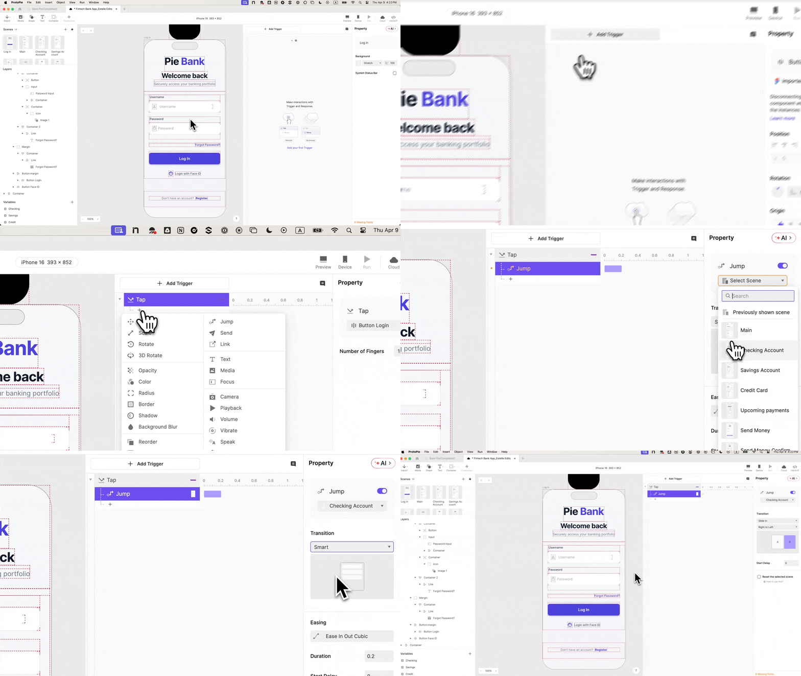
With the destination scene established, the "Log In" button can be wired. A "Tap" trigger is added to the button, configured to execute a "Jump" response. This response directs the user to the previously created dashboard scene, employing a "Slide in from right to left" transition for a natural flow.
Previewing the prototype at this stage demonstrates basic navigation. Tapping the "Log In" button successfully transitions the user to the next scene. However, the crucial flaw remains: this transition occurs regardless of the input provided. Any input, including an empty field or incorrect credentials, will still trigger the navigation. This highlights the necessity for the subsequent steps, which introduce validation logic.
Step 6: Integrating Variables for Input Tracking
To enable credential validation, the prototype needs to "remember" what the user has typed. This is achieved by introducing variables. At the bottom-left corner of the ProtoPie interface, two "Text" type variables are created: username and password.

These variables are then bound to their respective input layers using formulas. For the username variable, the formula is input("Input Username").text. Similarly, for the password variable, it is input("Input Password").text. This binding ensures that the variables dynamically update to reflect the current text content of the input fields.
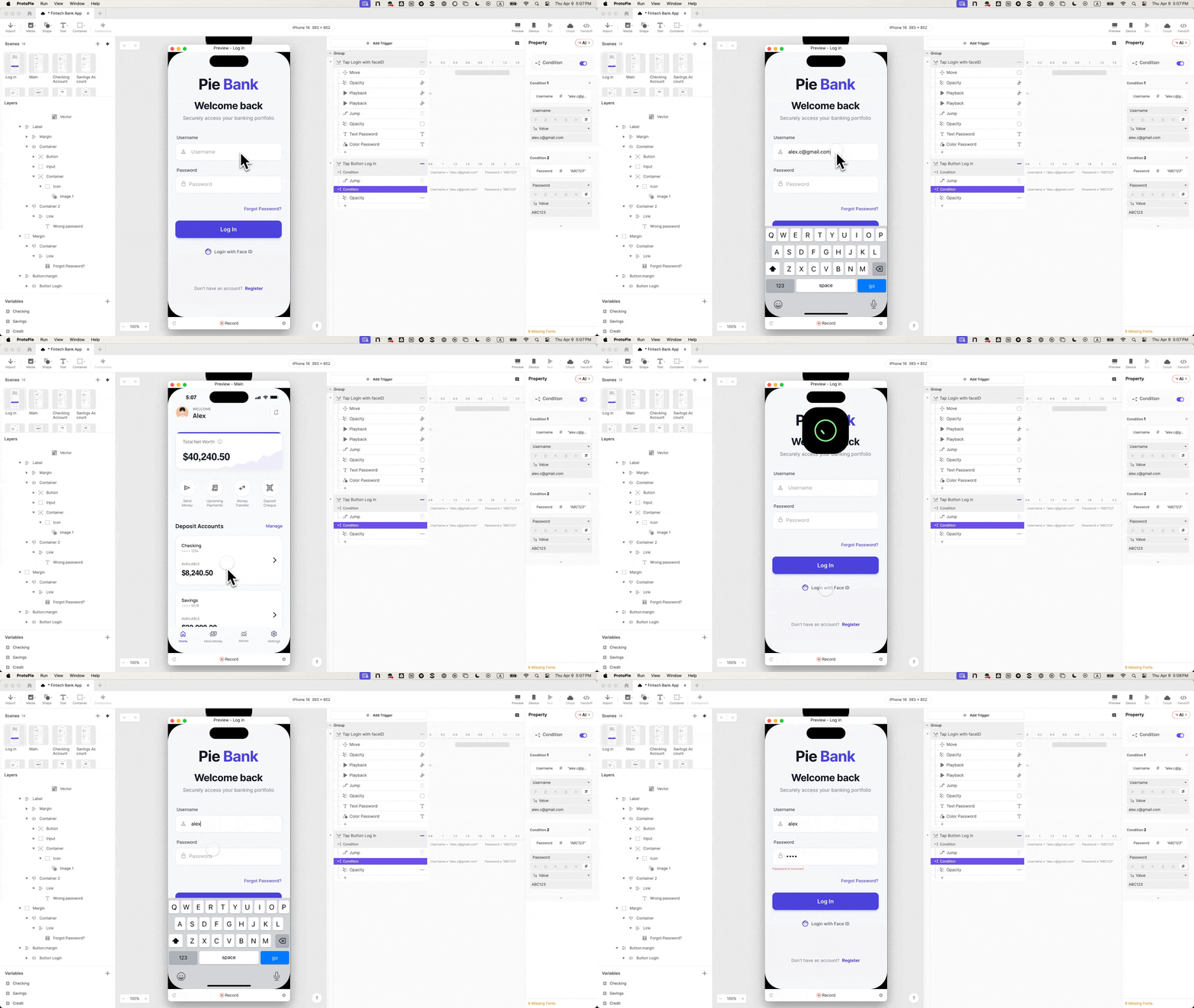
Enabling the debug icons in ProtoPie is a crucial validation step. Green overlays will appear on the screen, displaying the live values of the variables as the user types. The appearance of the typed keystrokes in real-time within these debug overlays confirms that the variable binding is correctly established, signifying that the prototype is accurately capturing user input.
Step 7: Implementing Conditional Logic for Valid Credentials
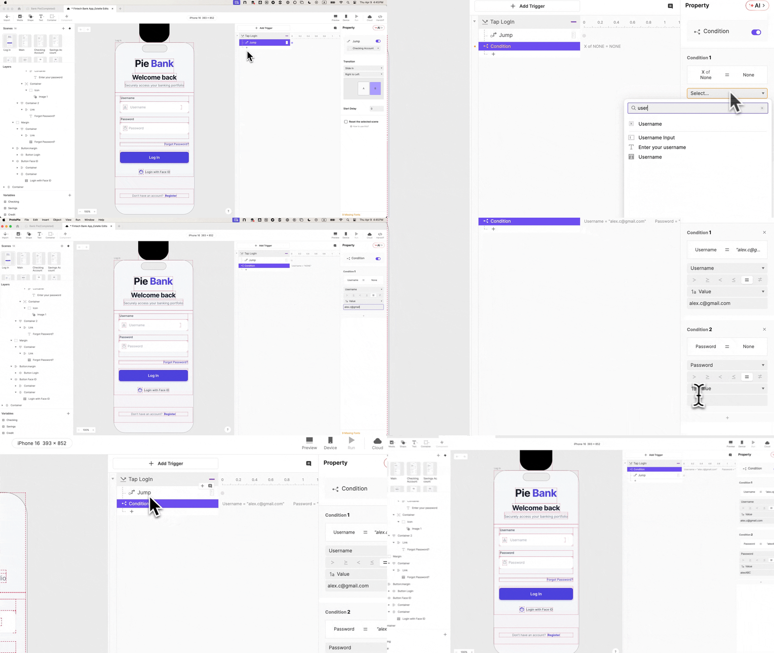
The next critical step involves refining the "Tap" trigger on the login button by introducing a "Condition." This condition is set up with two essential rules that must both be true for the login to proceed:
- Rule 1: The
usernamevariable must equal a predefined valid username (e.g., "testuser"). - Rule 2: The
passwordvariable must equal a predefined valid password (e.g., "password123").
The "Jump" response is then moved to reside within this conditional block. Consequently, if the entered credentials do not precisely match the defined valid combination, the "Jump" response will not execute. This means that incorrect credentials, empty fields, or inputs that don’t meet the defined criteria will prevent navigation. Participants are now required to enter actual, valid credentials to proceed. This single constraint fundamentally alters the texture of subsequent test sessions, forcing users to engage with the login process authentically.
Step 8: Crafting the Error State for Invalid Attempts
When the conditional logic in Step 7 prevents navigation, a visual cue indicating the error is necessary. This is achieved by building an error state, an interaction frequently omitted in simpler prototypes. A designated error message layer, previously named "Error Text," is identified and its initial opacity is set to "0" (invisible).
A second condition is then added, acting as the inverse of the first. This condition is met when the entered credentials are not valid. Within this inverse condition, a "Change Property" response is configured to set the "Error Text" layer’s opacity to "100" (fully visible).
The result is a dynamic feedback loop: incorrect credentials trigger the error message to appear, while correct credentials bypass this condition and proceed to the dashboard. This duality of outcomes—successful login or error display—transforms the prototype from a mere demonstration into a testable interaction, yielding meaningful data on user responses to error conditions. This is a significant step towards creating a prototype that reflects real-world product behavior.
Step 9: Integrating Advanced Biometric Animation
To elevate the realism to an even higher level, the tutorial incorporates a Face ID animation. This detail is often the tipping point that makes testers question if the prototype is indeed real. A "Lottie" layer is added from the "Media" panel and positioned off-screen above the iPhone frame. A pre-designed Face ID animation file is then loaded into this layer.

On the "Login with Face ID" button, a "Tap" trigger is added (and renamed "Tap Face ID"). This trigger is configured with four sequential responses:
- Move: This response animates the Lottie layer into view from its off-screen position.
- Seek: This response controls the playback of the Lottie animation itself, allowing for precise timing.
- Play: This response initiates the animation playback.
- Jump: This response, as before, navigates the user to the next scene upon successful completion of the animation.
Step 10: Orchestrating Timing for Native Feel
The effectiveness of the biometric animation hinges on its timing. If all four responses fire simultaneously, the scene transition will occur before the animation has a chance to play, breaking the illusion of realism. To achieve a native feel, these responses must be staggered using delays.
The tutorial specifies the following timing sequence:
- Move: 0s delay
- Seek: 0s delay
- Play: 0.5s delay
- Jump: 1s delay
This deliberate orchestration ensures that the animation gracefully appears, plays out its sequence, and then seamlessly transitions the user to the next screen. Furthermore, enabling the "Reset selected scenes" option on the "Jump" response is critical. Without this, navigating back from the dashboard would leave the Face ID animation stuck in its last displayed state, undermining the prototype’s consistency.
The preview now demonstrates a fully realized biometric login. Tapping the "Login with Face ID" button triggers the animation to descend, play its course, and then transition the user to the subsequent screen. This level of fidelity makes the interaction virtually indistinguishable from that of a live application.
The Research Impact of Realistic Authentication
A login process that functions authentically transforms the entire research paradigm. When authentication actually works, the error state becomes a genuine research touchpoint. Designers and researchers can now ask critical questions: Do users understand the error message? Do they attempt to re-enter their credentials? Do they opt for the biometric option instead? These are questions that a rudimentary, non-functional login screen simply cannot answer.
In stakeholder reviews, a prototype with a realistic login flow speaks volumes. It demonstrates a commitment to user experience and a deep understanding of user expectations. For engineering handoff, the detailed interaction panel within ProtoPie documents the complex behavior—conditional logic, variable bindings, and precise timing—providing engineers with a clear blueprint of the intended functionality, moving beyond mere visual interpretation to functional intent.
This is precisely why FinTech teams invest significant resources in achieving high fidelity in their login prototypes, even when the login screen itself is not the primary feature under examination. It is the foundational element where participant trust is established. By getting this critical interaction right, all subsequent user interactions and data points generate significantly higher quality signal, leading to more informed design decisions and ultimately, more successful financial products. The subtle pause at the login screen, when addressed with meticulous realism, unlocks a deeper and more valuable understanding of user behavior.