The High Cost of Trend-Driven Design in Mental Health Apps: A Critical Evaluation Framework for User Well-being

The digital landscape of mental health is facing a critical challenge: user retention. Despite the proliferation of apps designed to support mental well-being, a significant majority of users abandon them within the first month. Data indicates that nearly 95% of individuals who download a mental health app on day one cease using it by day 30, with a median 30-day retention rate of a mere 3.3%. Even leading platforms struggle, losing approximately 50% of their users within the initial ten days. This stark reality underscores the urgent need for effective interface design to be a paramount clinical and operational priority, recognizing that good design transcends aesthetics, serving as a fundamental tool for user retention and therapeutic efficacy.
While numerous factors contribute to this widespread user attrition, research increasingly points to a concerning trend: mental health applications have often prioritized eye-catching visual trends over the core functionalities that foster sustained engagement. In an arena defined by vulnerability and cognitive strain, the pursuit of fleeting design fads can inadvertently introduce additional burdens for users who have the least capacity to manage them. This often results in a trade-off, sacrificing essential utility and trust for superficial innovation. Users do not typically access mental health apps out of casual curiosity; they seek support during periods of significant stress, anxiety, overwhelm, or exhaustion. In such states, unconventional icons, obscure gestures, or flashy animations, rather than being delightful, can become significant sources of cognitive overload, ultimately serving as a primary reason for disengagement.
The stakes are exceptionally high. The World Health Organization (WHO) estimates that approximately one billion people globally live with a mental disorder, with depression alone affecting nearly 5% of the adult population. This number has seen a concerning increase, with depression and anxiety cases rising by 25% in the past decade. For this vast and vulnerable demographic, the efficacy of digital mental health tools hinges critically on their design. An interface that introduces friction or confusion at a moment of acute need can not only render the app ineffective for that specific instance but also deter the user from seeking help through digital channels in the future.

The Conflict Between Trend and Therapy
A core tension exists between the typical objectives of contemporary UI trends and the fundamental requirements of mental health applications. Trend-driven design often aims to capture attention and signal innovation, seeking to be novel and attention-grabbing. In contrast, mental health design must prioritize offering refuge, reducing cognitive and emotional strain, and building profound trust. The pursuit of the former can directly undermine the latter, creating a foundational conflict of purpose that manifests across several critical fronts. This tension is not merely about superficial aesthetic choices; it represents a deep-seated divergence in goals that can significantly impact user engagement and therapeutic outcomes.
1. Cognitive Friction: When Design Becomes a Barrier to Healing
The primary objective of any mental health tool should be to alleviate, not exacerbate, cognitive load. However, many trendy interfaces inadvertently achieve the opposite. Neo-brutalist layouts, with their stark contrasts, demand intense visual parsing. Hidden navigation menus that rely on non-standard gestures transform simple actions into complex puzzles. Abstract, unlabeled icons force users into guesswork rather than intuitive recognition. Each of these patterns introduces friction—moments of hesitation, brief periods of confusion—that, for a user whose mental energy is already depleted, can accumulate into a significant burden.

Research consistently highlights that during periods of high anxiety or depression, even basic tasks like typing or making simple choices can feel overwhelmingly difficult. When an interface demands high cognitive effort at the precise moment support is most needed, it doesn’t just complicate that single session; it provides an overwhelmed user with a tangible reason to close the app and, more importantly, a reason not to reopen it. Each point of confusion can become a threshold for permanent disengagement. Conversely, studies indicate that apps with simpler, more intuitive interfaces reduce the time and effort required for engagement, directly improving retention. A complex, trend-driven UI, therefore, creates an obstacle course that actively undermines the healthy habit formation the app is intended to foster.
This does not necessitate a universally plain or minimalist design. The critical question is whether the interface aligns with the user’s current cognitive capacity. For instance, a panic-support tool is most effective when it presents a limited number of straightforward actions, rather than requiring users to navigate extensive menus. If a feature intended for immediate panic relief instead surfaces an upgrade screen, the product fails its user at the most crucial juncture. Monetization itself is not the issue; the problem lies in its placement and presentation at a moment when the user expects immediate, uncomplicated support.

Consider the app "Nonori," which demonstrates effective design in a reflective context. Instead of presenting users with a vast content library or a complex dashboard upon opening, it guides them through a series of small, manageable actions. This linear, step-by-step approach reduces the effort required to initiate engagement. For users experiencing fatigue, anxiety, or mental overload, knowing precisely what to do next significantly lowers the barrier to returning to the app.
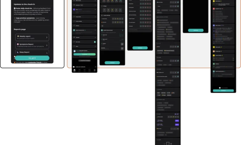
In contrast, comprehensive tracking apps, while valuable for managing chronic conditions, can present a different trade-off. Apps like "Bearable" consolidate numerous tracking metrics—mood, symptoms, sleep, medication, habits, and correlations—into a single platform. While this comprehensiveness is beneficial for some, it can become a significant burden for an exhausted user. Dense dashboards and multi-step check-ins demand a level of executive function that is often diminished by anxiety, depression, burnout, or brain fog.

Similarly, anxiety apps that feature robust support content but present busy home screens with too many cards, locked items, playful characters, or upgrade prompts can inadvertently complicate access to help. While such interfaces might be clear and engaging during periods of exploration, they can become overly demanding for users in distress. This underscores a fundamental principle: every interaction point must meet users at their current level of capacity, actively removing rather than adding mechanical and cognitive barriers.
2. Emotional Mismatch: The Trust Erosion of Misaligned Design Tone
A user’s emotional state is the fundamental context within which a mental health app operates. Consequently, its visual language must be empathetic and considerate. Research investigating the influence of color and aesthetics on mood in mHealth applications reveals a critical insight: users experiencing distress exhibit a strong preference for subtlety. They gravitate towards muted palettes, sleek and sophisticated aesthetics, and clean, uncluttered designs. Bright, cheerful colors, while seemingly appropriate, can create a jarring, even physically uncomfortable, dissonance with their current emotional state.

This does not imply that all mental health and well-being apps must adopt a dark, somber, or clinically restrained visual style. The category is broad, encompassing self-care, anxiety support, habit change, addiction recovery, trauma management, and therapeutic adjacencies. A playful visual style might be perfectly suitable for one product but entirely inappropriate for another. The crucial factor is not the inherent brightness or mutedness of the interface but whether its emotional tone aligns with the product’s purpose and the user’s likely state upon arrival.
Emotional mismatch can also manifest in interaction mechanics, not solely in aesthetics. For instance, some anxiety and panic relief apps, while featuring outwardly clean and relaxed interfaces, incorporate engagement and monetization mechanics that exist in a different emotional register. A discount wheel or confetti celebrating a logged low mood, for a user who has just recorded a difficult experience, can create a jarring disconnect. This shift, from quiet support to an upsell or celebratory notification, can feel incongruous and erode trust, regardless of the developer’s intent.

In applications like "Bear Room," a stress and anxiety reduction app, designers have focused on creating a "cozy room" aesthetic informed by user feedback. This approach directly addresses the user’s need for a digital safe space, moving away from interfaces described as "too bright, too happy, and too overwhelming." The final design employs a quieter palette of muted, earthy tones—soft greens and taupes—against darker, calming backgrounds. This creates a sense of safety without feeling gloomy, prioritizing calmness as a core feature and avoiding jarring alerts or sudden animations.
The principle here is that an overly cheerful, bold, or trend-forward interface can feel dismissive to someone in distress, fostering a conflict that erodes trust. Trust is cultivated when the interface respectfully mirrors the user’s emotional reality, offering solace through subtlety rather than overwhelming them with visual saturation.

3. The Inconsistency Penalty: Why Novelty Undermines Routine
Mental well-being often thrives on routine and predictability. However, many contemporary UI trends are built upon novelty and disruption, intentionally reimagining fundamental navigation patterns. When an app introduces a novel interaction, such as a unique swipe gesture or an unconventional button behavior, it compels the user to invest cognitive effort in learning something new before they can perform a desired action. This is a burden many users in low-capacity states cannot afford.
This doesn’t preclude apps from having distinct personalities, playfulness, or unique identities. The critical factor is whether this identity remains understandable and predictable when the user returns, particularly in a distressed state. For example, a gamified self-care app like "Finch" might function effectively when a user is actively engaged and ready to explore. However, if accessed after a difficult day, the non-skippable celebration screens that delight an engaged user can become an additional hurdle before the user can accomplish the simple task they came for.

Large meditation and well-being platforms often present a similar challenge. Apps like "Headspace" and "Calm" offer extensive libraries of content. While this breadth can be beneficial for exploration, in moments of stress, the user’s need sharpens: can they immediately locate the precise support they require, or must they navigate, search, and re-learn the app’s structure? Individuals experiencing anxiety or executive dysfunction need straightforward navigation, not an interface that requires constant re-learning.
A positive counter-example is "PTSD Coach," a public-health app designed to help users manage trauma symptoms. Its interface prioritizes a stable information architecture. Users can access distinct sections for learning, symptom tracking, symptom management, and support. This predictability is far more valuable to a user returning during distress than any element of novelty.

4. The Silent Exclusion: How Trends Compromise Accessibility
Many popular UI trends can inadvertently become exclusionary when not thoughtfully adapted. The minimalist trend of low-contrast text, for instance, poses significant challenges for users with visual impairments. Gesture-only navigation marginalizes individuals with motor difficulties. Visually dense, animated interfaces can overwhelm users with cognitive or attentional conditions. Crucially, the population seeking mental health support disproportionately includes individuals with these very accessibility needs.
Choosing a trending aesthetic over an accessible one is, therefore, an active decision to limit the app’s reach and efficacy. It ensures that those who might benefit most cannot effectively utilize the tool. Accessibility is not an add-on feature; it is a fundamental design constraint. Web Content Accessibility Guidelines (WCAG) 2.2, for example, mandate specific contrast ratios for text and interface elements, which minimalist trends often violate. Interactive targets require minimum sizes, and gesture-based interactions should ideally have visible button fallbacks to accommodate users with varying physical abilities.

5. The Coercion Paradox: When "Engagement" Becomes "Pressure"
A final, often overlooked, consequence of trend adoption is the incorporation of engagement mechanics designed for entertainment, educational, or productivity apps. Features like streaks, aggressive notifications, and gamified reward systems are engineered to maximize screen time and foster dependency. While these may be effective for increasing retention in other contexts, their application in mental health can be deeply problematic. What presents as "motivation" can quickly devolve into a source of performance pressure and guilt. For a user managing depression, a broken streak or a missed daily goal can exacerbate the very feelings the app aims to alleviate.
These mechanics are not inherently unethical, and in routine-building products, they can indeed assist some users. The risk arises when they are transferred to mental health contexts without considering the nuances of shame, low energy, relapse, and non-linear recovery. A streak, in this context, is not merely a retention mechanic; it can become a visible tally of whether the user has "kept up" with their well-being, fostering self-recrimination.

This tension is often evident in persuasive design patterns: streaks, streak freezes, commitment copy, urgency-driven notifications, and success-framed buttons. In self-care or well-being products, these elements can shift the app’s perception from a supportive tool to another system the user must satisfy.
Sustainable retention in mental health technology is not achieved by capturing attention but by becoming a consistently respectful and helpful presence in a user’s life. This requires a delicate balance between encouraging engagement and avoiding undue pressure.

A Practical Framework for Evaluation
The five critical areas—cognitive friction, emotional mismatch, inconsistency penalty, accessibility compromise, and the coercion paradox—form the bedrock of an essential evaluation framework for anyone designing in the mental health space. Before adopting any trendy visual or interaction pattern, it is prudent to subject it to rigorous scrutiny through these lenses:
- Cognitive Load: Does this pattern increase or decrease mental effort for a user under stress?
- Emotional Alignment: Does the design’s tone and aesthetics resonate with the user’s likely emotional state?
- Navigational Reliability: Does this pattern support routine and predictability, or does it introduce unnecessary novelty that hinders return use?
- Inclusivity: Does this trend inherently exclude or disadvantage any user groups, particularly those with accessibility needs?
- Supportive Engagement: Do the engagement mechanics foster genuine well-being or create pressure and guilt?
A design that successfully navigates these five points is not merely usable; it becomes a trusted tool that users can rely on during their moments of greatest vulnerability. While UI trends can be inspiring and generate buzz, in the realm of mental health, the most impactful design is often the one that fosters a sense of being understood. It is the quiet helper that users trust enough to return to, focusing not on stealing the spotlight but on being a reliable presence that supports the user’s journey toward well-being. Ultimately, the most effective interface is the one that is felt, not necessarily seen.