The most impactful visual concepts in brand identity design do not materialize spontaneously in design software. Instead, they are meticulously cultivated through a critical pre-concept phase, a stage often overlooked but fundamental to success. This crucial period involves deep dives into brand context, the careful excavation of stakeholder assumptions, and the transformation of collective vision into a robust visual framework before any conceptual design work commences. When branding initiatives falter, the root cause frequently lies not in the final logo execution, but in the strategic underspecification of core brand attributes. Ambiguous terms such as "modern," "trustworthy," "premium," "friendly," or "disruptive" remain undefined, creating a chasm between the intended brand message and the designer’s creative mandate. This conceptual void is what can be termed the "pre-concept phase."
Typically, design projects begin with a deluge of inputs: a client brief, initial stakeholder discussions, competitor benchmarks, and perhaps a mood board or a list of descriptive adjectives. From this foundation, designers are expected to conjure visual concepts that resonate. However, the very notion of "resonance" becomes elusive when the core communication goals of the brand have not been definitively established by the team.
Consider a health technology company that articulated a desire for its brand to appear "modern, trustworthy, and disruptive." Initially, "disruptive" might suggest a bold, unconventional aesthetic. Yet, through further dialogue, it became apparent that disruption, in this context, needed to remain credible within the inherently conservative healthcare sector. The company’s clientele comprised large governmental medical institutions, for whom a brand perceived as overly rebellious, experimental, or visually ostentatious would erode, rather than foster, trust. Consequently, their interpretation of "disruptive" leaned more towards innovation within established parameters, a nuance far removed from the word’s typical connotations.
The challenge was not in the client’s choice of language, but in its inherent breadth, which proved insufficient to guide design decisions. For a designer to translate strategy into a tangible visual concept, these broad descriptors must be refined. What specific form of "modernity" is desired? In what precise way should the brand convey "trustworthiness"? Disruptive in relation to whom, and to what extent can the brand deviate from industry expectations before alienating its audience?
This article delves into this critical pre-concept phase—the work that bridges the initial project kickoff and the introduction of the first visual directions. While the comprehensive brand identity process for digital products encompasses strategy, concept development, implementation, and the creation of assets for consistent product team execution, our focus here is on the foundational work that enables the first concept: researching the brand’s context, uncovering implicit assumptions with stakeholders, and consolidating a shared direction into a tangible visual bedrock. This process acts as a vital conduit, translating what the brand needs to signify into the initial stages of how it might visually manifest.
The genesis of this foundational bridge is often the brand workshop, where broad discovery coalesces into a lucid understanding of the brand’s context.
Stage 1: Researching the Brand Context
A typical brand workshop addresses fundamental discovery areas: the business’s objectives, its product or service offering, the competitive landscape, and the target audience. While a comprehensive list of all potential questions for designers to pose in such a workshop is beyond the scope of this article, resources like a "Brand Workshop Toolkit: Questions and Exercises" (a FigJam framework commonly used in studios) can provide a structured starting point for discovery conversations.
Our emphasis here, however, is on a targeted set of questions that are easily overlooked but profoundly valuable before any visual work begins. These inquiries are less about fact-gathering and more about clarifying perception. They guide the team to understand the essential beliefs the brand must instill, the contexts in which it needs to be perceived as credible, and the established category norms it should either align with or challenge.
Perception lies at the heart of brand discovery, as a brand’s ultimate form is sculpted within the minds of its audience. As Marty Neumeier aptly stated in "The Brand Gap," "A brand is a person’s gut feeling about a product, service, or company." If a brand’s existence is predicated on perception, then the workshop’s primary function must be to clarify the specific perception the team aims to cultivate.
The perception-focused questions that are particularly beneficial are those that reveal the underlying assumptions driving individual opinions, rather than merely accumulating more subjective viewpoints. Brand attributes can sound universally aligned until their underlying meanings are rigorously examined. For instance, a stakeholder might declare the brand should feel "premium," a sentiment met with general agreement. However, one individual might interpret "premium" as refined and editorial, another as expensive and exclusive, and yet another as clean, understated, and minimalist. The word appears unified, yet it can precipitate three entirely disparate visual systems.
Revisiting the health tech example, the client’s assertion of "disruptive" could, in many sectors, imply a bold, loud, or unconventional visual approach. However, given their audience of conservative medical institutions, disruption needed to be conveyed through clarity, efficiency, and confidence, rather than overt rebellion. If the term "disruptive" had been accepted at face value, the visual direction might have veered too far from what their audience would readily trust.

In another instance, a fintech company aimed for a "bold" brand image without sacrificing credibility. This single adjective introduced a potent tension. "Bold" could translate to vibrant colors, oversized typography, and a highly expressive visual system. However, within the financial services sector, boldness must also signal security, control, and competence. The pertinent question was not whether the brand should be bold, but rather, what specific manifestation of boldness would remain trustworthy.
When stakeholders can define these attributes within their specific context, designers are liberated from the constraints of vague adjectives. They are presented with a more precise design problem to solve.
While carefully chosen questions can illuminate the verbal layer of brand strategy, words alone are rarely sufficient. To transition from language to visual direction, exercises that prompt stakeholders to engage with images, associations, and relative perceptions are invaluable.
Jake Knapp, in GV’s "Three-Hour Brand Sprint," echoes this sentiment, emphasizing that "The point of these exercises is to make the abstract idea of ‘our brand’ into something concrete."
The following two exercises are instrumental in translating stakeholder discourse about the brand into tangible material that can inform look and feel, design principles, and concept development. These exercises also elevate stakeholder engagement from passive reception to active participation. When clients are merely presented with a strategy, they may passively agree without recognizing their own embedded assumptions. However, when they are required to position competitors on a map, select images, or articulate the credibility of a specific reference, they become active contributors. Their underlying attitudes, beliefs, and disagreements surface before they have the potential to derail the initial concept review.
Typically, the process begins by examining the external landscape—the category—before turning inward to the brand itself.

Exercise 1: Competitor Perception Mapping
Prior to the workshop, gather visual representations of competitor brands, including websites, product interfaces, social media visuals, and other discernible brand touchpoints. During the workshop, invite the client team to position these competitors on a simple two-axis map.
The objective of this exercise is not to judge the aesthetic merit of competitor designs but to understand how the client perceives the competitive landscape. This includes identifying what feels credible, what appears generic, what seems overly conservative, what registers as too experimental, and where potential visual territories for the brand might exist.
The axes of the map should be selected to reflect the core tensions the brand aims to address. For a health technology company seeking to appear innovative while serving conservative medical institutions, axes like "Traditional to Progressive" and "Corporate to Human" might be employed. For a fintech brand aiming for differentiation without compromising trust, axes such as "Understated to Bold" and "Accessible to Exclusive" could be more appropriate.
Often, the most valuable outcome of this exercise is not the finalized map itself, but the discussions and disagreements it generates. One stakeholder might perceive a competitor as progressive, while another views it as merely generic. Similarly, one might categorize a brand as premium, while another interprets it as cold. These divergences illuminate how different individuals define concepts like trust, innovation, credibility, and differentiation—precisely the ambiguities that require resolution before design work can commence.
Exercise 2: Visual Brand Driver
Following the discussion of the competitive category, the conversation shifts inward. One effective exercise for this is the "Visual Brand Driver." Each stakeholder is tasked with selecting images across a series of distinct categories: transport, typeface, activity, furniture, mood, object, animal, architecture, and drink.
Crucially, the instruction is that these images should represent the company’s perception, not the individual’s personal taste.

For example, if the company were a mode of transport, would it be a silent electric car, a high-speed train, a private jet, a bicycle, or a delivery van? If it were a piece of furniture, would it be a plush lounge chair, a precise modular desk, or a substantial boardroom table?
After selecting images, each participant adds four to five adjectives to explain their choices. This explanatory component is often more significant than the image itself, as the same object can hold diverse meanings for different individuals. A train, for instance, might symbolize speed, structure, reliability, mass accessibility, or a fixed route. A lounge chair could represent comfort, calm, informality, or a lack of urgency.
This exercise cultivates a deeper layer of brand perception by prompting stakeholders to think metaphorically and associatively, rather than directly describing the company. Patterns and contradictions emerge. One stakeholder might envision the brand as refined and serene, while another sees it as energetic and experimental. One might characterize the company as precise and structured, another as warm and flexible.
These differences are not impediments but valuable insights, highlighting areas that necessitate clarification before the visual concept phase. This exercise also serves to decouple brand perception from personal aesthetic preference. A stakeholder might personally favor a particular image, but if it does not accurately represent the company, it is excluded. This distinction is paramount throughout the branding process; the guiding question shifts from "Do we like this?" to "Does this effectively communicate the intended message about the brand?"
Once the workshop has surfaced the primary assumptions, the subsequent client meeting can translate this shared understanding into a visual foundation. This stage still precedes the initial identity concepts. It functions as a working layer between strategy and design, allowing the client to provide feedback on perception, visual principles, and nascent asset directions before the designer invests significant time in developing full concepts.
This meeting is typically structured around three interconnected layers:

These layers collectively guide the conversation from abstract perception towards concrete design parameters.
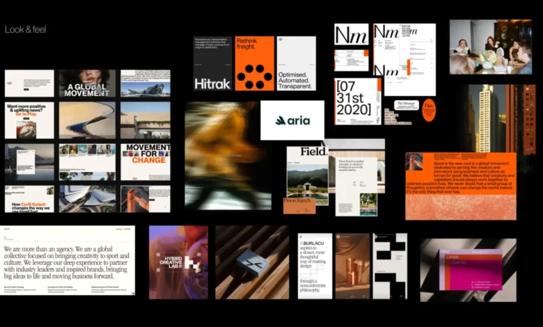
Look and Feel
"Look and feel" boards are not curated collections of visually pleasing elements. Instead, they function as perception boards. The designer compiles references based on the workshop findings: desired perceptions, category tensions, competitor visual codes, stakeholder disagreements, and the identified brand character.
If a brand is intended to embody trustworthiness, modernity, and humanity, the board should facilitate discussion on the specific nuances of trust, modernity, and humanity that are appropriate. Is the brand calm and institutional, or warm and approachable? Does its modernity stem from precision, or from a more expressive editorial tone?
The objective is to allow the client to respond to perceived qualities before reacting to a logo, color palette, or fully realized visual system.
Design Code
"Design code" refines the direction by translating key brand ideas into actionable visual principles.
For a German parenting app, the core message "personalized support for your unique journey" might translate into organic shapes, handwritten lines, and softer compositions. "Parenting is messy and magical" could manifest as soft gradients, layered imagery, and playful irregularity. "Research-backed support for real life" might incorporate visual elements like conference photos, data snapshots, infographics, and editorial layouts to establish credibility.

For a public relations agency specializing in prop tech companies, "momentum in motion" could be depicted through lines, arrows, ripple effects, or motion blur. "Springboard" might be visualized as a lift-off moment and elastic visual energy. "Building blocks" could translate into modular shapes or stacked compositions.
At this juncture, the team is not selecting the final graphic expression but is testing the efficacy of visual metaphors before embarking on concept design.
Brand Assets
The final layer brings the discussion down to the fundamental building blocks of identity: typography, color, logo style, photography, illustration, and the overall graphic language.
At this stage, the team can address questions such as:
- What typographic styles best convey the brand’s personality?
- What color palettes align with the desired perception, and what are their emotional implications?
- What are the stylistic parameters for photography or illustration that will reinforce the brand’s message?
- Are there specific graphic devices or patterns that can be consistently applied?
This process provides the designer with defined boundaries without dictating the final identity. The subsequent step remains concept design, but the team is no longer operating from a position of vague adjectives or unarticulated expectations.
Pre-Concept Checklist
Before proceeding to the initial concept development, it is beneficial to pause and verify that the team possesses a sufficiently shared direction. This checklist is not intended to pre-determine every decision but to ensure that the designer is not commencing work based on nebulous language, implicit assumptions, or unresolved disagreements.

Before creating the first concept, confirm that the team has:
- Clearly defined and agreed-upon brand attributes and their contextual meanings.
- A shared understanding of the competitive landscape and the brand’s desired positioning within it.
- A collective grasp of the core visual perceptions the brand should evoke.
- Identified specific visual directions to explore and, importantly, to avoid.
- Established a consensus on the fundamental visual principles that will guide design.
This final point is particularly valuable. A robust pre-concept phase not only informs the designer on what to explore but also clarifies what to eschew: directions that might be too predictable, too sterile, too playful, too conservative, too loud, too generic, or too divergent from audience trust.
When the team can articulate these boundaries, the evaluation of the first concept becomes more straightforward. The conversation shifts from a subjective "I like it" or "I don’t like it" to a more objective "Does this visually express the brand we collectively agreed upon?"
The First Concept Should Not Be A Guess
The initial concept should not feel like a shot in the dark or an unexpected reveal. Rather, it should represent a logical progression from a direction that the team already comprehends.
This does not imply the elimination of intuition, experimentation, or creative risk from the branding process. Instead, it means equipping these elements with a sharper problem to solve. When the team has clarified the brand’s character, tested visual perceptions, translated abstract ideas into design principles, and discussed the foundational components of the identity, the designer can explore with enhanced confidence.
Pre-concept work does not aim to render the final identity predictable. Its primary purpose is to imbue the conversation surrounding it with greater meaning. Instead of questioning whether the work aligns with an individual’s private expectations, the team can pose a more incisive question: Does this visual direction effectively articulate what the brand needs to become?