Google Analytics launches customizable dashboards to streamline performance reporting for businesses

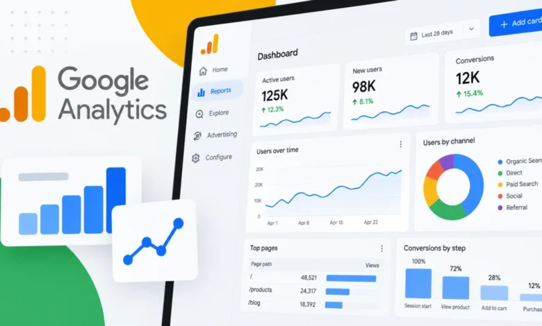
Google Analytics has officially introduced a new Dashboards feature, representing a significant evolution in how marketers and business analysts visualize their data. By transitioning to a grid-based, drag-and-drop interface, the platform now allows users to consolidate critical Key Performance Indicators (KPIs) and visualizations into single, bespoke reports. This update marks a strategic shift for Google, moving away from rigid reporting structures toward a more flexible, user-centric environment that prioritizes speed and accessibility for data-driven teams.
The Mechanics of the New Interface
The core innovation of the new Dashboards feature lies in its intuitive design canvas. Previously, Google Analytics users often had to navigate through a labyrinth of disparate reports to piece together a comprehensive view of their marketing performance. The new functionality replaces this fragmented approach with a grid-based system where users can manually position, resize, and align visualizations to fit their specific workflow.
The implementation is designed for efficiency. Instead of building individual reports from scratch, users can now drag specific dimensions and metrics directly onto the canvas. This allows for the rapid construction of a “single-pane-of-glass” view that tracks everything from top-level revenue metrics to granular user engagement data. By enabling this level of customization, Google is effectively reducing the "time-to-insight" for marketing teams, allowing them to monitor performance trends without the friction of navigating between multiple menus or external visualization tools.
Visualization Capabilities at Launch
To support diverse analytical needs, Google has introduced six primary visualization types available at launch. These include:
- Scorecards: Ideal for high-level KPIs, these display critical metrics and support percentage changes when date comparisons are applied, offering an immediate pulse on performance.
- Tables: Provided for detailed, row-by-row reporting, essential for analyzing specific campaigns or acquisition channels.
- Line Charts: These support daily, weekly, and monthly views, providing the necessary depth for tracking performance trends over extended periods.
- Bar Charts: Designed for direct comparisons between segments, channels, or product categories.
- Donut Charts: Used primarily for quick visual breakdowns of traffic sources or audience demographics.
- Funnel Charts: A critical addition for e-commerce and lead-generation teams, allowing for the monitoring of conversion steps and the identification of specific drop-off points in the customer journey.
Chronology and Deployment
The rollout of Dashboards arrives at a time when the digital marketing industry is increasingly focused on data democratization. Following the industry-wide transition to Google Analytics 4 (GA4), users have consistently requested more intuitive ways to display data without relying on the complexity of Looker Studio.
While the official launch occurred in September 2026, the development process has been a culmination of user feedback loops integrated throughout the previous year. By allowing dashboards to be published directly into the "Reports" left-hand navigation—bypassing the traditional, more cumbersome Google Analytics library—the platform is signaling a departure from its legacy of complex data management. This change ensures that once an Editor or Administrator creates a view, it is instantly accessible to the rest of the team, fostering a culture of shared performance metrics across the entire property.

Operational Limits and Governance
While the new feature provides significant flexibility, Google has implemented clear governance parameters to ensure system stability. Standard Google Analytics properties are limited to a maximum of 15 cards per dashboard, while premium properties are afforded up to 30 cards. This structure acknowledges the performance demands of enterprise-level data processing.
Furthermore, it is important for administrators to note that these dashboards are shared globally across the property. They are not currently designed for private, user-specific views. This architectural decision reinforces the objective of the tool: to provide a "source of truth" for the organization rather than a sandbox for individual analysis. Additionally, users should be aware that, at launch, the feature does not support API integration, advanced segments, or card-level comparisons, suggesting that while this is a major leap forward, further iterations are likely on the roadmap.
Broader Impact and Industry Implications
The introduction of Dashboards is a direct response to the "dashboard fatigue" felt by many modern marketers. For years, the industry standard involved exporting data into external tools like Looker Studio, Tableau, or Excel to create meaningful visualizations. While these tools remain powerful, the overhead of maintenance and data synchronization often creates a barrier to real-time decision-making.
By internalizing this capability, Google is effectively competing with third-party visualization tools for the "daily driver" use case. For small-to-medium-sized businesses, this could render external reporting suites unnecessary for day-to-day operations. For enterprise teams, it provides a faster way to vet performance before escalating data to deeper, more complex analytical environments.
From a strategic perspective, this move aligns with Google’s ongoing commitment to making Analytics a more proactive tool. Instead of being a reactive repository for historical data, the platform is evolving into a proactive dashboard that highlights trends and anomalies the moment they occur. The ability to visualize funnel drop-offs and KPI percentage shifts in real-time allows teams to pivot their strategies more effectively—a necessity in today’s volatile digital advertising climate.
Data-Driven Decision Making
The shift toward consolidated reporting has been supported by industry trends suggesting that organizations with centralized, accessible data views report a higher return on ad spend (ROAS). According to various digital marketing surveys, teams that reduce the time spent on data collection and formatting can increase their time spent on strategy and creative optimization by up to 30%.
By embedding these capabilities directly into the GA ecosystem, Google is empowering teams to become more agile. The ability to see a conversion drop-off on a funnel chart and immediately identify which campaign is underperforming without leaving the dashboard is a capability that will likely change the standard operating procedure for many PPC and SEO teams.

Future Outlook and Limitations
Despite the excitement surrounding this launch, industry analysts emphasize that this is a foundation, not the final destination. The absence of API support is a notable constraint for developers who rely on automated reporting pipelines. Similarly, the current restriction on segments limits the ability to perform deep-dive audience analysis directly within the dashboard.
However, Google’s history with Analytics updates suggests that this feature set will likely expand based on user adoption and feedback. As teams begin to utilize these dashboards, the demand for more advanced filtering and API access will likely drive the next phase of development. For now, the focus remains on accessibility and simplicity—enabling teams to align their business goals with their visual performance reporting.
Final Considerations for Marketing Leaders
For those currently managing Google Analytics properties, the immediate recommendation is to audit the most frequently accessed reports. By identifying the metrics that are checked daily, administrators can begin drafting their primary dashboards.
Effective dashboard design is an exercise in restraint. The 15-card limit for standard properties, while appearing as a constraint, serves as a safeguard against "information overload." A successful dashboard should be actionable; every card should represent a metric that, if it shifts, triggers a specific business action. By focusing on KPIs that drive revenue and growth, teams can leverage this new functionality to foster better communication between stakeholders and technical teams.
Ultimately, the launch of Dashboards within Google Analytics represents a maturation of the platform. It acknowledges that in an era of data abundance, the primary challenge is not access to information, but the ability to synthesize it into a format that supports rapid, high-stakes decision-making. As the digital marketing landscape continues to demand faster pivots and sharper insights, the tools that can deliver that clarity will define the future of the industry.