
Anime’s Mastery of Emotion in Flow Versus Hollywood’s Stumbles: Lessons for Product Design
Design transcends the meticulous arrangement of pixels and the elegant crafting of patterns; it is fundamentally about orchestrating pacing and evoking feelings. Alan Cohen, in his insightful exploration of "Emotion in Flow" and "Emotion in Conflict," draws parallels between the masterful emotional transitions in anime, such as Dan Da Dan, and the often jarring shifts in superhero films like James Gunn’s Superman. By dissecting these narrative techniques, Cohen translates these concepts into practical, actionable patterns for product design, particularly within the realm of digital experiences.
The core argument posits that effective design, much like compelling storytelling, doesn’t merely present information but guides users through an emotional journey. Products that achieve "Emotion in Flow" seamlessly navigate users through states of uncertainty, relief, confidence, and calm, fostering an immersive experience without causing disruption. Conversely, "Emotion in Conflict" arises when a product undermines its own emotional moments through ill-timed jokes, intrusive pop-ups, or abrupt transitions, thereby breaking user immersion and trust.
Cohen emphasizes that these principles are not confined to the user experience (UX) discipline but are universally observable in entertainment. The stark contrast between how anime handles emotional shifts and how many Marvel and DC films falter provides a clear lens through which to understand these concepts. By examining specific examples from the anime series Dan Da Dan and James Gunn’s Superman, Cohen aims to define "Emotion in Flow" and "Emotion in Conflict" and then transpose these insights into tangible product design patterns. The focus remains on digital products, encompassing applications, Software as a Service (SaaS), and websites.
The Art of Seamless Transition: Emotion in Flow through Dan Da Dan
Dan Da Dan, a popular anime series available on Netflix, exemplifies "Emotion in Flow" through its remarkable ability to traverse a vast tonal spectrum – from horror and comedy to profound tenderness – without sacrificing coherence. Cohen highlights a specific narrative arc where the protagonists engage in a bizarre, comedic quest involving a deeply unusual artifact, only to pivot to a heart-wrenching story about a mother whose child has been abducted. On paper, such a drastic shift might seem destined for a narrative car crash. However, on screen, Dan Da Dan delivers this transition with remarkable emotional legibility and coherence.
The success of Dan Da Dan‘s emotional fluidity lies in its ability to prepare the audience for shifts, execute them with grace, and provide a satisfying resolution. This cinematic approach can be directly mapped onto user experience design. Just as a film director builds anticipation before a dramatic reveal or a comedic beat, a well-designed digital product prepares users for changes in functionality or information presentation. This preparation can involve clear visual cues, subtle animations, or concise explanatory text that primes the user for what is about to occur.

The transition itself is a critical juncture. In Dan Da Dan, the narrative might employ a brief moment of reflection, a visual bridge, or a subtle shift in music to ease the audience from one emotional state to another. Similarly, digital products can utilize smooth animations, progressive loading indicators, or phased content reveals to manage transitions. These elements ensure that the user’s mental model remains intact, and they are not disoriented by abrupt changes.
Finally, resolution is key. After a significant emotional or informational shift, the product needs to confirm the new state and allow the user to settle into it. This could be a clear success message after a transaction, a confirmation of a setting change, or a visual reset that signals the completion of a task. By following this "prepare, transition, resolve" pattern, products can maintain user immersion and foster a sense of trust and competence, even when navigating complex or emotionally charged interactions.
The Pitfalls of Disruption: Emotion in Conflict in Superhero Cinema and Digital Products
In contrast to the seamless narrative arcs of Dan Da Dan, Cohen identifies "Emotion in Conflict" in films like James Gunn’s Superman. He points to a scene where Lois Lane and Clark Kent are engaged in a deeply intimate and heartfelt conversation, a moment designed for emotional resonance. However, the scene is undercut by a running gag in the background – a monster being comically dispatched with a giant baseball bat. This comedic element, while perhaps intended as a stylistic choice, inadvertently steals focus from the core emotional beat, creating a tonal clash that punctures the intended sentiment rather than enhancing it.
The failure of this scene, according to Cohen, lies in the misjudgment of emotional timing and prioritization. When a serious or intimate moment is juxtaposed with levity, the user’s (or viewer’s) emotional processing is disrupted. They are forced to reconcile conflicting emotional cues, leading to confusion and a diminished impact of the intended emotional experience.
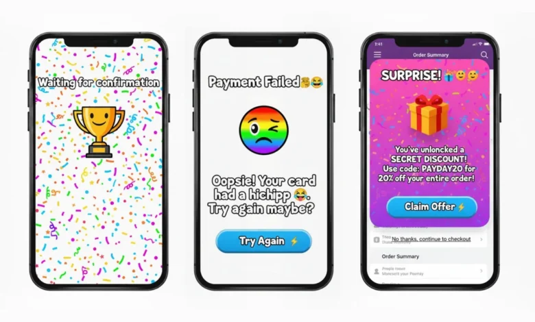
This phenomenon is directly analogous to common pitfalls in digital product design. A prime example is the "confetti-before-confirmation" problem, where a celebratory animation appears prematurely, before a critical task like a payment has been fully confirmed. This creates a false sense of completion and can lead to user anxiety if the actual confirmation is delayed or fails. Similarly, a cheeky or flippant error message during a financial transaction can be jarring and erode trust. The inclusion of a promotional modal that interrupts a user’s focused effort on a critical task is another instance of "Emotion in Conflict."
These disruptions not only break the emotional flow but also significantly increase cognitive load. Users are forced to process conflicting information and emotional cues simultaneously, which slows down their interaction, increases stress, and ultimately leads to a less satisfying and memorable experience. This cognitive dissonance is a direct contributor to negative user perceptions and can lead to higher bounce rates and lower conversion rates.

Defining the Dichotomy: Quick Definitions
To crystallize these concepts, Cohen offers concise definitions:
- Emotion in Flow: Emotional shifts feel earned, are appropriately telegraphed, and are timed to resolve prior narrative or interactive beats. This maintains user immersion.
- Emotion in Conflict: A jarring switch or abrupt cut that punctures a live emotional beat, breaking user immersion.
These definitions serve as foundational principles for evaluating and designing user experiences.
The Enduring Impact of Emotion on Product Memorability
The effectiveness of a product’s design, particularly its emotional impact, is intrinsically linked to user memorability. Humans do not typically recall the average of their experiences; instead, they remember the peaks of emotion and the final impression. If a product’s emotional arc culminates in frustration due to a poorly handled error, or if the ending feels messy and unresolved, these negative experiences will be the ones that linger in the user’s memory. Therefore, consciously designing the emotional curve of an experience is paramount.
Donald Norman’s seminal work on "Emotional Design" identifies three layers of emotional engagement: the visceral, the behavioral, and the reflective. A product’s design must align these layers to create a cohesive and positive emotional experience. The visceral layer relates to the immediate sensory appeal, the behavioral layer to the usability and functionality, and the reflective layer to the user’s self-perception and satisfaction after using the product.
Microinteractions, those small, often overlooked elements of design such as a subtle animation on button hover or a brief loading spinner, act as the "emotional glue" that binds these layers together. Each microinteraction has a trigger (user action), rules (system response), feedback (visual or haptic confirmation), and loops or modes (handling repeated actions or errors). When microinteractions are designed effectively, they seamlessly bridge emotional transitions, reinforcing the intended emotional state. Conversely, poorly executed microinteractions can break the flow, creating friction and confusion.
The concept of an "emotional beat sheet" is crucial here, mirroring narrative storytelling. This sheet maps the desired emotional progression through a user flow, typically progressing through stages like uncertainty, clarity, anticipation, achievement, and calm. Each step in a digital product’s journey should be considered within this emotional framework. For instance, the initial uncertainty of a new user can be addressed with clear onboarding. The anticipation of a process completing can be managed with progress indicators. The achievement of a successful outcome should be celebrated with appropriate feedback. And finally, a sense of calm and closure should be provided.

This sequence is not negated when things go wrong. Errors, latency issues, and degraded system states are not exceptions to the emotional arc; they are integral parts of it. From a narrative perspective, these are the obstacles in the hero’s journey. A well-designed recovery state acknowledges the setback, clarifies what happened, and guides the user toward the next step without introducing further emotional noise. When failures are treated as narrative beats rather than catastrophic ruptures, emotional flow can be preserved even under stressful conditions, reinforcing user trust and resilience.
Practical Applications: Emotion in Flow vs. Emotion in Conflict in UX
To illustrate these principles in practice, Cohen presents concrete UX examples:
Emotion in Flow: Seamless User Journeys
-
Checkout Processes (Stripe/Apple Pay): Exemplary checkout systems are characterized by short, clearly defined steps, explicit progress indicators, and a crisp, unambiguous success state. A simple checkmark, perhaps accompanied by a subtle haptic feedback, provides immediate confirmation. The peak moment of successful transaction is clearly defined, and the ending offers closure, either through a receipt or a clear next step, such as directing the user to their order history. This structured progression from review to payment to confirmation minimizes uncertainty and maximizes a sense of accomplishment.
-
Pickup Status Updates (Ride-hailing Apps): Applications like Uber, Free Now, and Bolt excel at managing user emotion during the pickup process. Progressive updates such as "Driver arriving," "2 minutes away," and "Arrived" provide constant orientation and significantly reduce anxiety. The initial uncertainty of waiting transforms into clarity as the estimated arrival time decreases. Gentle motion graphics and clear textual cues prepare users for each transition, ensuring they are not caught off guard and maintain a sense of control. This consistent feedback loop builds confidence and reinforces the reliability of the service.
Emotion in Conflict: Disruptive Design Patterns
While Cohen refrains from naming specific products that exhibit "Emotion in Conflict" to respect their developers, he outlines the common patterns that cause emotional disruption. These patterns, when identified and addressed, can significantly improve user experience.
-
Joking Tone in High-Stakes Errors: A common pitfall is employing a lighthearted or humorous tone when presenting critical errors, particularly those related to financial transactions or data loss. This juxtaposition creates cognitive dissonance. For example, an error message during a payment process that attempts to be witty can be perceived as dismissive or unprofessional, eroding user trust at a moment when clarity and reassurance are paramount.

-
Premature Celebration Before Confirmation: As mentioned earlier, displaying celebratory animations or messages before a process is fully confirmed, such as a purchase or a data submission, can lead to confusion and frustration if the process subsequently fails or encounters an issue. This premature gratification creates a false sense of security.
-
Surprise Promotional Takeovers Mid-Task: Interrupting a user’s focused workflow with unexpected promotional pop-ups or modals, especially during critical tasks like completing a checkout or filling out an important form, is a classic example of "Emotion in Conflict." This disruption breaks the user’s concentration, increases cognitive load, and can feel intrusive and disrespectful of their time and attention.
These instances of "Emotion in Conflict" not only break the emotional arc but also increase user stress and reduce confidence in the product.
Strategies for Cultivating Emotion in Flow
To proactively ensure "Emotion in Flow" in digital products, Cohen proposes a multi-faceted approach:
1. Craft the Emotional Beat Sheet First
Before designing any screens or writing copy, it is essential to map out the emotional journey for each core user flow. This involves identifying the desired emotional state at each step, from initial uncertainty to final calm. For example, an onboarding process might move from "curiosity" to "understanding" to "confidence." By attaching specific copy, motion design, and microinteractions to each emotional beat, designers can ensure a coherent and supportive user experience. The question to ask is: "Who carries the emotion at each stage, and how do we guide it?"
2. Align Tone with Task Risk
A crucial aspect of emotional design is understanding the inherent risk associated with a task and aligning the tone of the interface accordingly. A matrix can be developed where different risk levels (low, medium, high) are mapped against different system states (success, warning, error). In high-risk scenarios, such as critical error messages or financial transactions, the tone should be calm, clear, and solution-oriented. Playfulness and exuberance are best reserved for low-risk contexts, such as minor UI feedback or optional feature exploration. This principle helps prevent the unintentional introduction of "Emotion in Conflict." Many mature products subtly drift into emotional conflict over time as teams add "delight" by habit rather than by intentional design, often masking underlying friction. A critical self-check is to ask: If all playful or celebratory elements were removed from a specific step, would the flow still feel humane, or were those elements merely compensating for confusion?

3. Design Peak and End with Intent
Every user flow should have a clearly defined emotional peak and a clean, conclusive end. The peak is the moment of greatest emotional engagement, typically a successful outcome or a significant achievement. The end provides closure and sets expectations for what follows. Measuring user recall and satisfaction at these specific points can provide valuable insights into the effectiveness of the design.
4. Leverage Microinteractions as Bridges, Not Spotlights
Microinteractions should serve as seamless transitions between emotional states, guiding the user gently rather than demanding their attention. They act as bridges, reinforcing the narrative and emotional progression. When microinteractions become the sole focus or are overly elaborate, they can detract from the core task and introduce unnecessary cognitive load.
5. Test for Emotional Continuity
Beyond functional usability, testing should actively probe for emotional continuity. Instead of asking solely, "Was that easy?", designers should inquire, "What feeling changed here?" or "How did that transition make you feel?" Hearing a user describe a journey as "confused -> amused -> confused" is a clear indicator of "Emotion in Conflict." Iterating on transitions, not just static screens, is key to achieving genuine emotional flow.
A Fast Checklist to Avoid Emotion in Conflict
The following red flags and their corresponding fixes can help designers quickly identify and mitigate instances of "Emotion in Conflict":
-
Red Flag: Humorous or overly casual tone in serious contexts (e.g., error messages, security alerts).
- Fix: Adopt a clear, direct, and reassuring tone. Focus on providing actionable solutions.
-
Red Flag: Premature celebration or congratulations before task completion.

- Fix: Delay any celebratory feedback until the task is definitively confirmed. Use progress indicators to manage anticipation.
-
Red Flag: Unexpected pop-ups or modal windows disrupting critical workflows.
- Fix: Schedule interruptions strategically, or use less intrusive notification methods. Prioritize user flow over immediate promotional goals.
-
Red Flag: Inconsistent visual or auditory cues across related actions.
- Fix: Establish a clear design system and ensure consistent application of tone, animation, and feedback mechanisms.
It is important to note that there are specific instances where breaking emotional flow is intentional and necessary. Security warnings, legal confirmations, and safety-critical alerts often benefit from abrupt tonal shifts. In these scenarios, disruption signals importance and demands immediate attention. The issue is not "emotional conflict" itself, but rather "accidental conflict." When designers deliberately choose to disrupt the flow, users understand the heightened stakes and are less likely to feel whiplash.
Conclusion: The Directed Experience
Ultimately, great user experiences are directed experiences. Just as Dan Da Dan masterfully guides its audience through a complex emotional landscape by preparing, transitioning, and resolving, digital products must adopt a similar narrative sensibility. The juxtaposition of a comedic gag with a heartfelt moment in Superman serves as a cautionary tale, highlighting how tonal clashes can undermine emotional impact.
By consciously mapping emotional beats, aligning tone with task risk, and utilizing microinteractions as bridges rather than spotlights, designers can ensure that users remember the intended peaks of their experience and the satisfying conclusion, rather than the jarring disruptions in between. This deliberate orchestration of emotion is not merely about aesthetics; it is fundamental to creating memorable, trustworthy, and ultimately successful digital products.


