The Art and Science of Naming UI Components: A Comprehensive Guide to Professional Nomenclature

Naming is arguably one of the most persistent challenges in software development and interface design. The terminology employed within a digital product acts as the foundational layer of communication, shaping how designers, developers, product managers, and end-users perceive and interact with a system. When nomenclature is inconsistent or ambiguous, it introduces friction, leading to fragmented design systems, convoluted codebases, and poor user adoption. As modern interfaces grow in complexity, the demand for standardized, scalable, and intuitive naming conventions has become a critical focal point for engineering and design teams globally.

The core of the naming crisis often stems from a lack of balance. Terms that are too generic—such as "box," "wrapper," or "container"—fail to convey intent, leading to "div soup" in HTML and confusion during developer handoffs. Conversely, names that are too specific or tied to visual appearance—such as "blue-large-button"—restrict flexibility and impede the reusability of components when branding or design requirements evolve. Bridging this gap requires a disciplined approach to taxonomy, grounded in the principles of linguistic clarity and structural logic.
The Evolution of Design System Taxonomy
The movement toward structured naming conventions gained significant momentum with the rise of atomic design and enterprise-level design systems. Organizations such as Intuit, which manages a diverse portfolio including Mailchimp, QuickBooks, and TurboTax, have been at the forefront of this evolution. Faced with the challenge of maintaining brand integrity across multiple products, the company moved away from ad-hoc naming toward a highly disciplined, flexible token system.

Historically, design systems suffered from a "naming sprawl," where similar components were labeled differently across disparate teams. Research indicates that teams utilizing a unified, semantically-driven taxonomy reduce onboarding time for new developers by approximately 30% and decrease technical debt associated with CSS refactoring. By adopting a hierarchy that moves from brand-level primitives to semantic roles and finally to component-specific implementations, teams can ensure that their codebase remains robust and adaptable to future changes.
Essential Resources for Standardized Naming
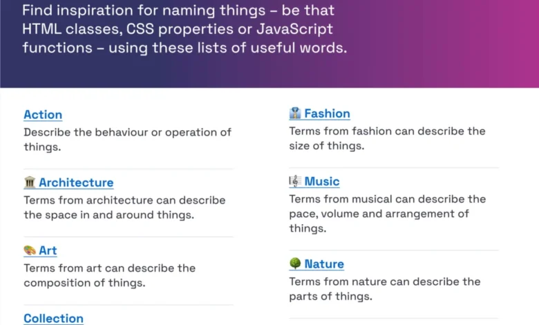
For teams struggling to establish a consistent vocabulary, several industry-standard resources have emerged. The "Classnames" repository serves as a vital reference, offering thematically grouped terminology that encourages developers to think beyond generic labels. By incorporating categories such as behavior, order, and association, alongside thematic groupings inspired by architecture, music, and publishing, teams can create names that are both descriptive and memorable.

Similarly, color management—a notorious source of confusion—has seen professional standardization through initiatives like the color-naming repository maintained by David Aerne. With over 30,000 unique, user-contributed names, this project provides a standardized nomenclature that prevents the common pitfall of assigning arbitrary names to hex codes. When a color is referred to by a consistent name across the entire organization, it eliminates the "this-is-kind-of-blue" ambiguity that often plagues design-to-development handoffs.
Best Practices in Layer and Component Management
Industry experts, including design consultants like Javier Cuello, have formalized the "do’s and don’ts" of layer and component naming. The prevailing consensus emphasizes that effective names must be short, meaningful, and entirely decoupled from visual properties. A button should be named for its role—such as "primary-action" or "secondary-navigation"—rather than its color or size. This distinction is crucial for maintaining a scalable system; if a "red-button" needs to be updated to blue, a visually-linked name becomes a source of technical misinformation.

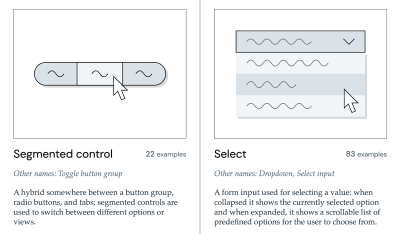
Data from the Component Gallery, an extensive index of real-world design systems, reinforces this necessity. The gallery provides an empirical look at how top-tier organizations name over 50 common UI components. Analyzing these trends reveals that the most successful systems prioritize functional descriptors. For example, using "accordion" over "collapsible-panel" provides an immediate, universally understood mental model for both the developer writing the code and the user navigating the interface.
The Impact of Naming on Feature Adoption
The consequences of poor naming extend well beyond the internal development environment; they directly impact user experience and feature adoption rates. According to usability research conducted by UX experts like Erin Gannon, low feature adoption is frequently a symptom of "naming disconnect." If a feature is labeled with internal jargon or corporate terminology that does not align with the user’s mental model, the user will fail to discover or understand the value of the tool.

The "Job-to-be-Done" (JTBD) framework is frequently applied here: names should signal the outcome or value provided by the feature. When teams conduct user interviews to understand how customers describe a task in their own words, they are often surprised to find that the internal project name is entirely disconnected from the user’s vocabulary. Aligning interface labels with the user’s language significantly increases engagement, as it bridges the gap between what the product does and what the user needs.
Structural Frameworks for Complex Systems
For large-scale, multi-brand environments, such as the infrastructure supporting the Vodafone UK Design System, the complexity requires a sophisticated mapping of variables. These systems employ a "Taxonomy Map" that links global primitives (like spacing, typography, and color palettes) to semantic tokens and finally to component-level variables. This structure ensures that a change at the primitive level cascades correctly through the entire system without breaking individual component definitions.
Tools such as the Design Token Naming Guide and various inventory spreadsheets have become essential for maintaining this bird’s-eye view. These tools allow teams to filter, categorize, and audit their design tokens, ensuring that every element of the UI has a clearly defined role. By treating naming as a critical infrastructure component rather than an afterthought, organizations can create "living" systems that grow alongside the product.
Broader Implications and Future Trends
The importance of disciplined naming will only intensify as artificial intelligence and automated UI generation become more prevalent. AI models rely on the semantic meaning embedded within codebases to interpret and manipulate UI components. If a component is named "x123-nav," an AI agent cannot infer its function. Conversely, if it is named "primary-navigation-menu," the AI can intelligently adapt that component to different contexts.

Furthermore, as global teams continue to adopt remote and asynchronous workflows, the cost of naming ambiguity is rising. When developers and designers operate in different time zones, the "dialect" they use must be perfectly synchronized. Misunderstandings regarding the definition of a "modal" versus a "dialog" or a "toast" versus a "notification" can lead to hours of unnecessary meetings and redundant development work.
Conclusion: The Strategic Value of Language
The effort required to standardize naming conventions is an investment in organizational efficiency. While it may seem like a trivial administrative task, the cumulative effect of clear nomenclature is a reduction in cognitive load, faster iteration cycles, and a more cohesive user experience.

Teams that prioritize a shared vocabulary are better equipped to navigate the complexities of modern digital product development. By leveraging existing taxonomies, adhering to best practices that decouple function from appearance, and ensuring that user needs drive the naming of features, organizations can transform their design systems into powerful, sustainable assets. As the digital landscape continues to evolve, the ability to name things clearly will remain the ultimate marker of a mature and professional design operation.
For those seeking further expertise in the intersection of UI architecture and user experience, resources such as "Design Patterns for AI Interfaces" provide deep dives into how these foundational naming principles apply to the next generation of intelligent, responsive digital products. Ultimately, the right name is the one that is understood by everyone—the designer, the developer, and most importantly, the person using the product.