The Strategic Imperative: Crafting High-Impact Calls to Action for Digital Success


In the competitive landscape of digital marketing, a well-executed Call to Action (CTA) stands as the pivotal determinant between a fleeting impression and a concrete conversion. More than just a phrase, a CTA is a direct invitation, a navigational beacon guiding an audience through the desired customer journey, whether it’s to click an advertisement, download an informational e-book, initiate a purchase, or engage with content. Conversely, an uninspired or unclear CTA can render even the most meticulously crafted campaign invisible, leaving potential leads to scroll past without recognition.
The digital realm is increasingly saturated with content and advertising, presenting a significant challenge for marketers vying for audience attention. Statistics reveal a growing trend of "ad fatigue," with reports indicating that over 22% of internet users employ ad blockers, often citing an overwhelming volume of advertisements as the primary reason. This heightened user discernment underscores the indispensable role of a compelling CTA in breaking through the noise and motivating engagement. This article delves into the intricacies of social media CTAs and beyond, exploring their fundamental nature, the elements that define their success, and strategic approaches to crafting persuasive prompts for any digital campaign. We will also examine a diverse collection of 17 real-world CTA examples from social media, email campaigns, and landing pages, demonstrating that the principles of effective CTAs transcend platform boundaries.
Understanding the Call to Action in the Digital Ecosystem
A Call to Action (CTA) is a strategically placed textual prompt within a marketing campaign designed to elicit a specific, desired response from the target audience. This response can range from a simple click on a link, leaving a comment on social media, or visiting an online store, to making a direct purchase or subscribing to a service. CTAs can manifest in various forms, from concise, direct phrases like "Buy Now" or "Download Here" to more elaborate, benefit-driven statements such as "Subscribe today and never miss our exclusive insights." The versatility of CTAs allows them to be tailored precisely to the campaign’s objective and the psychological state of the audience.
In an era characterized by information overload and decision fatigue, a well-crafted CTA provides crucial direction. It simplifies the user’s next step, lending purpose to the content they’ve just consumed. Even a two-word phrase can significantly reduce friction in the user journey, offering clarity on what action is expected. Furthermore, CTAs that skillfully incorporate a sense of urgency or exclusivity have been shown to significantly boost conversion rates, capitalizing on psychological triggers that encourage immediate action. The ultimate goal of any CTA is to maintain user engagement and propel them further down the sales funnel. While a single, prominent CTA is the most common approach, many sophisticated marketing strategies now integrate both primary and secondary CTAs to cater to different levels of user commitment or interest, a practice we will explore further.
The Art and Science of Crafting Persuasive CTAs
Developing an effective CTA for social media and other digital platforms requires a blend of creativity and strategic insight. With social media platforms increasingly prioritizing user engagement and facing challenges like ad blocker adoption, the precision of a CTA has never been more critical. Elevating conversion and engagement rates necessitates compelling CTAs across all digital touchpoints.
1. Employing Potent Action Verbs:
The foundation of a strong CTA lies in its verb. Short, direct, and powerful action words are not only more persuasive but also essential given the character constraints prevalent in many ad formats. Begin with a commanding verb (e.g., "Buy," "Download," "Discover") and follow it with an adverb (e.g., "Now," "Instantly") or a clear subject (e.g., "Your Ebook," "Our Service"), or a combination of both. Examples include "Shop Now" or "Unlock Your Potential Today."
Here is a categorized list of impactful verbs, designed to be paired with your specific offering:
| Most Common Purpose | Recommended CTAs |
|---|---|
| E-commerce | Buy, Shop, Order, Reserve, Save, Add to Cart, View Deals |
| SaaS Conversion | Try, Get Started, Subscribe, Sign Up, Start Free Trial |
| Non-profit Conversion | Donate, Commit, Volunteer, Adopt, Give, Support |
| Newsletter or Community | Subscribe, Join, Sign Up, Refer, Stay Connected |
| Freebie/Lead Magnet Giveaway | Download, Get, Grab, Claim, Access, Unlock |
| General Engagement | Learn More, See More, See How, Start, Find Out, Explore |
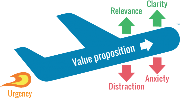
A useful framework for evaluating your CTA’s potential effectiveness is the LIFT Model, which considers six conversion factors: Value Proposition, Relevance, Clarity, Urgency, Anxiety, and Distraction. For instance, if we analyze "Download this ebook now," it breaks down as:
- Download: Establishes Relevance to a user looking for content.
- this ebook: Provides Clarity on what is being offered.
- now: Creates Urgency, prompting immediate action.
- Download this ebook: Collectively represents the Value Proposition, implicitly promising knowledge or solution.
The surrounding text of your CTA is equally vital. It should provide context, highlight benefits, and address potential objections, thereby reinforcing the CTA’s message and increasing its persuasive power.
2. Evoking Emotion and Enthusiasm:
For campaigns aiming to forge a deeper connection or drive a more significant emotional response, a slightly longer CTA can be more effective. Incorporating descriptive modifiers can amplify the desired emotional impact. Examples include:
- "Discover Your Perfect Getaway"
- "Transform Your Business Today"
- "Experience Unrivaled Comfort"
- "Join a Community That Cares"
These CTAs move beyond transactional language to resonate with the user’s aspirations or pain points.
3. Cultivating Uniqueness and Brand Voice:
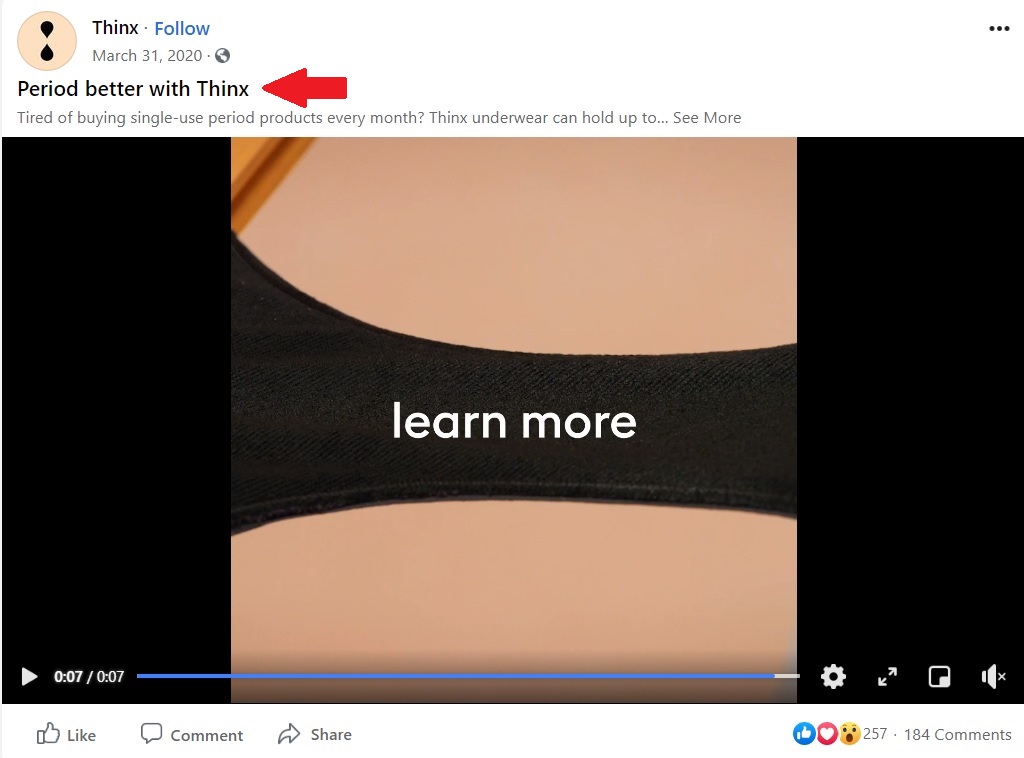
While established CTA formats are reliable, innovation can significantly differentiate your brand. Consider your company’s core mission and what unique value it provides to customers. Translate these into a 2-5 word CTA that reflects your brand’s personality. For instance, a spa might use "Treat Yourself Today!" or "Rejuvenate Your Senses." Thinx’s memorable "Period better" campaign exemplifies this creative approach, using a noun as a verb to create a highly distinctive and brand-specific call to action.
A critical component of CTA optimization is A/B testing. Industry data consistently shows that even minor tweaks to CTA wording, color, or placement can yield dramatic differences in conversion rates. Marketers are advised to run multiple A/B tests to systematically evaluate the performance of different CTAs and refine their strategy based on empirical data, rather than relying on initial assumptions.
Exemplary Calls to Action Across Platforms
Let’s examine how these principles are applied in practice through a selection of high-performing CTAs.
Facebook Ad CTAs:
Facebook’s native CTA buttons are powerful tools for guiding user action.
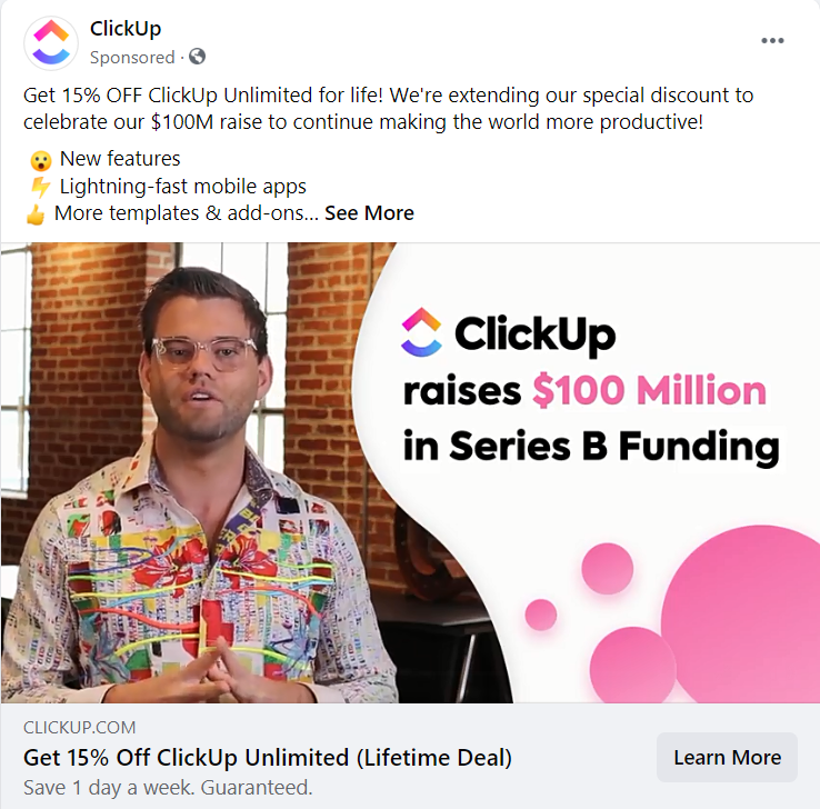
- ClickUp: "Get a Lifetime Deal" (Button: "Learn More")
- Why it works: This CTA, often seen in retargeting campaigns, combines urgency ("Lifetime Deal") with a low-commitment action ("Learn More"), appealing to users already familiar with the product. The ad copy further reinforces the value proposition.
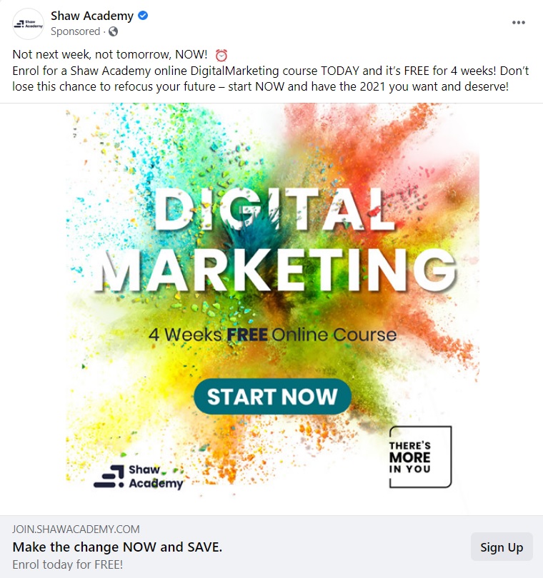
- Shaw Academy: "Claim Your Free Course Now!" (Button: "Sign Up")
- Why it works: This ad bombards the user with urgency (exploding colors, alarm emoji, multiple exclamation marks) and a clear, immediate benefit ("Free Course"). The direct language ensures no ambiguity.
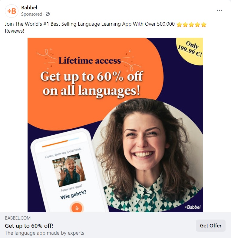
- Babbel: "Save 50% Today!" (Button: "Get Offer")
- Why it works: Babbel leverages social proof ("over 500,000 5-star reviews") and an attractive, time-sensitive discount. The "Get Offer" button clearly indicates the next step to claim the benefit.
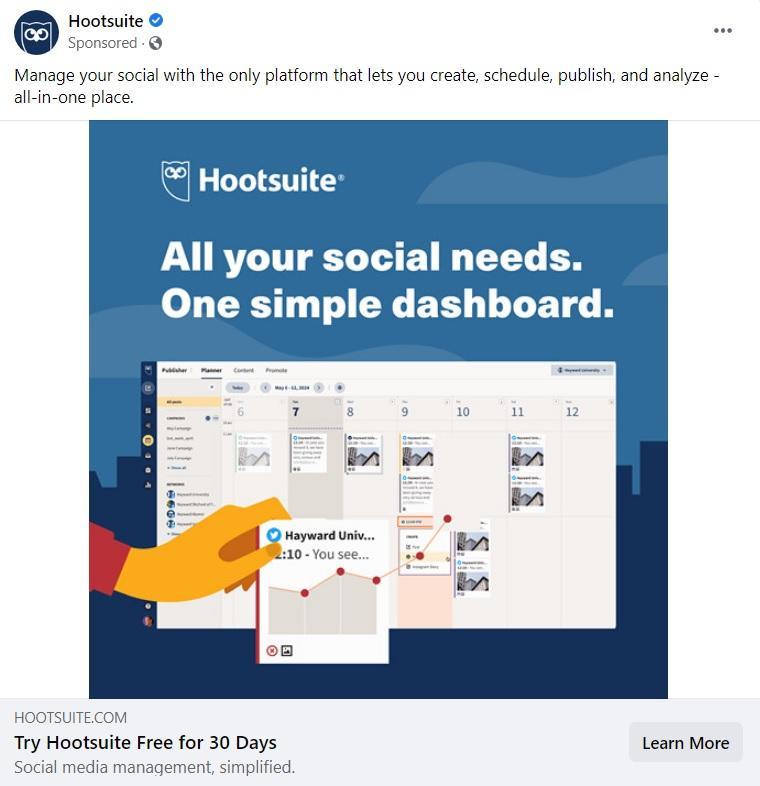
- Hootsuite: "Try for Free" (Button: "Learn More")
- Why it works: Hootsuite offers a low-risk entry point ("Try for Free") to its service, coupled with a "Learn More" button that caters to users who might need more information before committing. This addresses different stages of the buyer journey.
Instagram Ad CTAs:
Instagram, with its visual-first approach, demands CTAs that complement the imagery and concise copy.

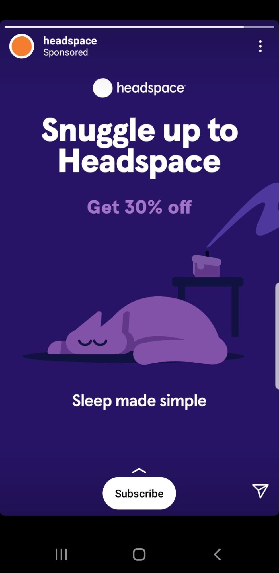
- Headspace: "Snuggle up to Headspace" (Button: "Download App")
- Why it works: This is a masterful example of a custom, emotionally resonant CTA. "Snuggle up" uses sensory language to evoke comfort and personalization, aligning perfectly with a meditation app. The "Download App" button is a clear, secondary action.
- Elementor: "Register for the Event" (Button: "Register Now")
- Why it works: For event-based ads, clarity is paramount. Elementor clearly presents all essential event details (name, speakers, date, time) and a direct "Register Now" CTA, leaving no room for confusion.
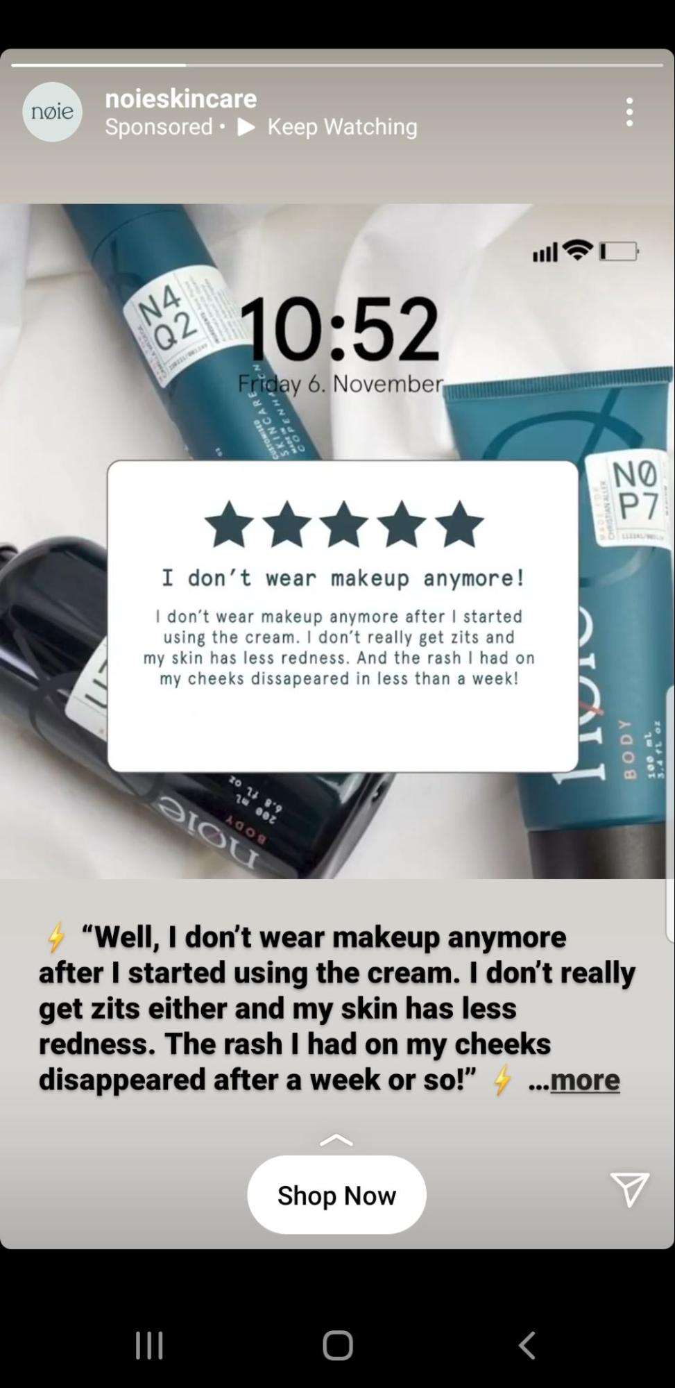
- Nøie Skincare: "Shop Now" (Button: "Shop Now")
- Why it works: While direct, this e-commerce CTA is supported by ad copy that focuses on the product experience and benefits, making the "Shop Now" button the logical conclusion to an enticing offer.
- VAI Course: "Explore Remote Jobs" (Button: "View Jobs")
- Why it works: This CTA, coupled with vibrant visuals, offers a clear path to a desired outcome (finding remote jobs). The button reinforces the exploration aspect, making it feel less like a hard sell.
Email CTAs:
Email campaigns, with their longer format, can accommodate more nuanced CTAs. Email conversion rates can be remarkably high, sometimes exceeding 15% for well-targeted campaigns.
- Black Illustrations: "Browse Illustrations" (Multiple buttons & hyperlinked text)
- Why it works: For longer emails, multiple CTAs can be highly effective. Black Illustrations strategically places several buttons and hyperlinked text, guiding users to various offerings and catering to different interests within the email content.
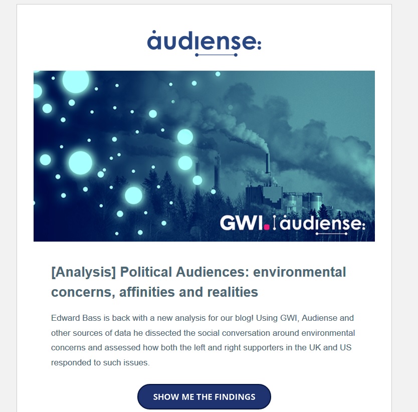
- Audiense: "Show Me the Findings" (Button: "View Report")
- Why it works: Phrases like "Show me…" or "Take me to…" give users a sense of control and directly align with their desire for information, creating a clear value proposition for clicking.
Landing Page CTAs:
Landing pages are conversion powerhouses, and their CTAs are meticulously optimized.
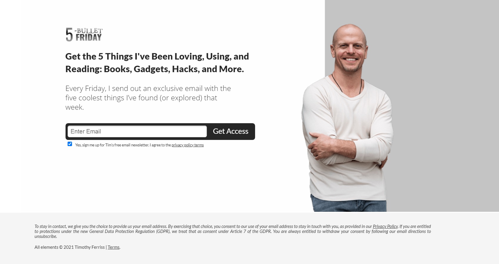
- Tim Ferriss: "Get My 5-Bullet Friday" (Button: "Sign Up Now")
- Why it works: This minimalist landing page removes all distractions, focusing solely on the value proposition (the newsletter) and the clear CTA to "Sign Up Now," making the desired action unambiguous.
- Joy (Razor Subscription): "Start My Subscription" (Button: "Get Joy")
- Why it works: The CTA button is the most visually prominent element on the page, contrasting sharply with the lighter background. The language "Start My Subscription" is personalized and action-oriented.
- Leadfeeder: "Get the Guide" (Button: "Download Now")
- Why it works: Leadfeeder’s lead-generation page provides a clear summary of the ebook’s value, and the "Get the Guide" CTA (reinforced by "Download Now" on the button) is the logical conclusion to accessing that value after providing basic information.
Website CTAs:
Beyond dedicated landing pages, a website’s homepage and internal pages require strategically placed CTAs to guide user exploration and conversion.
- Touchland: "Shop Hand Sanitizer" (Button: "Shop Now")
- Why it works: Touchland uses clever storytelling ("keys, wallet, phone, touchland") to place the product in a familiar context before presenting the "Shop Now" CTA, making the purchase a natural next step in the user’s daily routine.
- Airbnb: "Explore Outdoor Stays" (Button: "Discover Destinations")
- Why it works: In response to changing travel trends, Airbnb uses aspirational imagery and a CTA that encourages exploration of specific, relevant categories, keeping the brand top-of-mind.
- Smartlook: "Start Free Trial" (Button: "Get Started Free")
- Why it works: Smartlook follows best practices by placing a "hero" section above the fold with a clear value proposition, supported by a prominent "Start Free Trial" CTA. This minimizes friction for users to test the product.
- Ecom World: "Secure Your Spot" (Button: "Register Now")
- Why it works: For an event website, Ecom World places all critical information (what, when, where) above the fold, culminating in a direct and urgent CTA like "Secure Your Spot" to drive registrations.
The Indispensable Role and Design of CTA Buttons

CTAs are not confined to text; their visual representation, particularly as clickable buttons, significantly impacts user interaction and conversion rates. It is imperative to integrate CTAs across all marketing collateral and platforms, from PPC advertisements to landing pages, websites, blogs, and email newsletters. While plain-text, hyperlinked CTAs have their place, the strategic implementation of clickable CTA buttons offers substantial benefits.
Facebook, for instance, has long incorporated customizable CTA buttons directly into its ad interface, with options like "Shop Now," "Learn More," "Download," or "Send Message." These buttons serve to reinforce the ad’s message and demonstrably increase the likelihood of conversion. Research consistently supports the efficacy of CTA buttons. One study revealed that adding a CTA button to article templates boosted conversions by an impressive 83% and increased e-commerce conversions by 22%. Copyblogger further substantiated this, reporting a 45% increase in conversion rates when CTAs were presented as buttons rather than plain text.

The impact of CTA button choice is not merely anecdotal. AdEspresso’s own $1000 experiment on Facebook Ads rigorously tested various CTA buttons, revealing profound differences in performance. The top-performing CTA ("Download") achieved 49 conversions at $5.10 each, while the least effective (no button) garnered only 20 conversions at $12.50. This data underscores that the chosen CTA can more than double the cost per conversion, highlighting the critical need for meticulous A/B testing. Tools equipped with split-testing engines and automatic optimization features can systematically identify the most effective CTA combinations, streamlining campaign management and maximizing ROI.
Best Practices for CTA Buttons on Websites and Landing Pages:
For general website navigation and dedicated landing pages, CTA buttons are crucial for guiding users through the desired flow and prompting key actions. They can prioritize specific pathways, align with typical user journeys, and ultimately steer visitors towards conversion.
When designing CTA buttons for landing pages and website homepages, adherence to certain criteria is paramount:
- Prominent Placement: Buttons should be positioned "above the fold" or at logical points in the content flow, ensuring immediate visibility without requiring excessive scrolling.
- Visual Distinction: They must stand out from the surrounding design through contrasting colors, appropriate sizing, and clear spacing, making them easy to spot and click.
- Clear, Action-Oriented Copy: The text within the button should be concise, direct, and clearly communicate the immediate benefit or next step (e.g., "Get Your Free Quote," "Start Building Now").
- Singular Focus (Primary CTA): While secondary CTAs can exist, the primary button should have a singular, unmistakable purpose to avoid user confusion.
Continuous testing of website and landing page elements, including CTA copy, placement, and button colors, is essential for ongoing optimization. Platforms like Unbounce facilitate such testing, allowing marketers to uncover what resonates most effectively with their audience and refine pages for peak performance.
In conclusion, the Call to Action is far more than a simple instruction; it is a critical strategic element that dictates the success of digital marketing efforts. By understanding its foundational principles, employing powerful language, evoking emotion, maintaining brand authenticity, and rigorously testing various implementations, businesses can transform passive viewers into active participants, driving engagement, conversions, and ultimately, sustainable growth in the ever-evolving digital landscape.