Enhancing User Experience: React Aria Components Introduces Powerful Animation Capabilities

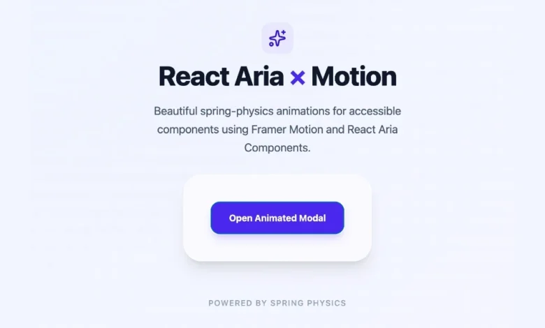
The landscape of modern web development is increasingly defined by its commitment to accessibility and seamless user interaction. In this context, React Aria Components, a library designed to provide developers with accessible, headless UI components, has unveiled significant enhancements to its animation capabilities. While the core offering of React Aria Components focuses on providing foundational UI elements that work flawlessly across various input methods – mouse, touch, and keyboard – its "headless" nature means it ships without default styling or animations. This approach offers maximum flexibility but necessitates a deliberate strategy for integrating visual polish, particularly for customer-facing applications where smooth motion is a key indicator of quality. The latest developments address this by offering clear, adaptable pathways for developers to imbue their applications with sophisticated animations, ranging from simple CSS transitions to complex physics-based motion.
The Foundation: Headless UI and the Need for Animation
React Aria Components operates on the principle of providing the underlying logic and accessibility features for UI components without dictating their visual presentation. This "headless" philosophy empowers developers to fully control the design and theming of their applications. However, this also means that components like popovers, modals, and menus, by default, appear or disappear abruptly. For internal tools, this might be an acceptable trade-off. But for applications designed for public consumption, the absence of animation can detract from the perceived quality and user experience. Subtle animations provide visual cues, guide user attention, and create a more engaging and polished feel. Recognizing this, Adobe, the driving force behind React Aria, has emphasized strategies to bridge this gap, ensuring that the power of accessible components is not compromised by a lack of visual dynamism.
Leveraging CSS for Smooth Transitions and Keyframes
The most straightforward method for introducing animation within React Aria Components involves leveraging native CSS features, specifically transitions and keyframes. This approach is particularly effective for overlay components, such as Popover, Modal, ModalOverlay, Tray, and Menu. These components are designed to appear and disappear conditionally, and React Aria exposes crucial data attributes – [data-entering] and [data-exiting] – to facilitate CSS-driven animations.
When an overlay component mounts, React Aria automatically applies the [data-entering] attribute. Conversely, when it’s about to unmount, the [data-exiting] attribute is applied. This mechanism is vital because it allows developers to define styles that are active only during these transition phases. Crucially, React Aria ensures that the component remains in the DOM until its exit animation has fully completed, preventing abrupt disappearances and ensuring a smooth visual closure.
CSS Transitions: A Simple and Efficient Approach
For many common animation needs, CSS transitions offer an elegant and performant solution. Developers can define simple transition properties in their CSS to animate properties like opacity and translate. For instance, a Popover component could be styled to fade in and slide down slightly upon entry, and reverse this motion upon exit.
.react-aria-Popover
  transition: opacity 200ms, translate 200ms;


.react-aria-Popover[data-entering],
.react-aria-Popover[data-exiting]
  opacity: 0;
  translate: 0 -8px; /* Example: fades from transparent and slides up */
This example demonstrates how a Popover can transition its opacity from 0 to 1 and its translation from a slight upward shift to its final position. The browser efficiently handles the animation timing, eliminating the need for JavaScript animation libraries and their associated overhead. This makes it an ideal choice for applications prioritizing performance and minimizing dependencies. The [data-exiting] attribute is particularly critical here, as it allows the browser to render the element with its exit animation styles applied before it is ultimately removed from the DOM, providing a visually coherent closing sequence.
CSS Keyframes: Granular Control Over Animation Sequences
While CSS transitions are excellent for simple, uniform animations, CSS keyframes provide a more granular level of control. This allows developers to define distinct animation sequences for entering and exiting states, offering greater flexibility in terms of timing, easing functions, and intermediate steps.
.react-aria-Popover[data-entering]
  animation: popover-enter 200ms ease-out forwards;


.react-aria-Popover[data-exiting]
  animation: popover-exit 150ms ease-in forwards;


@keyframes popover-enter
  from
    opacity: 0;
    translate: 0 -8px;

  to
    opacity: 1;
    translate: 0 0;


@keyframes popover-exit
  from
    opacity: 1;
    translate: 0 0;

  to
    opacity: 0;
    translate: 0 -4px;
Using keyframes, developers can specify different easing functions for entry (ease-out, which slows down towards the end) and exit (ease-in, which starts quickly and gradually fades out). This can create more nuanced and aesthetically pleasing animations. The forwards keyword in the animation property ensures that the element retains the styles of the last keyframe after the animation completes. This approach is particularly useful when precise control over the animation’s trajectory and timing is desired.
Component Support for Data Attributes
It’s important to note that the [data-entering] and [data-exiting] states are primarily available for overlay components that are conditionally mounted and unmounted. These include:
ModalModalOverlayPopoverMenuTray
For other React Aria components, such as Button, Switch, or Slider, which typically remain in the DOM, animation is handled through standard CSS techniques. This involves applying transitions to states like :hover, :focus, or React Aria-specific data attributes like [data-pressed] and [data-selected]. These components don’t require the entry/exit animation handling because their presence in the DOM is persistent.
Introducing Motion: Advanced Animation with Physics and Gestures
While CSS transitions and keyframes are powerful for many scenarios, there are instances where more sophisticated animation capabilities are required. This includes implementing physics-based animations (like springs), gesture-driven interactions, or complex layout animations. For these advanced use cases, React Aria Components integrates seamlessly with the Motion library.
Motion provides a comprehensive suite of animation tools designed for modern web applications. Its integration with React Aria is facilitated through the motion.create() function, which effectively wraps any React Aria component, transforming it into a "motion component" capable of advanced animations.
To begin, developers need to install the Motion library:
npm install motionOnce installed, a React Aria component can be wrapped using motion.create():
import  motion  from "motion/react";
import  Modal, ModalOverlay  from "react-aria-components";

const MotionModal = motion.create(Modal);
const MotionModalOverlay = motion.create(ModalOverlay);
With these motion components, developers can then leverage Motion’s declarative initial, animate, and exit props to define animation states. This allows for dynamic and interactive animations that respond to user input and application state changes.
Consider an example demonstrating an animated modal using Motion:
import  AnimatePresence, motion  from "motion/react";
import  DialogTrigger, Button  from "react-aria-components";
import  Modal, ModalOverlay  from "react-aria-components";
import  useState  from "react";

const MotionModal = motion.create(Modal);
const MotionModalOverlay = motion.create(ModalOverlay);

function AnimatedModal()
  let [isOpen, setOpen] = useState(false);

  return (
    <>
      <Button onPress=() => setOpen(true)>
        Open modal
      </Button>

      <AnimatePresence>
        isOpen && (
          <MotionModalOverlay
            isOpen
            onOpenChange=setOpen
            className="fixed inset-0 z-10 bg-black/50"
            initial= opacity: 0
            animate= opacity: 1
            exit= opacity: 0
            transition= duration: 0.2
          >
            <MotionModal
              className="fixed bottom-0 left-0 right-0 top-24 z-20 m-auto
                         h-fit w-full max-w-lg rounded-xl bg-white p-6 shadow-lg"
              initial= scale: 0.9, y: 20
              animate= scale: 1, y: 0
              exit= scale: 0.9, y: 20
              transition=
                type: "spring",
                bounce: 0.3,
                duration: 0.4

            >
              <div slot="title">Modal with spring animation</div>
              <p>This modal enters with a spring bounce and exits smoothly.</p>
            </MotionModal>
          </MotionModalOverlay>
        )
      </AnimatePresence>
    </>
  );
In this code snippet, AnimatePresence from Motion plays a crucial role. It manages the mounting and unmounting of components, ensuring that they remain in the DOM long enough for their exit animations to complete. The isOpen state is managed by the parent component, and AnimatePresence orchestrates the animation based on this state.
Key points to observe in this example include:
isOpenprop onMotionModalOverlay: This is set totruebecauseAnimatePresencehandles the conditional rendering. TheonOpenChangecallback still correctly updates the application’s state, allowing for standard modal closing mechanisms like pressing the Escape key or clicking the backdrop.initial,animate,exitprops: These props define the animation states.initialsets the starting point,animatedefines the end state when the component enters, andexitspecifies the state to animate towards when the component leaves.transitionprop: This prop configures the animation’s behavior. In the example, theMotionModalOverlayuses a simple duration-based transition for opacity, while theMotionModalemploys a physics-basedspringtransition with abounceeffect, creating a more dynamic and lively entrance.
This approach allows for highly customized and engaging animations, leveraging the power of physics engines and gesture recognition to create truly interactive user experiences.
Choosing the Right Animation Strategy
The decision of which animation approach to adopt depends on the complexity and desired outcome. React Aria Components provides a clear framework for making this choice:
| Approach | When to Use |
|---|---|
| CSS Transitions | Simple fades, slides, and scale effects; performance-critical scenarios; minimal dependencies. |
| CSS Keyframes | Differentiated enter/exit animations; complex sequential animations; fine-tuned timing and easing. |
Motion (motion.create()) |
Physics-based animations (springs, bounces); gesture-driven interactions; complex layout animations; highly dynamic UIs. |
For many common UI elements, especially overlays, a simple 200ms fade and a slight translation achieved with CSS transitions is often sufficient. This offers a good balance of visual polish and performance. However, when the application demands more sophisticated interactions, such as drag-and-drop functionality, physics-based effects, or intricate synchronized animations, the Motion library becomes an indispensable tool. The flexibility of React Aria Components ensures that developers can start with simpler CSS-based animations and seamlessly upgrade to more advanced solutions like Motion as their project’s needs evolve.
The continuous development and emphasis on animation capabilities within React Aria Components underscore a broader industry trend towards creating more engaging, accessible, and polished user interfaces. By providing developers with robust and adaptable tools, Adobe is empowering them to build web applications that not only function flawlessly but also delight users with their visual dynamism and smooth interactions. This commitment to enhancing the developer experience and, consequently, the end-user experience, positions React Aria Components as a vital tool in the modern web development toolkit.