
For over fifteen years, web developers have relied on the ubiquitous border-radius property to introduce rounded corners into user interfaces. While a significant advancement from the cumbersome multi-image hacks of the early web, border-radius has always been limited to a single shape: the circle. Achieving more complex corner aesthetics like beveled edges, scooped contours, or the popular "squircle" often necessitated intricate workarounds involving clip-path, SVG masks, or fragile CSS manipulations that were prone to breaking with minor layout adjustments. Now, a new CSS property, corner-shape, is poised to revolutionize this aspect of web design, offering a direct and powerful way to create a diverse range of corner styles.
The introduction of corner-shape marks a pivotal moment, potentially liberating designers and developers from the constraints of simple curves. This property acts as a sophisticated companion to border-radius, not replacing it, but rather modifying the fundamental shape of the corner. When used in conjunction with border-radius, corner-shape unlocks a spectrum of possibilities, allowing for beveled, scooped, squircle, and even custom superellipse shapes. This advancement promises to bring a new level of polish and expressiveness to web interfaces, moving beyond the one-size-fits-all roundness that has dominated for years.
A Look Back: The Evolution of Rounded Corners
The journey to corner-shape is a testament to the continuous innovation in web standards. In the nascent days of web development, achieving rounded corners was a labor-intensive process. Developers would often resort to using multiple background images – one for each corner, plus one for the main element – a technique that was both inefficient and inflexible. The introduction of the border-radius property around 2004-2005 was a watershed moment, widely celebrated for its simplicity and effectiveness. It allowed designers to create consistently rounded corners with a single CSS declaration, a vast improvement that brought a collective sigh of relief to the development community.
However, as design trends evolved and user expectations grew, the limitations of border-radius became increasingly apparent. The desire for more unique and sophisticated corner treatments led to the widespread adoption of workarounds. clip-path became a go-to for creating sharp, angular cutouts or complex polygons, while SVG masks offered even greater flexibility for intricate shapes. Yet, these solutions came with significant drawbacks. Borders often failed to adhere to clip-path boundaries, box shadows could be unceremoniously cut off, and the underlying code often became brittle, easily disrupted by changes in padding or other layout properties. The "squircle," a smooth, rounded square shape popularized by Apple’s iOS and macOS interfaces, was particularly challenging to implement consistently and efficiently using existing CSS. This often required carefully crafted SVG elements that were difficult to animate or dynamically adjust.
The Arrival of corner-shape: A New Era of Flexibility
The corner-shape property directly addresses these long-standing limitations. It is designed to work seamlessly with border-radius, allowing developers to specify the form of the corner’s curvature. The property accepts a range of predefined values, including:

round: The default behavior, equivalent toborder-radius.bevel: Creates a straight, angled cut across the corner.scoop: Generates a concave, inward-curving shape.squircle: Produces the smooth, superellipse shape, reminiscent of iOS icons.notch: Creates a sharp, inward-facing notch.
Furthermore, corner-shape offers the same per-corner specificity as border-radius, enabling developers to apply different shapes to each of the four corners of an element. This is achieved by listing the desired values in the same order as border-radius: top-left, top-right, bottom-right, bottom-left. For instance, corner-shape: bevel round scoop squircle; would apply a beveled corner to the top-left, a standard round corner to the top-right, a scooped corner to the bottom-right, and a squircle to the bottom-left.
For developers requiring even finer control, corner-shape can be used in conjunction with the superellipse() function. This function accepts a single numeric parameter, allowing for precise interpolation between a perfect circle and a squircle. For example, corner-shape: superellipse(0); is equivalent to bevel, while superellipse(0.5) creates a shape that falls between a standard round and a squircle, offering a unique aesthetic.
It is worth noting that the property is named corner-shape rather than border-shape to reflect its broader applicability. While it directly impacts the shape of borders, it also influences outlines, box shadows, and background rendering, extending its effect beyond just the border itself – a significant advantage over properties like clip-path which typically only affect the clipping of the element’s content.
Progressive Enhancement: The Strategy for Adoption

As of March 2026, corner-shape has achieved support in Chrome 139 and other Chromium-based browsers. While this represents a substantial user base, it is not yet universally available across all major browsers, with Firefox and Safari notably lacking support at this time. The W3C’s CSS Borders and Box Decorations Module Level 4 specification includes corner-shape, indicating its ongoing development and eventual standardization.
This partial browser support highlights the importance of a progressive enhancement strategy. Rather than withholding advanced features until they are universally adopted, or creating experiences that degrade gracefully, the recommended approach is to build a robust baseline with existing, well-supported CSS properties, and then layer on the enhanced features for browsers that can handle them. This ensures a functional and aesthetically pleasing experience for all users, while offering an elevated visual experience for those with compatible browsers.
The demos presented in the original article exemplify this strategy. Each demonstration is structured with CSS layers (@layer base, presentation, demo). The presentation layer contains the core UI, built using proven techniques like border-radius and standard layouts, ensuring a complete and professional look in any browser. The demo layer then wraps enhancements in an @supports (corner-shape: ...) query. This approach avoids intrusive fallback banners and instead offers a tiered design: "good" for all users and "better" for those with modern browsers. This philosophy echoes the early days of border-radius adoption, where progressive enhancement was key to its successful integration into the web.
Demonstrations of corner-shape in Action

To illustrate the practical applications of corner-shape, several demos showcase its capabilities across various UI components:
Demo 1: Product Cards with Ribbon Badges
A common design element in e-commerce sites is the use of small badges or "ribbons" to highlight product status like "New" or "Sale." Traditionally, achieving the angled or pointed shape of these ribbons required complex clip-path polygons or rotated pseudo-elements. These methods are often prone to breaking when card padding or dimensions are altered.
The progressive enhancement approach for product cards starts with a simple, well-formed badge using border-radius: 0 4px 4px 0;. This creates a clean, flush-left label that is universally supported and visually effective.

For browsers supporting corner-shape, the experience is elevated. The product cards themselves can adopt a more generous squircle shape. More significantly, the badges transform into dynamic ribbon shapes. For instance, corner-shape: round bevel bevel round; applied to a badge can create a directional ribbon that tapers to a point. This eliminates the need for complex clip-path rules, as borders, shadows, and backgrounds now correctly follow the declared corner-shape. The squircle on the main cards provides a subtle yet impactful premium feel, akin to the aesthetic seen in modern operating systems.
Demo 2: Buttons and Tags
This demo focuses on the practical application of corner-shape in common interface elements like buttons and status tags. The baseline for these components uses standard border-radius: 10px for buttons and appropriate rounding for tags, ensuring a polished and functional appearance across all browsers.
The demo layer then showcases the versatility of corner-shape. Primary buttons can adopt a bevel shape, giving them a faceted, gem-like appearance. On hover, these buttons can transition to a squircle shape, providing a smooth and engaging interactive experience, facilitated by the inherent animation capabilities of corner-shape through its superellipse() equivalents. Secondary buttons can utilize superellipse(0.5) for a unique, pill-like contour. Danger buttons might receive a more pronounced squircle, while notch and scoop can be applied to tags and directional elements to achieve distinct visual styles, such as a machine-stamped look for tags or sharp arrow shapes for badges. Crucially, when using clip-path for such shapes, borders and shadows could present issues; corner-shape elegantly resolves this by ensuring these elements conform to the defined shape.

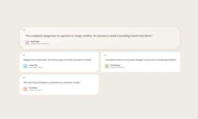
Demo 3: Testimonial Cards
Testimonial sections often benefit from a more editorial or organic feel. This demo illustrates how corner-shape can enhance this aesthetic. The baseline features testimonial cards with standard border-radius: 16px. The featured testimonial, distinguished by a gradient and a decorative quote mark, uses a full-width layout.
The corner-shape enhancement introduces character. Featured testimonials can adopt a scoop shape, creating concave corners that impart a softer, more hand-crafted feel, particularly effective when paired with serif typography. Alternating testimonial cards can utilize mixed scoop round shapes, giving each card a unique visual personality without requiring additional markup. Author avatars can also transition from simple circles to squircle shapes, adding a subtle but refined touch. The article notes that scoop pairs exceptionally well with serif fonts and warm color palettes, echoing editorial design principles.
Demo 4: Pricing Cards

Differentiating plans on a pricing page is a classic design challenge. This demo shows how corner-shape can be employed to create visual hierarchy. The baseline features three pricing cards with standard rounded corners, where the featured plan is already distinguished by a gradient background and a "Most Popular" badge.
The corner-shape enhancements elevate this distinction. Regular plans can receive squircle corners for a premium feel. The featured plan can be given scoop corners, making it visually distinct with its concave edges. The "Most Popular" badge can adopt a bevel shape, creating a faceted, jewel-like appearance that draws the eye. CTA buttons within each plan can also be styled with squircle corners to align with the card’s overall aesthetic. This demo effectively uses shape as a tool for visual emphasis, mirroring content hierarchy.
Demo 5: Music Player
The final demo showcases corner-shape within a more complex UI – a music player with album art, playback controls, genre tags, and a listening queue. The baseline employs standard rounded corners across all elements, creating a cohesive and functional player interface.

With corner-shape, this interface gains further refinement. The main player card and album art can adopt squircle shapes, consistent with modern app icon design. Album art swatches can also utilize squircle for subtle visual harmony. Queue items can employ scoop round shapes, providing concave corners on one side and rounded corners on the other, adding visual interest without clutter. Genre tags can be styled with bevel for a sharper, more defined appearance. Even the play button, often circular, can be enhanced with corner-shape: squircle on its existing border-radius: 50%, contributing to a more unified visual language. This comprehensive application demonstrates corner-shape‘s ability to work across a wide array of elements within a single, intricate design.
Implications and Future Outlook
The introduction of corner-shape represents a significant leap forward in CSS capabilities for UI design. It directly addresses years of workarounds, offering a declarative and robust solution for creating a diverse range of corner styles. The property’s ability to influence borders, shadows, and backgrounds uniformly, coupled with its per-corner flexibility and animation potential via superellipse(), provides designers with powerful new tools for crafting unique and engaging user experiences.
The adoption of corner-shape is expected to follow a trajectory similar to border-radius, starting with early adopters and gradually becoming a standard feature across browsers. The progressive enhancement strategy outlined in the article is crucial for its widespread adoption, ensuring that websites remain functional and visually appealing for all users, regardless of their browser’s capabilities.

As designers and developers begin to explore the full potential of corner-shape, we can anticipate a new wave of visually sophisticated web interfaces. The ability to move beyond simple rounded corners opens up avenues for more expressive branding, refined user journeys, and ultimately, a more aesthetically rich web. The evolution from five background images to border-radius and now to corner-shape signifies a continuous effort to simplify complex design tasks and empower creators with more expressive CSS tools. The impact of corner-shape is likely to be profound, transforming how we perceive and interact with the visual elements of the web.

