Animate React Aria Components: A Comprehensive Guide to Seamless UI Transitions and Motion Design

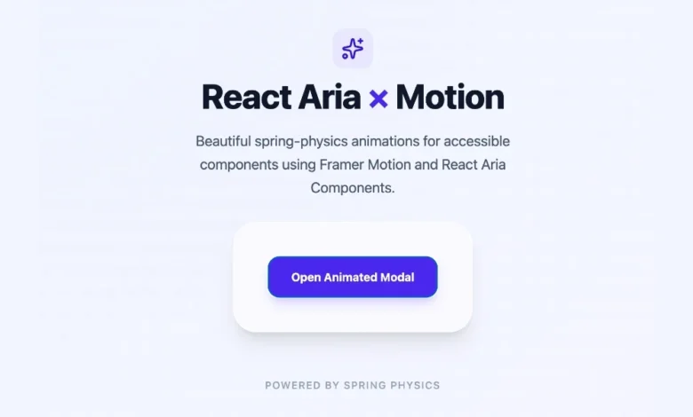
The modern web development ecosystem places an unprecedented emphasis on user experience, performance, and accessibility. Adobe’s React Aria Components has rapidly emerged as an industry-standard library for developers seeking robust, accessible, and headless user interface elements that perform seamlessly across mouse, touch, and keyboard interactions. However, the inherent philosophy of headless architecture dictates that these components ship with zero styles and zero default animations. When a developer implements a standard React Aria modal, popover, or tray, the element simply appears or vanishes instantaneously. While functional and fully compliant with World Wide Web Consortium (W3C) accessibility guidelines, this abrupt visual behavior often clashes with the polish expected in modern, consumer-facing digital products where smooth motion signals overall software quality.
Bridging the gap between strict accessibility compliance and high-end visual aesthetics requires a nuanced approach to component styling and lifecycle management. Fortunately, React Aria provides architectural pathways for integrating animations ranging from lightweight native Cascading Style Sheets (CSS) transitions to advanced, physics-based motion libraries. Understanding how to harness these tools enables frontend engineering teams to elevate their user interfaces without sacrificing the robust underlying accessibility tree that React Aria guarantees.
The Architectural Dilemma of Headless UI and Motion
Headless UI libraries decouple behavior, state management, and accessibility from visual presentation. This design philosophy grants developers absolute freedom over styling, ensuring that design systems can be implemented precisely according to brand specifications. Yet, this decoupling introduces a distinct engineering challenge: managing component lifecycle animations during conditional mounting and unmounting.
In a traditional React application, when a conditional expression evaluates to false, a component is instantly purged from the Document Object Model (DOM). Attempting to animate an element as it disappears—an exit animation—presents a race condition because the DOM node is removed before the visual transition can render. Historically, developers had to write custom wrapper components or rely on heavy JavaScript orchestration libraries to track exit states. React Aria solves this underlying friction by natively exposing explicit lifecycle data attributes on its overlay primitives, providing a predictable hook for both native CSS and advanced JavaScript animation engines.
Leveraging Native CSS Transitions and Data States
For the vast majority of web applications, introducing heavy JavaScript animation runtimes is unnecessary and can negatively impact bundle size and execution performance. React Aria overlay components—including Popover, Modal, ModalOverlay, Tray, and Menu—solve the exit animation problem natively by exposing [data-entering] and [data-exiting] states as standard DOM attributes.
These data attributes are applied automatically by the library during the component mount and unmount phases. Crucially, React Aria intercepts the destruction of the DOM node, keeping the element alive in the tree until the browser signals that the exit animation has completely finished running. This mechanism allows developers to implement smooth transitions using standard, declarative CSS without writing a single line of JavaScript animation logic.
To implement a basic fade and slide effect on a Popover component, developers can target the corresponding class and data attributes:
.react-aria-Popover
transition: opacity 200ms ease, transform 200ms ease;
.react-aria-Popover[data-entering],
.react-aria-Popover[data-exiting]
opacity: 0;
transform: translateY(-8px);
By applying this stylesheet, a Popover gracefully fades in and translates downward by eight pixels upon entering the viewport, then reverses the exact motion when dismissed. The browser’s native rendering engine handles the timing overhead, eliminating garbage collection pressure and reducing execution bottlenecks.
Advanced CSS Keyframes for Asymmetric Transitions
While standard transitions handle symmetric entry and exit animations effectively, complex user interface patterns often require asymmetric timing. For instance, user experience research frequently demonstrates that interface elements should enter slowly with a decelerating curve to draw the eye, but exit rapidly with an accelerating curve to feel responsive and unobtrusive.
Cascading Style Sheets keyframes offer precise control over these distinct phases. By utilizing the same [data-entering] and [data-exiting] attributes, developers can define independent rules for each state of the component lifecycle:
.react-aria-Popover[data-entering]
animation: popover-enter 200ms cubic-bezier(0.16, 1, 0.3, 1);
.react-aria-Popover[data-exit]
animation: popover-exit 150ms cubic-bezier(0.7, 0, 0.84, 0);
@keyframes popover-enter
from
opacity: 0;
transform: translateY(-8px);
to
opacity: 1;
transform: translateY(0);
@keyframes popover-exit
from
opacity: 1;
transform: translateY(0);
to
opacity: 0;
transform: translateY(-4px);
It is important to note that these lifecycle data attributes are specifically engineered for overlay components that mount and unmount conditionally. Non-overlay interactive primitives—such as Button, Switch, Toggle, and Slider—remain persistently in the DOM. Consequently, animating these elements does not rely on entering or exiting states, but rather standard pseudo-classes like :hover and :focus, alongside React Aria state attributes such as [data-pressed] or [data-selected].
Integrating Motion for Complex Physics and Gestures
While CSS transitions and keyframes easily accommodate standard fades, scales, and translations, certain design systems demand advanced animation paradigms. When an application requires spring physics, drag-to-dismiss gestures, shared layout animations, or complex orchestration across multiple sibling elements, CSS limitations become apparent.
For scenarios requiring programmatic control and physics simulations, the Motion library (formerly Framer Motion) provides a powerful integration pathway. Motion integrates smoothly with React Aria through the motion.create() utility function, which wraps any React Aria component into a fully animatable motion-enabled component.
To implement this architecture, engineering teams first install the animation package via a standard package manager:
npm install motion
Following installation, developers wrap the required React Aria primitives using the creation utility:
import motion from "motion/react";
import Modal, ModalOverlay from "react-aria-components";
const MotionModal = motion.create(Modal);
const MotionModalOverlay = motion.create(ModalOverlay);
Once wrapped, these components accept declarative animation props including initial, animate, exit, and transition. When combined with an AnimatePresence wrapper from the Motion library, developers can construct sophisticated, spring-physics-driven dialogs that respond organically to user input.
function AnimatedModal()
let [isOpen, setOpen] = useState(false);
return (
<>
<Button onPress=() => setOpen(true)>
Open modal
  <AnimatePresence>
    isOpen && (
      <MotionModalOverlay
        isOpen
        onOpenChange=setOpen
        className="fixed inset-0 z-10 bg-black/50"
        initial= opacity: 0
        animate= opacity: 1
        exit= opacity: 0
        transition= duration: 0.2
      >
        <MotionModal
          className="fixed bottom-0 left-0 right-0 top-24 z-20 m-auto h-fit w-full max-w-lg rounded-xl bg-white p-6 shadow-lg"
          initial= scale: 0.9, y: 20
          animate= scale: 1, y: 0
          exit= scale: 0.9, y: 20
          transition=
            type: "spring",
            bounce: 0.3,
            duration: 0.4

        >
          <div slot="title" className="text-lg font-bold">Modal with spring animation</div>
          <p className="mt-2 text-sm text-gray-600">This modal enters with a spring bounce and exits smoothly.</p>
        </MotionModal>
      </MotionModalOverlay>
    )
  </AnimatePresence>
</>
);
Strategic Considerations for Production Environments
Choosing the appropriate animation strategy requires balancing visual fidelity against engineering maintenance overhead and runtime performance metrics. Enterprise applications with strict performance budgets across mobile devices often benefit from prioritizing native CSS implementations wherever possible.
| Approach | Primary Use Cases | Performance Profile | Implementation Complexity |
|---|---|---|---|
| CSS Transitions | Simple fades, sliding sheets, basic scaling effects | Exceptional; executed entirely on the browser compositor thread | Low; zero external dependencies |
| CSS Keyframes | Asymmetric timing, multi-stage entrance and exit sequences | High; lightweight and natively optimized by modern browsers | Low to Moderate |
| Motion Library | Spring physics, gesture tracking, drag interactions, layout shifts | Moderate; requires JavaScript runtime execution and bundle inclusion | Moderate to Advanced |
Industry benchmarks consistently demonstrate that offloading animation computation to the browser compositor thread via CSS transforms and opacity changes yields superior frame rates—maintaining a steady 60 or 120 frames per second—compared to JavaScript-driven loops. However, the qualitative value of organic spring physics in modern software design often justifies the inclusion of dedicated animation runtimes for primary user touchpoints.
Future Outlook and Ecosystem Evolution
As web standards evolve and design systems grow increasingly sophisticated, the division between accessible headless libraries and expressive styling layers continues to blur. Adobe’s commitment to maintaining open, standards-compliant APIs in React Aria ensures that developers are never locked into proprietary animation frameworks. Whether an engineering team opts for zero-dependency CSS transitions or advanced physics engines via Motion, the underlying commitment to inclusive, accessible design remains uncompromised.
By mastering the lifecycle data attributes exposed by React Aria components, frontend architects can successfully reconcile the technical demands of robust accessibility compliance with the aesthetic expectations of modern digital craftsmanship.