Despite broad support across all major modern web browsers—currently hovering at approximately 94%—the adoption of CSS Container Queries remains unexpectedly low among professional front-end developers. While the feature was designed to solve the long-standing problem of component-based responsiveness, recent industry surveys, including the 2025 State of CSS report, indicate that only 41.4% of developers have integrated this technology into their workflows, even though 86% acknowledge being aware of its existence. This gap between availability and implementation underscores a fundamental misunderstanding of the technology’s purpose, often rooted in the tendency to treat container queries as mere substitutes for the familiar, viewport-centric media query.
The Evolution of Responsive Design
To understand why container queries are often misapplied, one must look at the history of responsive web design (RWD). Introduced in 2010 by Ethan Marcotte, the RWD paradigm shifted web development from static page widths to fluid layouts governed by media queries. For over a decade, the viewport—the visible area of the browser window—has served as the primary, and often sole, proxy for determining the layout of a webpage.
However, the modern web has moved toward component-based architecture, characterized by modular elements like cards, navigation bars, and widgets that are frequently reused across different areas of a single application. A media query, by definition, only interrogates the viewport dimensions. Consequently, a component designed to look optimal on a 1024px-wide screen will often break or display incorrectly when placed in a sidebar that occupies only 300px of that same screen. The media query remains oblivious to the component’s actual environment, leading to layout deformation and inefficient code.

The Technological Shift
The introduction of CSS Container Queries represents a transition from "macro-layout" thinking to "micro-layout" logic. The feature, which gained significant traction in recent years following years of requests from the developer community, enables an element to respond to the size of its parent container rather than the browser window.
The technical implementation involves defining a container using the container-type and container-name properties. Once a parent is defined as a container, the child elements can apply styles using the @container rule. This allows developers to create truly modular components. A card, for instance, can switch from a vertical layout to a horizontal layout based on the width of its parent container, regardless of whether that parent is located in a narrow sidebar or a wide main-content area.
Industry Adoption and Challenges
The slow adoption rate has been a point of discussion among industry experts, including prominent web developer and educator Kevin Powell. During his address at SmashingConf Amsterdam 2026, Powell noted that the adoption of container queries has been significantly slower than anticipated, given that the feature was a top-tier request on nearly every CSS wishlist for years.
The resistance to adoption appears to be twofold. First, the syntax of container queries mirrors that of media queries, leading many developers to assume they are functionally identical. Second, there are inherent differences in how the browser calculates these queries that can lead to unexpected behavior if not managed correctly.

A notable example is the "self-querying" limitation. A container cannot query its own dimensions because doing so would create an infinite recursive loop. Developers must instead utilize an additional wrapper or ensure that the query logic is applied to a descendant element. Furthermore, querying the block (vertical) size of a container can result in a collapsed layout if not paired with explicit height definitions, as the browser calculates the container’s dimensions independently of its contents.
Fluid Typography and Layout Detection
Beyond simple layout switching, container queries have opened new doors for advanced responsive techniques. Fluid typography, which adjusts font size based on the available space, can now be tied to the container’s dimensions using the cqi (container query inline-size) unit combined with the clamp() function. This ensures that typography scales harmoniously within a specific component, independent of the screen size.
Moreover, container queries offer a workaround for the long-standing "flex-wrap" problem. CSS currently lacks a native way to detect when flex items have wrapped onto a new line, a task that previously required JavaScript-based solutions like ResizeObserver. By using container queries in conjunction with flex-wrap, developers can now trigger style changes the moment a flex item reaches a specific width, effectively "observing" internal layout changes without the performance overhead of external scripts.
Implications for Future Web Development
The broader implications of this shift are significant. As the number of unique viewport sizes has ballooned to over 2,300, the reliance on device-based breakpoints has become increasingly untenable. By decoupling responsive logic from the viewport, developers can move toward a more resilient, component-first design methodology.

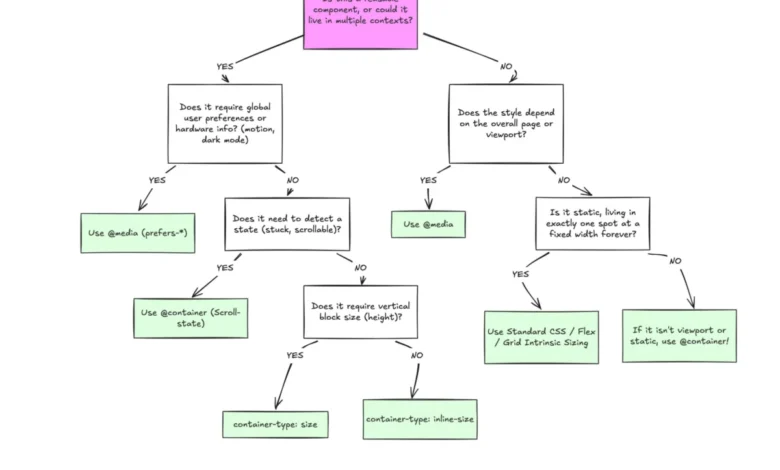
The current industry consensus suggests that media queries should not be abandoned; rather, they should be reserved for "macro-layout" tasks—such as global page structure, system-level preferences like prefers-color-scheme, or broad changes to the site’s overall navigation. In contrast, container queries are intended for the "micro-layout" of individual components.
As organizations continue to prioritize modularity and design systems, the adoption of container queries is expected to rise. The transition requires a departure from legacy habits, but the result is a more robust, scalable, and maintainable codebase. For the web development community, the challenge is not one of browser capability, but one of architectural strategy—recognizing that the most effective responsive designs are those that respond to the immediate environment of the content itself, not the arbitrary dimensions of the device screen.