
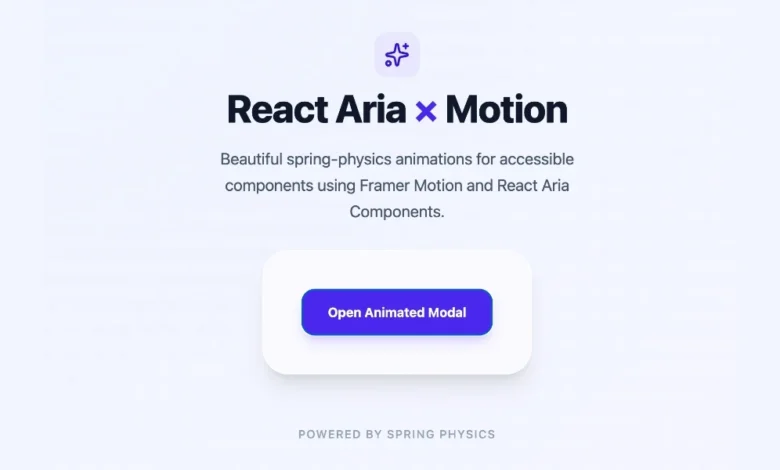
The modern landscape of front-end web development has increasingly prioritized accessibility, modularity, and high-performance user interfaces. Among the tools leading this paradigm shift is React Aria Components, developed and maintained by Adobe. Released as a robust library of accessible, unstyled, and headless UI components, React Aria provides engineers with the foundation to build sophisticated web applications that comply rigorously with international accessibility standards. It guarantees seamless functionality across various input modalities, including mouse, touch, and keyboard interactions.
However, the headless nature of the library presents a distinct architectural challenge. Because React Aria components ship with zero default styles and zero built-in animations, interface elements such as popovers, modals, trays, and menus appear instantly upon trigger activation without visual transition. While this zero-runtime-overhead approach is ideal for internal administrative dashboards or resource-constrained applications, it often falls short in consumer-facing products. In contemporary web design, smooth motion and polished transitions serve as primary indicators of software quality, guiding the user’s eye and providing spatial context during state changes.
To bridge this gap, developers must implement custom styling and animation layers. Fortunately, React Aria has been architected to accommodate clear, scalable paths for adding motion, ranging from lightweight native Cascading Style Sheets (CSS) transitions to complex, physics-based animation engines.
Understanding the Headless Architecture and Motion Requirements
React Aria’s headless design separates behavior and accessibility from visual presentation. This decoupling allows design engineering teams to apply proprietary design systems without fighting pre-existing styles. When building enterprise-grade user interfaces, however, the lack of animation can introduce cognitive friction. Instantaneous visual state changes disrupt the user’s mental model of spatial relationships within an application.
When a modal window snaps open abruptly or a dropdown menu blinks into existence, the user interface feels jarring. Industry benchmarks and usability studies consistently demonstrate that subtle transitions—lasting between 150 to 300 milliseconds—significantly enhance user perception of speed and responsiveness. By acknowledging where an element originates and where it goes, users maintain better spatial orientation.
Engineers tasked with enhancing React Aria components generally choose between two primary methodologies: native CSS transitions driven by DOM data attributes, or external JavaScript animation libraries like Motion (formerly Framer Motion) for advanced physics and gesture control.
Implementing CSS Transitions and Keyframe Animations via Data States
For the vast majority of applications, introducing heavy JavaScript animation libraries is entirely unnecessary. Native browser capabilities can handle simple fades, slides, and scaling effects with optimal performance. React Aria overlay components—including Popover, Modal, ModalOverlay, Tray, and Menu—are designed to expose specific DOM data states, namely [data-entering] and [data-exiting].
These data attributes are dynamically applied by the library during the component lifecycle. When an overlay component mounts or unmounts, the underlying DOM node does not instantly disappear. Instead, React Aria pauses the destruction of the element, holding it in the DOM while it waits for exit animations to complete. This clever orchestration allows developers to write standard CSS transitions without managing complex unmount timers in JavaScript.
For example, implementing a smooth fade and slide for a popover requires only a few lines of CSS:
.react-aria-Popover
  transition: opacity 200ms ease, translate 200ms ease;


.react-aria-Popover[data-entering],
.react-aria-Popover[data-exiting]
  opacity: 0;
  translate: 0 -8px;
When this stylesheet is active, the Popover fades in and shifts downward by eight pixels upon opening, reversing the transition seamlessly when closed. The browser’s native rendering engine handles the timing, eliminating JavaScript thread overhead and reducing external dependency bloat.
For more granular control over entry versus exit behavior, developers can employ CSS @keyframes. Keyframes allow for asymmetric timing and easing functions, which often yield a more natural physical feel. An entering element might benefit from an ease-out curve—starting fast and decelerating gracefully as it settles into place—while an exiting element can utilize an ease-in curve to accelerate out of view quickly.
.react-aria-Popover[data-entering]
  animation: popover-enter 200ms cubic-bezier(0.16, 1, 0.3, 1);


.react-aria-Popover[data-exiting]
  animation: popover-exit 150ms cubic-bezier(0.7, 0, 0.84, 0);


@keyframes popover-enter
  from
    opacity: 0;
    translate: 0 -8px;


@keyframes popover-exit
  to
    opacity: 0;
    translate: 0 -4px;
It is important to note that these lifecycle data attributes are strictly limited to conditionally mounted overlay components. Non-overlay components—such as buttons, switches, sliders, and toggle fields—remain persistently in the DOM. Consequently, animating those elements relies on standard pseudo-classes like :hover and :focus, or React Aria’s internal state attributes such as [data-pressed] and [data-selected].
Advanced Motion Control With Physics and Spring Dynamics
While CSS transitions are exceptional for basic fading and translating, they fall short when an application demands advanced interactive physics, gesture-driven dragging, complex layout morphing, or spring-based dynamics. In these scenarios, integrating a dedicated animation library becomes necessary.
Motion stands out as an industry-standard library for React ecosystems. It bridges the gap between declarative React syntax and high-performance animations by providing robust support for spring physics and exit transitions. Integrating Motion with React Aria Components is achieved through the motion.create() utility function, which transforms any standard React Aria component into an animatable motion component.
To implement this workflow, developers first install the package via a standard package manager:
npm install motionNext, specific components—such as modals and modal overlays—are wrapped using the factory function:
import  motion  from "motion/react";
import  Modal, ModalOverlay  from "react-aria-components";

const MotionModal = motion.create(Modal);
const MotionModalOverlay = motion.create(ModalOverlay);
Once wrapped, these components accept Motion’s declarative props, including initial, animate, exit, and transition. When paired with AnimatePresence, developers gain absolute control over the mounting and unmounting lifecycle, enabling complex spring physics that are otherwise impossible to achieve with pure CSS.
Below is an implementation of a dialog modal featuring a spring-loaded entry and smooth exit transition:
import  AnimatePresence, motion  from "motion/react";
import  DialogTrigger, Button, Modal, ModalOverlay  from "react-aria-components";
import  useState  from "react";

const MotionModal = motion.create(Modal);
const MotionModalOverlay = motion.create(ModalOverlay);

function AnimatedModal()
  let [isOpen, setOpen] = useState(false);

  return (
    <>
      <Button onPress=() => setOpen(true)>
        Open Modal
      </Button>

      <AnimatePresence>
        isOpen && (
          <MotionModalOverlay
            isOpen
            onOpenChange=setOpen
            className="fixed inset-0 z-10 bg-black/50 backdrop-blur-sm"
            initial= opacity: 0
            animate= opacity: 1
            exit= opacity: 0
            transition= duration: 0.2
          >
            <MotionModal
              className="fixed bottom-0 left-0 right-0 top-24 z-20 m-auto h-fit w-full max-w-lg rounded-2xl bg-white p-6 shadow-2xl"
              initial= scale: 0.9, y: 20
              animate= scale: 1, y: 0
              exit= scale: 0.9, y: 20
              transition=
                type: "spring",
                bounce: 0.3,
                duration: 0.4

            >
              <div slot="title" className="text-lg font-semibold text-slate-900">
                Spring Animated Modal
              </div>
              <p className="mt-2 text-sm text-slate-600">
                This modal utilizes spring physics for its entry and a controlled fade for its exit, maintaining full accessibility and keyboard navigation.
              </p>
            </MotionModal>
          </MotionModalOverlay>
        )
      </AnimatePresence>
    </>
  );
In this architecture, the isOpen prop on the MotionModalOverlay is explicitly set to true because the lifecycle control is delegated to AnimatePresence. Simultaneously, the onOpenChange callback ensures that standard accessibility dismissals—such as pressing the Escape key or clicking the backdrop overlay—continue to function natively without breaking internal state management.
Strategic Evaluation: Choosing the Right Animation Approach
Architects and senior frontend engineers must weigh performance, bundle size, and user experience requirements when deciding how to animate headless component libraries. A methodical approach ensures that applications remain lightweight while delivering a premium user experience.
| Approach | Primary Use Cases | Performance Impact | Dependency Overhead |
|---|---|---|---|
| CSS Transitions & Keyframes | Simple fades, sliding menus, tooltips, basic modal scaling. | Minimal (GPU-accelerated by default). | Zero dependencies. |
Motion (motion.create) |
Complex spring physics, drag gestures, layout morphing, orchestration. | Moderate (managed via JavaScript runtime). | Requires external library bundle. |
Best practices within the engineering community advocate for a progressive enhancement strategy. Development teams should default to native CSS transitions for standard UI overlays, reserving JavaScript animation libraries strictly for complex, physics-driven interactions where CSS limitations impact product quality. By adhering to this principle, applications built on React Aria Components can achieve the ideal balance between rigid accessibility compliance, rapid rendering performance, and exquisite visual polish.