Mastering Animations in Headless UI: A Comprehensive Guide to Transitioning React Aria Components with CSS and Motion

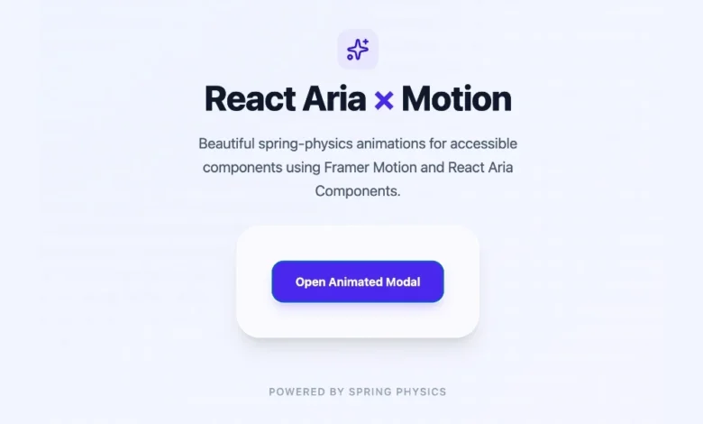
The modern web development ecosystem has undergone a profound shift toward headless architectures, prioritizing strict separation of concerns, absolute customization control, and robust accessibility standards. Among the leading tools in this paradigm is Adobe’s React Aria Components, a library renowned for supplying developers with unstyled, fully accessible UI primitives that function seamlessly across mouse, touch, and keyboard interactions. However, the defining characteristic of headless libraries
—their lack of default styles and animations—presents a unique set of design challenges. Out of the box, interactive elements such as popovers, modals, and trays appear and disappear abruptly. While this utilitarian approach is frequently acceptable for internal administrative dashboards or highly specialized developer tools, it often falls short when deployed in consumer-facing products where fluid motion, easing curves, and visual polish serve as core indicators of application quality and software craftsmanship.
Addressing this inherent design limitation requires understanding how to bridge the gap between static headless primitives and dynamic user interfaces. Fortunately, the development team behind React Aria anticipated these visual requirements, engineering explicit integration pathways that accommodate everything from lightweight, native Cascading Style Sheet (CSS) transitions to complex, physics-based motion libraries. Examining these methodologies reveals how engineering teams can achieve high-performance animations without compromising the strict accessibility and behavioral guarantees that make headless components indispensable in enterprise environments.
The Evolution of Headless UI and the Motion Dilemma
To fully comprehend the challenge of animating headless components, one must examine the historical trajectory of front-end component architecture. In the early days of React development, UI libraries such as Material-UI or Bootstrap offered monolithic packages where styles, behaviors, and accessibility were tightly coupled. While these libraries allowed developers to ship visually polished applications rapidly, they introduced severe limitations regarding design system compliance, bundle size bloat, and customizability. If a design team required a button or modal that deviated significantly from the library’s opinionated visual language, developers were forced to override extensive style sheets, frequently resulting in brittle code and degraded accessibility.
The subsequent rise of headless UI libraries solved the styling dilemma by stripping away visual presentations entirely, leaving behind robust state machines, keyboard navigation handlers, and ARIA attribute management. Adobe’s React Aria emerged as an industry standard in this domain, providing battle-tested logic for complex components like comboboxes, menus, and dialogs. Yet, this abstraction created a secondary problem: the separation of behavior from presentation meant that dynamic transitions—long considered a fundamental aspect of human-computer interaction—were entirely omitted.
In user experience design, motion is not merely decorative. Visual transitions provide essential cognitive scaffolding, helping users maintain spatial awareness as elements enter and exit the viewport. A modal that instantly pops into existence can disorient a user, whereas a modal that scales and fades in smoothly establishes a clear visual hierarchy and confirms that the application has acknowledged a user action. Recognizing this, developers are tasked with implementing animations that integrate cleanly with React Aria’s lifecycle management, ensuring that elements remain mounted in the Document Object Model (DOM) long enough for exit transitions to conclude gracefully.
Implementing Native CSS Transitions Using Data States
For many production environments, introducing heavy JavaScript animation dependencies is undesirable due to bundle size constraints, performance overhead, and maintenance complexity. For developers seeking a lightweight solution, React Aria provides a native mechanism leveraging modern CSS through automated data attributes.
Conditional overlay components within the React Aria ecosystem—including Popover, Modal, ModalOverlay, Tray, and Menu—dynamically expose specific state selectors, most notably [data-entering] and [data-exiting]. The library applies these data attributes automatically during the component lifecycle. Crucially, React Aria manages the DOM lifecycle to ensure that when a user triggers a close action, the component is not instantly unmounted. Instead, it remains active in the DOM while the browser executes the exit transition, removing the element only after the animation concludes.
Implementing a standard fade and slide effect requires minimal CSS configuration:
.react-aria-Popover
  transition: opacity 200ms ease, translate 200ms ease;


.react-aria-Popover[data-entering],
.react-aria-Popover[data-exiting]
  opacity: 0;
  translate: 0 -8px;
By applying this style rule, a Popover component automatically fades in and shifts downward by eight pixels upon opening, reversing the transformation seamlessly upon closure. The browser’s native compositing engine handles the execution, resulting in smooth 60 frames-per-second performance without JavaScript intervention.
For developers requiring asymmetric timing—such as a slower entrance paired with a rapid exit—CSS keyframe animations offer an alternative approach:
.react-aria-Popover[data-entering]
  animation: popover-enter 200ms cubic-bezier(0.16, 1, 0.3, 1);


.react-aria-Popover[data-exiting]
  animation: popover-exit 150ms cubic-bezier(0.7, 0, 0.84, 0);


@keyframes popover-enter
  from
    opacity: 0;
    translate: 0 -8px;


@keyframes popover-exit
  to
    opacity: 0;
    translate: 0 -4px;
This capability is restricted primarily to conditional overlay components that mount and unmount dynamically. Non-overlay interactive primitives, such as Buttons, Switches, and Sliders, persist within the DOM indefinitely. Consequently, animating these elements relies on standard pseudo-class selectors like :hover and :focus, alongside React Aria state attributes such as [data-pressed] or [data-selected], rather than entering and exiting lifecycle states.
Advanced Choreography with Spring Physics and Motion
While native CSS transitions excel at handling basic fades, scale adjustments, and positional slides, certain user interface paradigms demand advanced animation capabilities. Scenarios involving gesture-driven interactions, complex layout shifts, physics-based springs, and orchestrated multi-element sequences often exceed the limitations of declarative style sheets.
To address these requirements, developers frequently integrate specialized animation libraries. Among the most prominent options in the modern React ecosystem is Motion (formerly Framer Motion), a comprehensive animation toolkit that integrates smoothly with React Aria components through the motion.create() utility function. This wrapper transforms any standard React Aria component into an animation-aware element capable of accepting advanced props such as initial, animate, exit, and complex transition configurations.
Integrating Motion into a React Aria workflow begins with package installation:
npm install motionSubsequently, developers wrap the required React Aria primitives, such as Modal and ModalOverlay:
import  motion  from "motion/react";
import  Modal, ModalOverlay  from "react-aria-components";

const MotionModal = motion.create(Modal);
const MotionModalOverlay = motion.create(ModalOverlay);
When building fully animated composite components, managing the unmounting lifecycle requires coordination between React state, AnimatePresence, and Motion’s orchestration props. The following implementation demonstrates a fully functional, spring-animated modal dialogue:
import  AnimatePresence, motion  from "motion/react";
import  DialogTrigger, Button, Modal, ModalOverlay  from "react-aria-components";
import  useState  from "react";

const MotionModal = motion.create(Modal);
const MotionModalOverlay = motion.create(ModalOverlay);

function AnimatedModal()
  let [isOpen, setOpen] = useState(false);

  return (
    <>
      <Button onPress=() => setOpen(true) className="px-4 py-2 bg-blue-600 text-white rounded-md">
        Open Modal
      </Button>

      <AnimatePresence>
        isOpen && (
          <MotionModalOverlay
            isOpen
            onOpenChange=setOpen
            className="fixed inset-0 z-10 bg-black/50 flex items-center justify-center"
            initial= opacity: 0
            animate= opacity: 1
            exit= opacity: 0
            transition= duration: 0.2
          >
            <MotionModal
              className="w-full max-w-lg rounded-xl bg-white p-6 shadow-2xl"
              initial= scale: 0.9, y: 20
              animate= scale: 1, y: 0
              exit= scale: 0.9, y: 20
              transition=
                type: "spring",
                bounce: 0.3,
                duration: 0.4

            >
              <div slot="title" className="text-lg font-bold text-gray-900">
                Spring-Animated Modal
              </div>
              <p className="mt-2 text-sm text-gray-600">
                This component enters with dynamic spring physics and exits smoothly, driven by Motion and React Aria.
              </p>
              <Button onPress=() => setOpen(false) className="mt-4 px-3 py-1.5 bg-gray-200 text-gray-800 rounded">
                Close
              </Button>
            </MotionModal>
          </MotionModalOverlay>
        )
      </AnimatePresence>
    </>
  );
In this architecture, the MotionModalOverlay enforces isOpen=true explicitly because AnimatePresence assumes responsibility for orchestrating the mount and unmount lifecycle. Meanwhile, the onOpenChange callback continues to report closure intents back to the local React state, ensuring that standard accessibility dismissals—such as pressing the Escape key or clicking the backdrop overlay—function correctly without interruption.
Comparative Analysis and Strategic Implementation Guidelines
Selecting the appropriate animation strategy requires engineering teams to balance visual requirements against performance budgets and architectural complexity. A rigorous evaluation of available methodologies indicates clear demarcations for their optimal application:
| Approach | Primary Use Cases | Performance Footprint | Dependency Overhead |
|---|---|---|---|
| CSS Transitions | Simple fades, opacity shifts, basic translations, scale effects | Extremely High (Hardware Accelerated) | Zero Dependencies |
| CSS Keyframes | Asymmetric enter/exit timings, multi-step stylistic sequences | High (Optimized via Compositor) | Zero Dependencies |
Motion (motion.create) |
Spring physics, drag gestures, layout animations, shared element transitions | Moderate (JavaScript-driven interpolation) | External Package Required |
For the vast majority of enterprise applications, the vast majority of component overlays require nothing more than a standard 200-millisecond fade combined with a subtle vertical translation. These standard UI patterns fall squarely within the domain of native CSS transitions, allowing organizations to maintain minimal JavaScript bundle sizes while achieving optimal runtime performance.
Conversely, product teams developing highly tactile, consumer-grade experiences where physical interaction feedback, gesture recognition, and spring dynamics are central to the brand identity will find immense value in integrating Motion with React Aria. By adhering to these structured evaluation metrics, development teams can successfully reconcile the uncompromising accessibility and headless flexibility of React Aria with the visual polish demanded by contemporary digital standards.