
Mobile SEO Your Guide to Mobile Success
Mobile seo – Mobile is crucial for any website aiming to succeed in today’s digital landscape. Mobile-first indexing means Google prioritizes the mobile version of your site for search results. This necessitates a different approach than desktop , focusing on site speed, user experience, and mobile-specific content. This guide delves into the specifics, offering actionable strategies and insights to optimize your mobile presence.
From understanding mobile-first indexing to optimizing content and user experience, this guide will equip you with the knowledge needed to maximize your website’s visibility on mobile search results. We’ll explore the critical differences between mobile and desktop , common mistakes to avoid, and the latest trends shaping the mobile search landscape.
Mobile-Specific Considerations
Optimizing for mobile search is no longer optional; it’s crucial for any website aiming for high visibility and user engagement. Mobile devices dominate internet usage, making mobile a critical aspect of a comprehensive digital strategy. Understanding the nuances of mobile search and adapting your website accordingly can significantly improve your search rankings and drive organic traffic. This section delves into the specifics of mobile , highlighting key differences from desktop , and outlining crucial considerations for success.Mobile search is fundamentally different from desktop search.
Users often have different needs and search behaviors on mobile devices. They might be looking for quick answers, local businesses, or directions, often using voice search or shorter queries. These distinctions necessitate a tailored approach to strategies.
Differences Between Desktop and Mobile
Desktop and mobile strategies differ significantly due to variations in user behavior and device capabilities. Mobile users often prioritize speed, accessibility, and local results. Desktop users might have more time to explore and use complex search queries. This means mobile optimization must prioritize fast loading times, intuitive navigation, and concise content. Responsive design, a critical aspect of mobile optimization, adapts website layouts to different screen sizes and resolutions.
Importance of Mobile-First Indexing
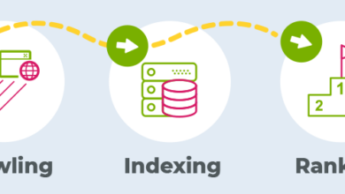
Google’s mobile-first indexing approach prioritizes the mobile version of a website when determining search rankings. This means Google primarily uses the mobile version of your website to crawl, index, and rank your pages. This paradigm shift emphasizes the importance of a flawless mobile experience. A well-optimized mobile site translates directly to higher search rankings and better user engagement.
Key Mobile-Specific Ranking Factors
Several factors play a crucial role in mobile search rankings. These factors include page speed, mobile-friendliness, site structure, and user experience. A site that loads quickly, is easy to navigate, and provides a seamless experience will perform better in mobile search results.
- Page Speed: Fast loading times are essential for mobile users, as they often have limited patience for slow websites. Optimizing images, minimizing HTTP requests, and leveraging browser caching can significantly improve page speed. For instance, a 2-second delay in loading time can significantly reduce conversions and user engagement.
- Mobile-Friendliness: A site that adapts seamlessly to different screen sizes and resolutions is crucial. This ensures readability and usability for all users regardless of their device. Examples of mobile-friendly features include responsive design and a user-friendly interface.
- Site Structure: A well-structured website is easier to navigate on mobile devices. This includes clear navigation menus, logical page hierarchies, and intuitive internal linking.
- User Experience (UX): A positive user experience on mobile is paramount. This encompasses factors like ease of navigation, readability, and intuitive interaction with elements on the page.
Mobile-Friendly Design Principles, Mobile seo
Various principles guide mobile-friendly website design. These include responsive design, intuitive navigation, and optimized content. The goal is to create a user-friendly experience tailored to mobile users.
- Responsive Design: This approach automatically adjusts the layout and content of a website to fit different screen sizes, ensuring a consistent and accessible experience across various devices.
- Intuitive Navigation: Mobile navigation should be simple and straightforward, allowing users to quickly access the information they need. Clear menus and easily accessible links are essential for a positive user experience.
- Optimized Content: Mobile-optimized content should be concise, easy to read, and well-structured for readability on smaller screens. Use of clear headings, short paragraphs, and high-quality images is essential.
Common Mobile Mistakes to Avoid
Avoiding certain mistakes is essential for effective mobile . These errors can significantly impact search rankings and user experience.
| Mistake | Explanation | Impact | Solution |
|---|---|---|---|
| Ignoring Mobile-First Indexing | Failing to optimize the mobile version of the website for search engines. | Lower search rankings, reduced organic traffic. | Prioritize mobile optimization and ensure the mobile site is well-structured and functional. |
| Poor Page Speed | Slow loading times on mobile devices. | Reduced user engagement, higher bounce rates, lower rankings. | Optimize images, minimize HTTP requests, leverage browser caching, and use a Content Delivery Network (CDN). |
| Lack of Mobile-Friendly Design | Failing to adapt the website’s layout and content for mobile devices. | Poor user experience, higher bounce rates, reduced conversions. | Implement responsive design, ensure easy navigation, and optimize content for readability. |
| Ignoring User Experience (UX) | Poor usability and navigation on mobile. | Reduced user engagement, higher bounce rates, lower conversions. | Conduct user testing, improve site navigation, ensure clear call-to-actions, and optimize for accessibility. |
Mobile Site Speed Optimization
Mobile site speed is crucial for a positive user experience and search engine rankings. Slow-loading pages lead to higher bounce rates, frustrated users, and ultimately, a negative impact on your website’s visibility. Fast-loading mobile sites are key to attracting and retaining customers in today’s demanding digital landscape.A fast-loading website translates to a better user experience. Users expect immediate responses from mobile apps and websites.
Slow loading times can drive users away, leading to lost conversions and a diminished reputation. Search engines also prioritize fast-loading websites in their rankings. This prioritization reflects the understanding that a positive user experience is directly correlated with a website’s overall performance.
Impact on User Experience and Search Rankings
Mobile site speed significantly impacts user experience. Slow loading times frustrate users, leading to higher bounce rates and decreased engagement. This negatively affects metrics like time on site and conversion rates. Search engines like Google prioritize mobile-friendliness and speed in their ranking algorithms. Sites with optimal loading times often rank higher, increasing visibility and driving more organic traffic.
Measuring and Analyzing Mobile Site Speed
Various tools and techniques can be used to measure and analyze mobile site speed. Google PageSpeed Insights is a popular free tool that provides valuable data on site performance. It offers suggestions for optimization based on real user experience metrics. Other tools include GTmetrix and WebPageTest, which provide detailed reports on loading times, identifying bottlenecks and areas needing improvement.
These tools are crucial in the identification of slow-loading components.
Optimizing Images and Assets
Images and other assets often contribute significantly to loading times. Compressing images without compromising quality is essential. Using appropriate image formats like WebP (which often offers better compression than JPEG) is crucial. Optimizing images for different screen sizes and resolutions can also improve loading speed. Choosing the right image format is a crucial step in optimization, ensuring that the image’s quality is not compromised while maintaining the loading speed.
Minimizing HTTP Requests
Reducing the number of HTTP requests is critical for faster loading times. Combining files (CSS, JavaScript, images) into fewer requests can significantly reduce loading time. Using efficient caching strategies can also reduce the number of requests needed for static assets, improving performance. Employing techniques like HTTP/2 can also significantly reduce the overhead associated with multiple requests. These strategies are key to streamlining the loading process.
Tools for Improving Mobile Site Speed
Several tools can assist in optimizing mobile site speed.
- Google PageSpeed Insights: A free tool providing valuable insights into mobile site performance and recommendations for improvement.
- GTmetrix: A comprehensive tool offering detailed reports on website speed and performance metrics.
- WebPageTest: A tool allowing users to test website loading times from various locations and devices.
- Lighthouse: A performance auditing tool integrated into Chrome DevTools, providing actionable insights and recommendations for improvement.
- Cloudflare: A CDN (Content Delivery Network) that can significantly reduce loading times by caching static assets closer to users.
These tools offer valuable data and actionable recommendations to optimize your mobile site’s performance.
Mobile-Friendly Content Strategy
Optimizing content for mobile devices is no longer a nice-to-have, but a crucial element of a successful online presence. More and more users are accessing the internet exclusively or primarily through their smartphones and tablets. Failing to adapt content for these devices can lead to a poor user experience, decreased engagement, and ultimately, lower search rankings. This section dives into the specific strategies needed to craft mobile-friendly content.A well-designed mobile content strategy ensures seamless browsing and optimal engagement on smaller screens.
This involves careful consideration of format, structure, and responsiveness to different screen sizes. By prioritizing these aspects, you can significantly improve user experience and enhance your website’s visibility in mobile search results.
Importance of Mobile-Optimized Content
Mobile-optimized content is crucial for several reasons. Firstly, it caters to the growing number of mobile users, providing a positive user experience. Secondly, search engines like Google prioritize mobile-friendly websites in search results. A mobile-friendly website signals to search engines that you are prioritizing the user experience and can help you rank higher in search results, leading to more organic traffic.
Finally, mobile optimization improves user engagement and encourages conversions by providing a smooth and intuitive browsing experience.
Mobile-Friendly Formats
Mobile-friendly formats are designed for smaller screens and faster loading times. AMP (Accelerated Mobile Pages) is a prime example, using lightweight code to create pages that load almost instantly on mobile devices. Other optimized formats include responsive design, which automatically adjusts the layout to fit different screen sizes, and concise, scannable text.
Examples of Effective Mobile Content Formats
Various formats can be employed to create effective mobile content. Short, engaging videos, infographics, and interactive content are highly effective for mobile devices. These formats often provide more visual engagement and are better suited to smaller screens than lengthy articles. For instance, a video showcasing a product’s features can be far more compelling and engaging on a phone than a wall of text.
Adapting Existing Content for Mobile
Adapting existing content for mobile involves several steps. First, ensure the content is concise and easy to read on smaller screens. Next, optimize images and videos for mobile viewing, using compressed formats to reduce file size and load time. Finally, use responsive design to ensure the layout adapts to various screen sizes. This involves carefully considering the layout and flow of the content, making sure it’s easy to read and navigate on any device.
Responsive Design and Content Structure
Responsive design is essential for creating a consistent and user-friendly experience across all devices. A well-structured website with clear headings, short paragraphs, and relevant images will contribute to a seamless mobile experience. The structure should prioritize scannability and accessibility, with elements clearly labeled and easily navigable. For example, use clear calls to action and concise, easy-to-understand text to guide users through the site.
Mobile User Experience (UX)
Mobile UX is paramount to mobile success. A positive mobile user experience (UX) directly impacts how search engines perceive your site’s relevance and usability, influencing search rankings. A seamless and intuitive mobile experience encourages users to stay longer, explore more, and return, ultimately boosting your site’s visibility in mobile search results.A well-designed mobile UX prioritizes user needs, offering a smooth and efficient browsing experience.
This includes quick loading times, easy navigation, and intuitive interactions. Mobile UX is no longer a separate concern from ; it’s an integral component. A great mobile UX will attract and retain users, increasing your site’s authority in the eyes of search engines.
Mobile SEO is crucial for reaching your audience on the go. A key element in optimizing your mobile site is understanding canonicalization. This involves ensuring that search engines point to the correct version of your content, whether it’s a desktop or mobile version, which is often handled through canonical tags. Learning about what is canonicalization how to use canonical tags will help you avoid duplicate content issues and boost your mobile search rankings.
Proper use of canonical tags is essential for a strong mobile SEO strategy.
Role of Mobile UX in Mobile
Mobile UX directly impacts search engine rankings. Search engines prioritize sites that offer a positive user experience, and a poor mobile UX negatively impacts rankings. Factors like page load speed, mobile-friendliness, and ease of navigation significantly influence search engine algorithms. This prioritization stems from the desire to provide users with the best possible search results. Mobile-first indexing reflects this commitment to mobile-friendly sites.
Key Mobile UX Elements Affecting Rankings
Several UX elements directly affect mobile rankings. These include page load speed, site navigation, mobile-friendliness, and the overall visual appeal. The more intuitive and responsive the mobile site, the better the UX.
- Page Load Speed: A slow-loading site negatively impacts user experience, leading to high bounce rates and decreased time on site. This, in turn, signals to search engines that the site is not user-friendly, potentially impacting rankings. Faster loading times are directly correlated with improved user experience and search engine ranking.
- Site Navigation: Easy-to-use navigation is crucial for mobile users. Users should be able to quickly find what they need without getting lost or frustrated. Clear, intuitive navigation minimizes user frustration, improving their experience and encouraging longer visits.
- Mobile-Friendliness: The site must adapt to various screen sizes and orientations. This includes proper font sizes, responsive images, and intuitive touch interactions. Mobile-friendliness is a cornerstone of good mobile UX, ensuring accessibility and usability across different devices.
- Visual Appeal: Visually appealing design, including appropriate imagery, clear typography, and consistent branding, enhances user experience. A visually pleasing site is more engaging, leading to longer user sessions and higher user satisfaction.
Creating a Seamless Mobile User Experience
A seamless mobile UX involves prioritizing user needs and designing the site with their experience in mind. This means ensuring fast loading times, intuitive navigation, and visually appealing content. It’s about understanding how users interact with mobile devices and tailoring the experience accordingly.
- Prioritize Fast Loading Times: Optimize images, minimize HTTP requests, and leverage caching strategies to reduce page load times. This is crucial for a positive user experience and search engine ranking.
- Implement Intuitive Navigation: Use clear menus, concise labels, and simple calls to action. Easy navigation ensures users can quickly find what they’re looking for without confusion or frustration.
- Design for Mobile-First: Start with the mobile design and then adapt it for desktop, not the other way around. This ensures a superior mobile experience.
- Ensure Accessibility: Use appropriate font sizes, color contrasts, and keyboard navigation to ensure accessibility for all users. This is vital for inclusivity and complying with accessibility standards.
Examples of Good Mobile UX Practices
Numerous examples showcase good mobile UX practices. Netflix, for instance, prioritizes a seamless mobile experience, with fast loading times, intuitive navigation, and personalized recommendations. Other examples include Spotify, offering a simple interface that allows easy access to music and playlists.
Comparison of Mobile UX Design Approaches
| Approach | Description | Pros | Cons |
|---|---|---|---|
| Progressive Web App (PWA) | A web app that feels like a native app. | Fast loading, offline access, push notifications, native app-like experience. | Can be complex to implement, requires specialized skills. |
| Responsive Design | Adapts to different screen sizes. | Cost-effective, easier to implement than PWAs. | May not provide the same level of performance as a native app or PWA. |
| Native App | Developed specifically for a given platform. | Excellent performance, full access to device features. | High development costs, longer development time. |
Mobile-Specific Technical
Mobile-first indexing has fundamentally shifted how search engines crawl and index websites. A strong technical foundation is crucial for mobile optimization, ensuring your site is easily discoverable and usable on various devices. This includes not only the user experience but also the technical underpinnings that allow search engines to effectively understand and index your content.Technical for mobile goes beyond simple design choices.
It involves meticulous attention to details like site architecture, crawlability, and indexability. A well-structured mobile site, optimized for speed and accessibility, translates to higher rankings and improved user engagement.
Mobile-Friendly URLs
Mobile-friendly URLs are crucial for mobile . They enhance both user experience and search engine understanding. A concise and descriptive URL structure is essential for mobile users and search engines. These URLs should be short, -rich, and accurately reflect the content of the page.
Mobile SEO is all about optimizing your app for search engines, making it easier for users to find it. But, as the app economy evolves, factors beyond basic SEO are becoming crucial. For example, the recent struggle by Clubhouse to retain contributors with creator payment plans highlights how app monetization directly affects user engagement, and consequently, how users find and interact with the app.
Understanding these dynamics is vital for any mobile SEO strategy. This article about clubhouse fights to keep app contributors with creator payment shows the connection between user satisfaction and the overall discoverability of the app. Ultimately, this means mobile SEO is more than just keywords; it’s about creating a valuable, engaging user experience.
- Using hyphens to separate words in URLs is a common and recommended practice.
- Avoid using special characters or excessive numbers in URLs.
- Make URLs easy to read and understand for both users and search engines.
Mobile Sitemaps
Mobile sitemaps are essential for guiding search engine crawlers through your site’s structure. They are particularly helpful for mobile-first indexing, as they provide a clear map of all accessible content on your site.
- XML sitemaps are specifically designed for search engine crawlers and are crucial for mobile .
- Ensure that your sitemap is regularly updated to reflect the latest changes in your site’s content and structure.
- Include URLs for all important pages on your mobile site.
Optimizing Mobile Site Architecture
A well-structured mobile site architecture is vital for both user experience and search engine crawlability.
- Employ a clear and logical hierarchy for organizing pages and content.
- Use descriptive and relevant headings (H1, H2, etc.) to structure content for improved readability and comprehension.
- Maintain a consistent navigation structure across all pages for seamless user experience.
Mobile-Specific Technical Issues
Several technical issues can negatively impact your mobile .
- Slow loading times: Mobile users have limited patience. Slow loading times can lead to high bounce rates and poor rankings.
- Poorly structured URLs: Complex and ambiguous URLs can hinder search engine understanding and negatively impact user experience.
- Missing or outdated mobile sitemaps: Search engines may struggle to discover and index your content if sitemaps are missing or outdated.
Ensuring Mobile Crawlability and Indexability
Ensuring your mobile site is easily crawlable and indexable is crucial for achieving higher rankings.
- Robots.txt file: A correctly configured robots.txt file prevents search engines from crawling pages you don’t want indexed.
- Canonical tags: These tags help search engines understand the primary version of a page, preventing duplicate content issues, especially important for mobile versions.
- Mobile-friendly site structure: Employing a responsive design or a dedicated mobile site with a separate URL structure can ensure that all pages are easily accessible.
Troubleshooting Common Mobile Errors
Troubleshooting common mobile errors can significantly improve your site’s performance.
- Check for mobile-specific errors: Use developer tools to identify technical issues like broken links, missing meta tags, or slow loading times, specific to mobile.
- Analyze user behavior: Track user interaction on your mobile site to identify areas of improvement in navigation and content presentation.
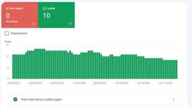
- Use Google Search Console: Utilize Google Search Console tools to identify crawl errors and technical issues affecting your mobile site’s visibility.
Mobile Search Results & Features

Mobile search results are fundamentally different from their desktop counterparts. This difference stems from the unique characteristics of mobile browsing, such as smaller screens, touch-based interactions, and varying network conditions. Understanding these distinctions is crucial for optimizing content for mobile search visibility.Mobile search results prioritize speed, relevance, and user experience. This often manifests in shorter snippets, more visually appealing results, and a greater emphasis on local search.
The core principle is to provide users with the information they need quickly and easily, which is why mobile optimization is not just a trend but a necessity.
Mobile-Specific Search Features
Mobile search engines offer various features tailored to the mobile user experience. These features often enhance the user’s ability to find relevant and actionable information quickly.Mobile search engines are designed to understand user intent and provide relevant results. They often employ sophisticated algorithms to discern the user’s location, past search history, and current context, leading to personalized and location-aware results.
- Local Search: Mobile search frequently prioritizes local businesses. Users often seek information about nearby restaurants, stores, or services. This necessitates tailoring your content to include location-specific s and details like business hours and addresses.
- Featured Snippets: Mobile-specific featured snippets often appear in a more prominent position than on desktop, and may be tailored to the user’s context and device. Optimizing for these snippets involves focusing on clear, concise answers to common user questions.
- Image Search: Mobile image search is often integrated directly into the search results. Ensuring high-quality images with relevant alt text and descriptive filenames is essential for appearing in image search results.
- Voice Search: Mobile voice search has exploded in popularity. Users are increasingly using voice assistants to perform searches. This necessitates optimizing for conversational queries and natural language.
Impact of Mobile Voice Search
Voice search is rapidly altering how users interact with search engines. Mobile voice searches are often longer and more conversational than text-based searches, reflecting natural language queries.The impact of mobile voice search is significant. Voice search results are often more contextually aware and tailored to the user’s location, increasing the need for businesses to adapt to this emerging trend.
Mobile SEO is all about optimizing your website for those on the go. A crucial part of that is ensuring great user experience, which directly impacts your Google ranking. A big part of this is paying attention to customer reviews, as positive feedback directly influences Google’s algorithm. For example, checking out how google customer reviews affect search results can provide valuable insights into what truly matters to your target audience.
Ultimately, focusing on positive customer experiences, via thorough review analysis, directly strengthens your mobile SEO strategy.
- Conversational Queries: Users typically phrase voice searches as questions, making conversational s crucial for optimization.
- Contextual Understanding: Mobile voice searches are frequently tied to location, leading to higher relevance for local searches.
- Natural Language Processing: Search engines are becoming increasingly adept at understanding natural language, necessitating content optimization that aligns with conversational phrasing.
Optimizing for Mobile-Specific Search Features
Optimizing for mobile-specific search features involves tailoring your content and website to address the needs of mobile users.This approach requires understanding the nuances of mobile search, including the importance of mobile-first indexing, site speed, and user experience.
- Mobile-Friendly Content: Content should be concise, clear, and easily digestible on smaller screens. Use short paragraphs, bulleted lists, and visually appealing elements to improve readability.
- Local Optimization: Ensure your business information (name, address, phone number – NAP) is consistent across all online platforms and use relevant local s.
- Schema Markup: Implementing schema markup can enhance the visibility of your content in search results. This is particularly useful for local businesses, product listings, and other structured data.
Improving Visibility in Mobile Search Results
Improving visibility in mobile search results involves addressing various technical and content-related factors.Techniques for enhancing visibility often involve optimizing for mobile-first indexing, improving site speed, and focusing on user experience.
- Mobile-First Indexing: Ensure your website is optimized for mobile devices, as mobile-first indexing prioritizes mobile versions of websites.
- Site Speed Optimization: Fast-loading websites are crucial for mobile users. Optimize images, minimize HTTP requests, and leverage caching to improve page load times.
- User Experience (UX): A seamless and intuitive user experience is essential for attracting and retaining mobile users. A simple and easy-to-navigate website improves user experience.
Local for Mobile

Local is crucial for businesses targeting customers in a specific geographic area. Mobile users, more than ever, rely on their phones to find local businesses, from restaurants to plumbers. Optimizing for mobile local search means understanding and catering to these users’ needs, leading to higher visibility, more foot traffic, and ultimately, increased revenue.Local search results are highly tailored to the user’s current location.
Mobile optimization ensures your business appears prominently when a user searches for relevant services near them, leading to increased customer engagement.
Importance of Local for Mobile Users
Mobile users often search for local businesses with specific needs and immediate requirements. A well-optimized local strategy is essential for appearing in these searches, maximizing the chances of attracting customers actively looking for products or services in their immediate vicinity. Understanding the local context is paramount, as mobile users often want results that are geographically relevant to their current location.
Local search is a powerful tool for businesses to connect with customers who are actively seeking their services.
Strategies for Optimizing Local Search Results for Mobile Devices
Optimizing local search results for mobile involves several key strategies. Firstly, accurate business information is crucial. Ensure your Google My Business profile is up-to-date with correct hours, address, phone number, and other details. Secondly, mobile-friendly website design is critical. A slow or difficult-to-navigate website will drive customers away.
Thirdly, local citations are vital. Consistent information across various online directories enhances credibility and visibility.
Optimizing Google My Business for Mobile
Google My Business (GMB) is a critical component of local . Optimizing your GMB profile for mobile involves several steps. Ensure high-quality photos, including exterior and interior views of your business. Provide detailed business descriptions highlighting key services and special offers. Encourage customer reviews; positive reviews significantly impact visibility and trust.
Utilize all available features within the mobile GMB interface. Using relevant s in your descriptions and categories is essential.
Examples of Successful Mobile Local Strategies
Numerous businesses have successfully leveraged mobile local . A coffee shop in a city center, for example, might focus on s like “best coffee near me” or “coffee shops downtown.” They would ensure their GMB profile is optimized, with high-quality photos and frequent updates on specials. A plumbing company might focus on specific areas, optimizing for s like “plumbing services [neighborhood name]”.
They would build local citations across relevant online directories.
Significance of Mobile-Friendly Local Citations
Mobile-friendly local citations are essential for consistent and accurate business information across the web. Ensuring your business information appears identically across various directories helps establish trust and reliability with search engines. This consistency strengthens your local search ranking and enhances your visibility to potential customers. Maintaining accurate and consistent citations across various platforms helps build a strong online presence for your business.
Measuring and Analyzing Mobile Performance
Understanding how users interact with your mobile site and how search engines perceive it is crucial for optimizing mobile . Accurate measurement and analysis provide the insights needed to refine strategies and maximize performance. This involves tracking user behavior, analyzing search data, and utilizing specialized tools.Mobile success hinges on a deep understanding of how users navigate and engage with your mobile site.
Data collected from these interactions offers invaluable insights into user experience, helping identify areas for improvement and ultimately leading to better rankings and higher conversion rates. Understanding how search engines perceive your site’s mobile presence through relevant data analysis further strengthens your mobile strategy.
Tracking Mobile User Behavior
Understanding user behavior on mobile is essential for optimizing the user experience and improving . This involves analyzing various metrics, including session duration, bounce rate, and pages per session. These metrics offer crucial insights into how users interact with your site, revealing potential issues and areas for improvement.
- Session Duration: The average time users spend on your site during a single session provides insight into how engaging your content is. Longer sessions typically indicate higher user satisfaction and increased engagement. Shorter sessions may suggest content isn’t relevant or that the site navigation is difficult.
- Bounce Rate: The percentage of users who leave your site after viewing only one page is the bounce rate. A high bounce rate can indicate issues with the landing page or a lack of relevance to the user’s search query.
- Pages Per Session: This metric shows the average number of pages users visit during a single session. A higher number often suggests users are finding value in your content and exploring further. Low pages per session might indicate a need for better internal linking or more comprehensive content.
Analyzing Mobile Search Data
Analyzing search data provides insights into how users discover your mobile site. This includes examining search queries, performance, and the mobile search results your site appears in.
- Search Queries: Identifying the specific s and phrases users are using to find your site reveals what content they are seeking. This data can be used to optimize existing content or create new content that addresses user needs.
- Performance: Tracking the performance of specific s shows which terms are driving traffic and which aren’t. Analyzing this data can help refine your strategy to target more relevant searches.
- Mobile Search Results: Understanding how your site appears in mobile search results, including the visibility of your snippets, site links, and featured snippets, allows you to optimize your content and meta descriptions to improve visibility and attract more clicks.
Tools for Monitoring Mobile Performance
Various tools help monitor mobile performance, providing detailed insights into user behavior and search data.
- Google Analytics: A comprehensive tool for tracking user behavior on your mobile site, including session duration, bounce rate, and geographic data.
- Google Search Console: Provides insights into how Google sees your mobile site, including mobile usability issues, indexation status, and mobile search performance.
- SEMrush, Ahrefs, and Moz: Third-party tools offering advanced research, site audit reports, and competitor analysis, providing a broader perspective on mobile performance.
Key Mobile Metrics to Track
Tracking specific metrics provides crucial data for assessing your mobile performance.
- Mobile Conversion Rate: This metric measures the percentage of mobile users who complete a desired action, such as making a purchase or filling out a form.
- Mobile Click-Through Rate (CTR): The percentage of users who click on your site’s listing in mobile search results.
- Mobile Rankings: Tracking your site’s ranking in mobile search results for specific s demonstrates how your site performs in relation to competitors.
Interpreting Mobile Data
Interpreting data requires understanding trends and patterns. Comparing data across different time periods and user groups provides context for evaluating performance.
- Data Trends: Identifying trends in data, such as seasonal fluctuations or sudden changes in user behavior, can provide insight into factors affecting your mobile .
- User Segmentation: Analyzing data by user segments, such as demographics or geographic location, helps understand how different groups interact with your mobile site.
- Benchmarking: Comparing your mobile performance against industry benchmarks helps identify areas where you can improve or maintain a competitive edge.
Mobile Trends and Future Outlook
Mobile is constantly evolving, mirroring the rapid advancements in mobile technology and user behavior. Staying ahead of the curve requires understanding not just the current trends but also the likely future developments in mobile search. This understanding is crucial for businesses seeking to maintain and improve their online visibility on mobile devices.The future of mobile search hinges on several key trends, including a greater emphasis on user experience, a deeper integration of AI, and the continued evolution of mobile-first indexing.
Businesses that anticipate these changes and adapt their strategies accordingly will be better positioned to succeed in the mobile-driven digital landscape.
Emerging Mobile Trends
The mobile landscape is dynamic, with new technologies and user behaviors constantly reshaping the playing field. Key emerging trends include the rise of voice search, the increasing importance of mobile-first indexing, and the integration of AI into search algorithms. These trends indicate a shift towards more natural and intuitive search interactions, emphasizing user experience and context.
- Voice Search Optimization: With the growing popularity of voice assistants like Siri, Alexa, and Google Assistant, optimizing for voice search is becoming increasingly important. Users often phrase voice queries differently than text queries, requiring a focus on conversational s and natural language.
- Augmented Reality (AR) Integration: AR technology is poised to revolutionize how users interact with businesses online. Mobile strategies must adapt to support AR experiences, including providing accurate location data, product information, and interactive elements within search results.
- Enhanced Mobile-First Indexing: Mobile-first indexing is no longer a future concept; it’s the present. Search engines prioritize the mobile version of a website for indexing and ranking. This means ensuring a seamless and responsive mobile experience is paramount for visibility.
Future Developments in Mobile Search Technology
Search technology is advancing rapidly, introducing new ways for users to interact with information. These developments are fundamentally altering how search results are presented and how businesses need to optimize their sites.
- AI-Powered Search: AI is rapidly changing search algorithms, enabling more intelligent and context-aware results. This shift demands optimization for natural language processing and AI-driven queries.
- Personalized Search Results: Search engines are increasingly personalizing results based on user history and preferences. Mobile strategies must account for this personalization by focusing on user-specific needs and interests.
- The Rise of Mobile-Specific Features: Expect to see more features specific to mobile searches, such as location-based results, augmented reality integration, and rich snippets. Businesses need to optimize their sites to leverage these features and improve visibility.
Evolving Role of Mobile-First Indexing
Mobile-first indexing is no longer a trend; it’s a fundamental shift in how search engines rank websites. Understanding this shift is crucial for maintaining visibility in mobile search results.Mobile-first indexing prioritizes the mobile version of a website during indexing and ranking, demanding a focus on a fast, user-friendly mobile experience. Websites that fail to meet these requirements risk being penalized in mobile search results.
Impact of Emerging Mobile Technologies on
The emergence of mobile technologies is impacting in significant ways. Businesses must adapt their strategies to capitalize on these advancements and avoid being left behind.
- Increased User Expectations: Mobile users expect fast loading times, intuitive navigation, and a seamless experience. strategies need to focus on optimizing site speed and providing a user-friendly mobile interface.
- Shift in Search Behavior: Mobile search behavior is changing, with users increasingly relying on voice search and mobile-specific features. strategies need to adapt to these evolving behaviors.
Strategies to Prepare for Future Mobile Changes
Proactive measures are essential to maintain a competitive edge in the dynamic mobile landscape.
- Continuous Monitoring and Analysis: Regularly monitor mobile search trends, user behavior, and algorithm updates. Adapt your strategies to stay current with the changes.
- Prioritize User Experience (UX): A positive user experience is critical for mobile success. Optimize site speed, navigation, and design for seamless mobile browsing.
- Embrace Mobile-First Design Principles: Ensure your website is built with mobile-first design principles in mind, prioritizing a fast, responsive, and user-friendly mobile experience.
Conclusive Thoughts: Mobile Seo
In conclusion, mastering mobile is no longer optional; it’s essential for reaching your target audience effectively. This guide has provided a comprehensive overview of the key aspects, from technical to user experience and local optimization. By implementing the strategies Artikeld, you can significantly improve your mobile search visibility, ultimately driving more traffic and conversions. Stay tuned for future updates on the ever-evolving mobile landscape!


