Despite broad browser support, CSS container queries remain a significantly underutilized feature in modern web development, often misunderstood as mere alternatives to traditional media queries. With current adoption rates hovering at roughly 41.4% according to the 2025 State of CSS survey, the industry faces a gap between technical capability and practical implementation. While media queries have served as the backbone of responsive design since the inception of the mobile web, the evolution of component-based architecture necessitates a shift toward container-based logic to ensure truly adaptive, modular interfaces.
A Historical Context of Responsive Design
The advent of media queries in the late 2000s fundamentally changed how developers approached the web. As mobile devices began to proliferate, the ability to query the browser’s viewport—the physical width of the device screen—provided a vital mechanism for adjusting layouts. This "macro-layout" approach allowed websites to stack columns or hide elements based on whether a user was accessing content via a desktop, tablet, or smartphone.
However, as the web matured, the industry moved away from page-centric designs toward reusable component-based frameworks like React, Vue, and Web Components. In this new paradigm, developers create individual modules—such as cards, widgets, or navigation bars—that are designed to be dropped into various parts of an application. The limitation of the viewport-based media query becomes apparent when a component is placed in a confined space, such as a narrow sidebar or a complex dashboard grid. The media query, by design, remains oblivious to the component’s actual surroundings, leading to layout breakage and redundant code.
The Technical Divide: Viewport vs. Container
The primary distinction between the two methodologies lies in their reference points. Media queries are outward-facing; they ask the browser, "What is the width of the window?" In contrast, container queries are inward-facing, asking, "How much space is allocated to this specific element?"
The introduction of the container-type and container-name properties allows developers to define a parent element as a reference point. Once defined, any descendant of that container can query its dimensions. This shift is critical for high-performance applications where consistency across different contexts is required. For instance, a news card component might be designed to display an image alongside text when it occupies 600 pixels of space. With container queries, that card will automatically transition to a horizontal layout if placed in a wide main column, and revert to a vertical stack if moved to a narrow sidebar, regardless of the overall screen size.
Chronology of Adoption and Current Trends
Container queries reached a pivotal milestone in 2023, achieving widespread support across all major browser engines, including Chrome, Edge, Firefox, and Safari. Despite this, the transition has been slow. Industry experts, including prominent web developer Kevin Powell, have highlighted this discrepancy, noting that container queries were once among the most requested features on CSS wishlists, yet their actual implementation in production environments remains stagnant.
Data from the 2025 State of CSS survey indicates that while awareness of the technology is high—with 86% of developers reporting familiarity—a majority still rely on legacy media query patterns. This inertia is largely attributed to the initial learning curve and the false perception that the two tools are functionally equivalent.

Implications for Modern Web Performance
The failure to adopt container queries carries several implications for developers and end-users alike. First, relying solely on media queries often necessitates the use of complex, non-semantic CSS classes to account for every possible viewport width. This "breakpoint bloat" increases the size of stylesheets and complicates maintenance.
Second, the lack of component-level responsiveness forces developers to rely on JavaScript-based solutions, such as ResizeObserver, to track element dimensions. While effective, these solutions add unnecessary overhead to the browser’s main thread, potentially impacting page load times and core web vitals. By utilizing native CSS container queries, developers can achieve the same level of responsiveness with significantly less code and improved performance.
Navigating Technical Limitations and Best Practices
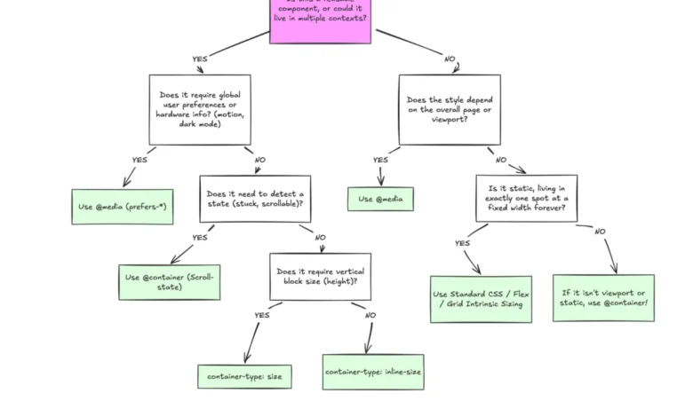
While powerful, container queries require a shift in architectural thinking. Developers must be wary of "infinite loop" scenarios, where an element attempts to query its own size, or where querying block (vertical) size leads to layout collapse. A container, by definition, must have its dimensions determined by its parent; if that parent is set to query its own height without explicit constraints, the browser may default to a height of zero.
Furthermore, current specifications prevent the use of custom properties (CSS variables) directly within a container query. This is a deliberate design choice by the W3C, intended to prevent the circular dependencies that could arise if a query were to trigger a change in a variable that the query itself depends on. Consequently, developers must use fixed or fluid units like cqi (container query inline-size) rather than relying on variables for breakpoints.

Case Study: Fluid Typography
The benefits of this transition are perhaps best illustrated by fluid typography. Traditionally, typography scaling has been tied to the viewport (vw units). While this works for the page as a whole, it fails when a component is moved to a container smaller than the page. By employing container-relative units like cqi alongside the clamp() function, developers can create text that scales proportionally to its immediate container. This ensures that a headline inside a small widget remains readable and visually balanced, even if the parent container’s width changes independently of the device’s viewport.
Future Outlook and Conclusion
The industry is currently at a turning point. As the web continues to favor modular, component-driven design, the reliance on viewport-based media queries will likely decrease. The transition to container queries is not merely a stylistic preference; it is a necessary evolution in web development practices.
To improve adoption, development teams should treat container queries as the standard for "micro-layouts"—the internal components of a site—while reserving media queries for "macro-layouts," such as the overall page structure, site-wide navigation, or global theme preferences. By decoupling component logic from the device’s physical screen size, developers can build more resilient, maintainable, and user-friendly digital experiences. As the ecosystem matures and more documentation becomes available, the "fear of the new" will likely give way to a more sophisticated understanding of these tools, eventually establishing container queries as a fundamental pillar of modern CSS. The future of responsive design is not found in the browser window, but within the containers themselves.