Heat Map Marketing Explained Your Guide
Heat map marketing explained unlocks the secrets to understanding your website visitors’ behavior. This guide delves into the world of heat maps, exploring how they reveal crucial insights into user interactions, from simple website navigation to landing page conversions. Learn how to interpret these visual representations of user activity to optimize your website design and marketing strategies for maximum impact.
From understanding the fundamental principles of heat maps to applying them to your specific marketing channels, this comprehensive overview provides a roadmap to harnessing the power of heat map data. We’ll cover everything from the different types of heat maps and how to collect and analyze the data to practical case studies demonstrating real-world successes.
Introduction to Heat Maps
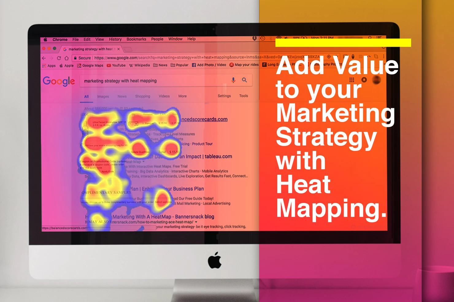
Heat maps are powerful visual tools in marketing that transform complex data into easily digestible insights. They highlight areas of high user engagement or interest on a website, app, or other digital platform. By visualizing user behavior, marketers can pinpoint effective elements and identify areas needing improvement, ultimately optimizing conversion rates and user experience.Understanding the principles behind heat maps is crucial for interpreting their findings accurately.
They work by assigning colors to different data points, with darker shades indicating higher activity or engagement. This visual representation allows marketers to quickly identify patterns and trends in user behavior, making data-driven decisions.
Different Types of Heat Maps
Heat maps come in various forms, each designed to highlight different aspects of user interaction. Click maps, for example, show the exact locations on a webpage where users clicked the most. Scroll maps visually depict how far down a page users typically scroll, revealing if the content is engaging enough to keep them scrolling. Another common type is the region heat map, where colors represent the overall user activity within a specific region of the page.
These types of heat maps help understand where users focus their attention, allowing marketers to improve their website design.
Key Metrics Measured by Heat Maps, Heat map marketing explained
Heat maps capture a range of crucial metrics to understand user behavior. These include click-through rates (CTR), scroll depth, time spent on a page, and even mouse movements. Understanding how users interact with your content is critical in identifying opportunities for improvement. For instance, a low click-through rate on a call-to-action button may suggest the button is not visible or clear enough.
Conversely, high scroll depth indicates users are engaged with the content and likely to convert. By examining these metrics, marketers can assess the effectiveness of their design and messaging.
Basic Structure of a Heat Map
Heat maps are typically presented as a visual representation of a webpage or app screen. The data points are colored according to the level of engagement or interaction. A simple table can illustrate this concept:
| Region A | Region B | Region C | |
|---|---|---|---|
| User Interaction | High (Dark Red) | Medium (Orange) | Low (Light Yellow) |
This table demonstrates a simplified representation. In a real-world heat map, the colors and intensity would be much more nuanced, providing a more detailed understanding of user behavior. For instance, the intensity of the red shade in Region A might represent a high concentration of clicks in that specific area. This kind of detailed information can be crucial in understanding user behavior and in optimizing the user experience.
Applications of Heat Maps
Heat maps are powerful tools that reveal patterns in user behavior, offering invaluable insights for optimizing websites and marketing campaigns. They provide a visual representation of user interactions, highlighting areas of high and low engagement. This visual clarity allows marketers and web designers to understand where users are clicking, scrolling, and spending the most time on a page, offering actionable data for improvements.By understanding user engagement patterns, businesses can fine-tune their websites and marketing efforts to maximize conversions and user satisfaction.
Heat maps help to identify areas of confusion or disinterest, enabling targeted adjustments to improve user experience and drive better results.
Website User Behavior Analysis
Heat maps provide a comprehensive view of user navigation on a website. By visualizing mouse movements, click patterns, and scroll depth, businesses gain a deeper understanding of how users interact with their site. This detailed understanding helps identify problematic areas, such as confusing navigation or poorly placed calls-to-action. For example, a heat map might reveal that users are consistently overlooking a crucial section of a product page, prompting a design change to improve visibility and user engagement.
Website Design Improvement
Heat maps offer valuable data for website design optimization. Identifying areas with low interaction rates allows for strategic changes to improve user experience. For instance, a heat map indicating a high concentration of clicks in a specific area might highlight a well-placed call-to-action button, while a lack of engagement in another area might point to a need for clearer navigation or more compelling content.
These insights allow for adjustments to site layout, content placement, and overall aesthetics, ensuring a more intuitive and engaging user experience.
Online Marketing Campaign Optimization
Heat maps can significantly enhance online marketing campaigns. By analyzing user interactions with marketing materials, such as landing pages or promotional emails, businesses can pinpoint areas where users engage most and least. This knowledge allows for the creation of targeted marketing messages, improved ad copy, and refined call-to-actions to resonate better with the target audience. For instance, a heat map of an email campaign could show that a particular section is receiving the least attention, suggesting changes to the layout or content to capture user interest.
Heat Maps and A/B Testing
Heat maps are highly valuable for A/B testing. By comparing user interactions on different versions of a website or marketing campaign element, heat maps can reveal which version resonates better with users. This allows for data-driven decisions on which design or message to prioritize, optimizing conversions and ROI. A/B testing combined with heat maps provides a powerful framework for continuous improvement in online marketing strategies.
Landing Page Performance Analysis
Analyzing landing page performance with heat maps reveals crucial user behavior insights. Visualizing click patterns, scroll depth, and mouse movements on landing pages helps identify sections that attract or repel users. For example, a landing page heat map might show a high concentration of mouse movements around a specific product image but a low interaction rate with the “add to cart” button.
This indicates that while the product is engaging, the call-to-action might need refinement.
Marketing Channel Performance Comparison
Analyzing marketing channel performance using heat maps allows for a visual comparison of user engagement across different channels. This allows for a comparative analysis of user interactions on various platforms (e.g., social media ads, email campaigns, search engine results pages). The visualization enables businesses to identify which channels are performing best in terms of user engagement and conversion rates.
| Marketing Channel | Engagement Rate | Conversion Rate | Average Session Duration |
|---|---|---|---|
| Social Media Ads | 85% | 15% | 2 minutes |
| Email Campaigns | 70% | 10% | 5 minutes |
| Search Engine Results Pages (SERPs) | 90% | 20% | 3 minutes |
This table illustrates a hypothetical comparison of marketing channel performance, highlighting the potential insights that heat maps can provide. Engagement rates, conversion rates, and average session durations can be dynamically visualized, offering a comprehensive overview of each channel’s effectiveness.
Data Collection and Analysis
Heat maps are powerful tools for understanding user behavior on websites and apps. But the insights they provide are only as good as the data they’re built on. Effective data collection and analysis are crucial steps in creating insightful and actionable heat maps. Careful consideration of data gathering methods, selection of appropriate tools, and effective interpretation techniques are paramount to achieving valuable results.
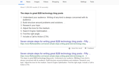
Heat map marketing shows you where website visitors are clicking and scrolling, revealing valuable insights into user behavior. Knowing where people interact most helps tailor your site for maximum impact. To ensure your Instagram presence complements your Facebook strategy, learning how to connect an Instagram account to a Facebook page here is crucial. This connection allows for seamless data sharing, optimizing your overall marketing approach, and ultimately improving the effectiveness of your heat map analysis.
Data Collection Methods
Understanding how users interact with your platform is fundamental to heat map analysis. Various methods can be used to gather the data required to create heat maps. Clickstream data, collected from user interactions like mouse movements, clicks, and scrolls, is a primary source. Eye-tracking technology provides detailed information on where users look on a page, offering a deeper understanding of visual attention.
Surveys and questionnaires can supplement these data sources, offering qualitative insights into user preferences and motivations. A combination of methods often yields the most comprehensive picture of user behavior.
Heat Map Creation Tools
Numerous tools are available for creating and analyzing heat maps. Some popular options include Hotjar, Crazy Egg, and Mouseflow. Hotjar, for example, offers comprehensive features, including heat maps, recordings of user sessions, and surveys. Crazy Egg provides a simpler interface with straightforward heat map generation capabilities. Mouseflow offers a robust platform with advanced features like session recordings and user behavior analysis.
Heat map marketing, basically, shows you where users click and scroll on your website. Understanding user engagement is key, and this data is super helpful for improving your email marketing strategy. For example, if your website visitors aren’t clicking the “Shop Now” button, then you can use this heat map data to improve your email subject lines and call-to-actions.
This directly relates to successful tips and strategies for email marketing, like A/B testing different subject lines to see what resonates best with your audience successful tips and strategies for email marketing. Ultimately, a better understanding of user behavior on your website will lead to more effective heat map marketing campaigns.
Choosing the right tool depends on your specific needs and budget.
Heat Map Interpretation Techniques
Interpreting heat map data requires a methodical approach. Analyzing patterns of user engagement, such as areas of high click density or prolonged dwell time, is essential. Combining heat map data with other metrics, like conversion rates and bounce rates, provides a more holistic view of user behavior. Identifying areas of low engagement or confusion allows for targeted improvements in design and user experience.
For example, a high concentration of clicks on a specific call-to-action button might indicate that it is clear and effective. Conversely, a lack of engagement in a particular section of a webpage could suggest a need for clearer navigation or more compelling content.
Heat map marketing reveals user behavior on your website, showing you exactly where visitors click and scroll. Understanding these patterns is crucial, and that’s where LinkedIn Showcase Pages come in handy. Knowing how to effectively set up and use your LinkedIn Showcase Page, as outlined in this guide on linked in showcase page insights important tips for setup , will help you target your audience more effectively.
Ultimately, these insights inform your heat map strategies, enabling you to optimize your website for maximum conversions.
Heat Map Visualization Methods
Different visualization methods present heat map data in various ways. Color-based heat maps, where darker colors indicate higher activity, are a common and intuitive approach. Click maps, highlighting areas where users clicked, provide a clear picture of interactive elements. Scroll maps visualize user scrolling patterns, revealing where users are engaging with content on a page. Choosing the appropriate visualization method depends on the specific insights you are seeking from the data.
Best Practices for Heat Map Data Analysis
To ensure reliable insights, adhering to best practices in heat map data analysis is crucial. Establish clear objectives for your analysis, defining what you want to learn from the heat map data. Consider the context of the data, ensuring that the heat map is analyzed within the broader context of user behavior and website performance. Always compare heat map data with other relevant metrics.
For instance, comparing click-through rates with scroll depth data can provide a more complete picture of user engagement. Finally, avoid drawing conclusions from isolated data points. Look for patterns and trends in the data to derive meaningful insights.
Comparison of Heat Map Tools
| Tool | Features | Pros | Cons |
|---|---|---|---|
| Hotjar | Heatmaps, session recordings, surveys, funnels, and more. | Comprehensive suite of features, detailed data. | Can be more expensive than simpler tools. |
| Crazy Egg | Heatmaps, scroll maps, and A/B testing. | Simple interface, good for quick analysis. | Fewer features compared to Hotjar. |
| Mouseflow | Heatmaps, session recordings, user behavior analysis. | Detailed recordings of user sessions. | More complex setup and use compared to other tools. |
Interpreting Heat Map Results: Heat Map Marketing Explained
Heat maps, with their visual representation of user engagement, offer valuable insights into website behavior. Understanding how to interpret these insights is crucial for optimizing user experience and driving conversions. This section delves into a structured approach to deciphering heat map data, focusing on identifying areas of high and low engagement, understanding user patterns, and translating findings into actionable improvements.Interpreting heat map data is not just about identifying hot spots; it’s about understandingwhy* those spots are hot.
A thorough analysis considers not only where users click but also how they move through the site, what elements attract their attention, and what might be deterring them from desired actions. By examining these patterns, website owners can identify areas needing improvement, leading to a more effective and user-friendly website.
Identifying High and Low Engagement Areas
Heat maps visually highlight areas of high and low interaction on a webpage. Areas with dense clusters of clicks, hovers, or scrolls indicate high engagement, suggesting these sections are likely well-designed and appealing to users. Conversely, areas with minimal interaction may signal issues such as confusing layouts, unattractive design elements, or irrelevant content. For example, if the “Sign Up” button receives few clicks, the heat map might show a lack of engagement in that area.
Understanding User Behavior Patterns
User behavior patterns gleaned from heat maps are invaluable for understanding user intent. For instance, if users frequently scroll down but don’t interact with content below the fold, this suggests the website needs a clearer way to guide them to valuable information. Similarly, if a user spends significant time hovering over a specific element, it could indicate confusion or a need for more information.
Recognizing these patterns helps in designing a site that better caters to user needs and expectations.
Actionable Steps for Website Improvement
Heat maps are not just visual tools; they’re catalysts for change. Armed with the insights from heat maps, website owners can make informed decisions about design and content improvements. For example, if a heat map reveals a high number of clicks on the “Contact Us” form, but low completion rates, it suggests a problem with the form itself, potentially complex fields or confusing instructions.
This highlights the need to streamline the process.
Common Mistakes in Heat Map Interpretation
A common mistake is attributing high interaction solely to visual appeal without considering other factors. A visually striking element might receive many clicks but not necessarily translate into desired conversions. Another error is over-generalizing based on limited data. Heat maps, while insightful, should be viewed in conjunction with other data sources. It’s essential to consider the overall user journey and not just isolated actions.
Translating Heat Map Data into Website Improvements
| Heat Map Data | Interpretation | Website Improvement |
|---|---|---|
| High Clicks on “Add to Cart” Button, Low Clicks on “Checkout” | Users are interested in products but face difficulty checking out. | Simplify the checkout process, provide clear instructions, and address any technical issues. |
| High Scrolling but Low Interaction with Footer Links | Users are not engaging with footer information. | Make footer links more prominent, place crucial links above the fold, or use a clearer call-to-action. |
| Hovering over “FAQ” but Low Clicks | Users are interested in information but unable to find it. | Ensure the FAQ is easily accessible and categorized effectively, and provide clear and concise answers. |
| High Clicks on a specific product page but low conversion rate | Users are interested in the product but may have concerns regarding pricing or availability. | Highlight product details, provide accurate pricing information, showcase availability, or use clear calls to action to address these concerns. |
Using Heat Maps for Optimization
Heat maps are invaluable tools for understanding user behavior on websites and marketing materials. Beyond simply visualizing user engagement, they offer a powerful pathway to optimize website design, enhance user experience, and ultimately boost conversion rates. By identifying areas of high and low engagement, marketers can strategically adjust elements to maximize impact and user satisfaction.
Optimizing Website Layout and Design
Heat maps provide clear visual representations of user interaction patterns. Areas of high mouse clicks, scrolls, and clicks on specific elements indicate user interest and engagement. By identifying these hotspots, designers can strategically place crucial elements, like call-to-action buttons or important product information, in high-traffic areas. Conversely, areas with little interaction can be redesigned or eliminated to improve user flow and reduce distractions.
For example, if a large portion of users are ignoring a particular section of the webpage, it might indicate a need to revise its content, layout, or presentation.
Optimizing Conversion Rates
Conversion rate optimization is a key application of heat map data. Heat maps can pinpoint exactly where users are abandoning the conversion process. If users are frequently clicking away from the purchase button or are not filling out forms, the heat map can reveal the problem area. For instance, if the heat map shows a significant amount of inactivity on a critical form field, it suggests that the field is confusing or poorly designed.
This data enables targeted adjustments, such as simplifying the form, providing clearer instructions, or strategically positioning the field.
Improving User Experience
Heat maps can reveal usability issues that may not be immediately apparent. Areas of the site where users tend to linger or get stuck often suggest areas for improvement in design or navigation. Identifying these bottlenecks enhances the overall user experience. Users are often naturally drawn to visually appealing and clear layouts. If heat maps indicate that users are avoiding certain sections, designers can adjust these sections to make them more user-friendly.
Incorporating Heat Map Data into Marketing Strategy
Heat maps offer insights into user preferences and behaviors, allowing for a more nuanced and data-driven marketing strategy. This involves adjusting content, imagery, and layout to match user engagement patterns. For example, if a specific advertisement receives little attention, the heat map data can help determine if the design, placement, or copy needs refinement. Incorporating this feedback into future campaigns can significantly increase the effectiveness of marketing efforts.
Evaluating the Impact of Changes
The effectiveness of changes implemented based on heat map analysis needs rigorous evaluation. Track key metrics such as conversion rates, bounce rates, and time spent on site before and after implementing changes. A/B testing is also a crucial tool in this process. By comparing data from different versions of a webpage, marketers can gain a clearer picture of which changes yielded the desired results.
Steps in Optimization Process
| Step | Action | Expected Outcome |
|---|---|---|
| 1 | Gather heat map data from the website. | Visual representation of user interactions. |
| 2 | Identify areas of high and low engagement. | Pinpoint user preferences and potential problems. |
| 3 | Develop hypotheses for potential improvements. | Create actionable suggestions based on insights. |
| 4 | Implement changes based on hypotheses. | Modify website layout, content, and design. |
| 5 | Re-collect heat map data after changes. | Measure the impact of the changes. |
| 6 | Analyze the new heat map data. | Assess whether the changes improved user experience. |
| 7 | Iterate on changes based on analysis. | Refine optimization strategies for continued improvement. |
Case Studies and Examples
Heat maps, when used strategically, can unlock valuable insights into user behavior and preferences. Understanding how users interact with a website or application can lead to significant improvements in design, conversion rates, and overall user experience. Real-world examples demonstrate the power of heat maps in driving tangible results for various businesses.
E-commerce Success with Heat Maps
E-commerce businesses can use heat maps to optimize product pages, checkout processes, and overall site navigation. A clothing retailer, for example, noticed a high concentration of mouse clicks on the “Add to Cart” button, but a significant number of users weren’t completing the purchase. By using heat maps to analyze the user journey, they identified a “drop-off” point at the shipping and payment pages.
This indicated that the payment process was confusing or lacked clarity. Improving the payment flow, guided by heat map data, resulted in a 15% increase in conversion rates.
Analyzing Website Navigation
Heat maps reveal patterns in user navigation, pinpointing areas of high or low engagement. A blog website noticed that users were spending less time on the “About Us” page than expected. Analyzing the heat map, they discovered that the page’s layout was cluttered, and the information wasn’t easily digestible. They redesigned the page, incorporating clearer visuals and a more concise narrative.
This redesign resulted in a 20% increase in time spent on the “About Us” page, suggesting improved user engagement.
Optimizing Mobile App Design
Mobile applications can also benefit from heat map analysis. A food delivery app observed that users were frequently tapping on the “Search” bar but then abandoning the search process. Heat maps identified that the search results were not visually appealing and the filters were difficult to use. Improving the search results layout and the filter options, guided by heat map data, resulted in a 10% increase in order placements.
Table of Successful Case Studies
| Case Study | Problem Solved | Heat Map Application | Outcome |
|---|---|---|---|
| E-commerce Retailer | High click-through rate on “Add to Cart” but low conversion rate. | Analyzing user journey on checkout pages. | 15% increase in conversion rates. |
| Blog Website | Users spending little time on “About Us” page. | Identifying layout issues and improving content presentation. | 20% increase in time spent on the “About Us” page. |
| Food Delivery App | Users frequently tapping “Search” but abandoning the search process. | Analyzing search results and filter options. | 10% increase in order placements. |
Future Trends in Heat Map Marketing
Heat maps have become an indispensable tool for marketers, providing valuable insights into user behavior on websites and applications. As technology advances, so too will the capabilities of heat maps, promising even more sophisticated and impactful data analysis for future marketing strategies. This evolution is fueled by the increasing need for personalized experiences and the ongoing quest to optimize user journeys.The future of heat map marketing hinges on the ability to integrate data from multiple sources, providing a more holistic view of user behavior.
This comprehensive understanding will enable more effective targeting, personalization, and ultimately, better conversion rates. Furthermore, the integration of AI will propel heat map analysis to new heights, enabling proactive predictions and adjustments to marketing campaigns in real-time.
Emerging Heat Map Technology
Heat maps are evolving beyond simple visual representations of user engagement. Advanced technologies are allowing for more nuanced data collection and analysis. For instance, heat maps are increasingly incorporating eye-tracking data, providing a deeper understanding of user attention and focus. Furthermore, the integration of machine learning algorithms is allowing for more sophisticated modeling of user behavior, enabling predictions about future user actions.
This detailed analysis will help marketers proactively adjust their strategies to optimize user experience.
Applications of Heat Maps in the Future
Heat maps will continue to be valuable tools for understanding user behavior across a multitude of digital platforms. Beyond website optimization, they will play a crucial role in optimizing mobile app design, improving user engagement in social media campaigns, and enhancing the overall user experience across various touchpoints. This broad applicability will allow marketers to make data-driven decisions that impact every aspect of the user journey.
Data Collection and Analysis Advancements
Future heat map technology will leverage a broader range of data sources, including browser history, social media interactions, and even real-time location data. This will enable more comprehensive and detailed analyses of user behavior, enabling a more granular understanding of user motivations and preferences. This advanced data collection will empower marketers to personalize experiences in ways previously unimaginable.
Integration with Other Marketing Technologies
Heat maps will seamlessly integrate with other marketing technologies, such as CRM systems and marketing automation platforms. This integration will enable a more comprehensive view of the customer journey, allowing marketers to track user interactions across multiple channels and personalize experiences at each touchpoint. This unification of data will help businesses understand the entire customer lifecycle and optimize engagement at every stage.
Impact of Artificial Intelligence on Heat Map Analysis
Artificial intelligence will play a pivotal role in improving heat map analysis. AI-powered algorithms can identify patterns and trends in user behavior that might be missed by traditional methods. Furthermore, AI can be used to predict future user behavior, allowing marketers to proactively adapt their strategies and optimize campaigns in real-time. This proactive approach to marketing will improve efficiency and yield significant return on investment.
Potential Future Trends and Implications
| Future Trend | Implications for Marketers ||—|—|| Enhanced Data Collection | More comprehensive understanding of user behavior, leading to highly targeted marketing campaigns. || AI-powered Heat Map Analysis | Proactive adjustments to marketing strategies, real-time optimization, and improved ROI. || Integration with Other Marketing Tools | Holistic view of the customer journey, personalized experiences across all touchpoints. || Personalized Heat Maps | Tailored insights for individual users or segments, allowing for highly customized marketing strategies.
|| Real-time Heat Map Analysis | Immediate feedback on campaign effectiveness, allowing for dynamic adjustments and optimization. || Immersive Heat Map Visualization | More intuitive understanding of complex user behaviors, providing actionable insights. |
Final Thoughts
In conclusion, heat map marketing explained offers a powerful tool for optimizing website design, improving user experience, and boosting conversion rates. By understanding user behavior through heat maps, you can refine your marketing strategies and drive meaningful results. This detailed guide provides the knowledge and tools you need to effectively utilize heat maps for your specific needs.