Performance Based Marketing CPA and CPL A Deep Dive
Performance based marketing CPA and CPL sets the stage for understanding how to effectively measure and optimize marketing campaigns. This involves scrutinizing the intricacies of Cost Per Acquisition (CPA) and Cost Per Lead (CPL) models, which are crucial for driving profitable results. We’ll explore the fundamental differences between these models, delve into optimizing strategies for each, and provide insights on choosing the right model for your business objectives.
Understanding the nuances of performance metrics is vital for achieving optimal campaign results.
This comprehensive guide will walk you through the essentials of performance-based marketing, including its core principles, common KPIs, and the practical application of CPA and CPL models. We’ll discuss the intricacies of conversion tracking, landing page optimization, lead generation, and nurturing, along with detailed comparisons of the two models. We’ll also look at the tools and technologies needed to effectively track and manage campaigns, culminating in best practices for consistent success.
Introduction to Performance-Based Marketing
Performance-based marketing is a powerful approach to advertising that focuses entirely on measurable results. Unlike traditional marketing methods that often rely on broad reach and brand building, performance-based marketing prioritizes delivering a specific outcome, such as a sale or a lead. This direct link to tangible results makes it a highly attractive and effective strategy for businesses looking to maximize their return on investment (ROI).The core principle of performance-based marketing is its outcome-driven nature.
It shifts the focus from simply promoting a brand to demonstrating a direct and measurable impact on key business objectives. This contrasts sharply with traditional marketing approaches that may not directly correlate ad spend with tangible results, such as brand awareness campaigns. Instead, performance-based marketing metrics are precisely defined, enabling businesses to measure and optimize campaigns for better results.
Key Performance Indicators (KPIs)
Performance-based marketing heavily relies on tracking and analyzing specific KPIs. These KPIs provide insights into campaign effectiveness, allowing for adjustments and optimization. Common KPIs include conversion rates, click-through rates (CTR), cost per acquisition (CPA), cost per lead (CPL), and return on ad spend (ROAS). Tracking these metrics is crucial for understanding the performance of campaigns and making data-driven decisions.
Performance-Based Marketing Models
Several performance-based marketing models exist, each focusing on a specific outcome. These models are crucial for tailoring campaigns to match specific business objectives. Two prominent models are Cost Per Acquisition (CPA) and Cost Per Lead (CPL). The choice of model depends on the specific business goals and target audience.
Cost Per Acquisition (CPA) vs. Cost Per Lead (CPL)
| Metric | Cost Per Acquisition (CPA) | Cost Per Lead (CPL) |
|---|---|---|
| Definition | The cost incurred by an advertiser for each successful conversion (e.g., a sale, a completed registration). | The cost incurred by an advertiser for each lead generated (e.g., a form submission, a phone call). |
| Focus | Driving revenue and sales. | Building a prospect list and nurturing leads for future conversions. |
| Success Measurement | Number of sales and revenue generated. | Number of leads collected and qualified. |
| Strengths | Directly tied to revenue; clear ROI; incentivizes high-quality conversions. | Efficient for building a sales pipeline; less expensive than CPA, allows for lead nurturing. |
| Weaknesses | Can be more expensive than CPL; requires a higher conversion rate; more challenging to optimize. | May not directly translate to revenue; requires lead nurturing efforts to drive conversions; difficulty in tracking the entire sales funnel. |
CPA and CPL models are vital for performance-based marketing, each serving a distinct purpose. Choosing the right model hinges on the business’s specific objectives and the desired outcome.
CPA (Cost Per Acquisition) Model
The CPA model, or Cost Per Acquisition, is a performance-based marketing model where advertisers pay a publisher only when a specific action, like a sale or lead generation, is successfully completed. This direct correlation between payment and results makes it a highly attractive option for businesses seeking to maximize their return on investment (ROI). Unlike other models, CPA focuses solely on conversions, making it a valuable tool for evaluating the effectiveness of marketing efforts.CPA campaigns are designed to drive specific actions, from online purchases to form submissions.
This direct focus on conversions ensures advertisers are only paying for demonstrably successful interactions, unlike models where ad impressions or clicks are the basis of payment. The CPA model is particularly valuable for businesses with high-value products or services where each conversion is a significant financial transaction.
How CPA Works in Detail
CPA works by linking an advertiser’s payment to a desired user action, such as completing a purchase, signing up for a newsletter, or downloading a resource. The publisher is paid only when a user performs the specific action. For instance, if an e-commerce company sets a CPA of $25 for a new customer signup, they’ll only pay the publisher $25 when a user successfully registers and becomes a paying customer.
This contrasts with other models where the advertiser pays for clicks or views, regardless of conversions.
Real-World Examples of CPA
A travel agency might pay a travel blog a CPA of $50 for each booking made through a specific affiliate link. A software company could pay a CPA of $100 for each trial signup that leads to a paid subscription. These examples showcase the wide range of applications for the CPA model across different industries.
Performance-based marketing, focusing on CPA (Cost Per Acquisition) and CPL (Cost Per Lead), is crucial for tracking ROI. A great alternative to the cluttered ad-filled search landscape is ad free search engine neeva , which offers a cleaner experience. Ultimately, this approach allows for more focused marketing campaigns and better measurement of performance in the long run, especially when comparing performance based marketing strategies.
Strategies for Optimizing CPA Campaigns
Effective CPA campaigns hinge on several crucial strategies.
- Targeting: Precise targeting is paramount. Identifying the ideal customer profile based on demographics, interests, and online behavior significantly boosts conversion rates. This ensures ads are seen by users most likely to perform the desired action. For instance, targeting potential homebuyers in a specific region with ads for mortgage lenders would likely yield higher conversion rates compared to a broader, less specific target audience.
- Bidding: Optimal bidding strategies are crucial for maximizing return. Competitive bidding, where bids are adjusted based on real-time market conditions, ensures that the advertiser’s ads remain visible to the most relevant users. This often involves using automated bidding systems that continuously analyze and adjust bids to ensure optimal performance.
- Ad Copy: Persuasive ad copy is key. Compelling headlines, clear calls to action, and concise messaging can significantly increase click-through rates and conversions. For example, instead of simply saying “Buy now,” a well-crafted ad copy might read, “Secure your dream home with our exclusive mortgage offers. Get started today!”
Importance of Conversion Tracking in CPA Campaigns
Accurate conversion tracking is essential for assessing the success of a CPA campaign. Without robust tracking, it’s impossible to determine which marketing channels and strategies are yielding the best results. Tools that measure the number of conversions, the cost per conversion, and the overall ROI of the campaign are indispensable for optimizing future campaigns.
Role of Landing Pages in Influencing CPA Performance
Landing pages play a pivotal role in driving conversions. A well-designed landing page should be user-friendly, visually appealing, and directly focused on the desired action. This means clear calls to action, concise information, and a streamlined user experience. For instance, a landing page designed to collect email addresses should have a prominent sign-up form, concise explanation of the benefits of joining, and clear terms and conditions.
Common CPA Campaign Challenges and Solutions
| Challenge | Solution |
|---|---|
| High cost per acquisition | Refine targeting, optimize ad copy, A/B test landing pages, and explore alternative marketing channels. |
| Low conversion rates | Improve landing page design, enhance ad copy, and refine targeting to reach a more receptive audience. |
| Poor conversion tracking | Implement robust conversion tracking tools, accurately define conversion goals, and ensure data integrity. |
| Competition for ad space | Increase bids strategically, utilize advanced targeting options, and focus on unique selling propositions. |
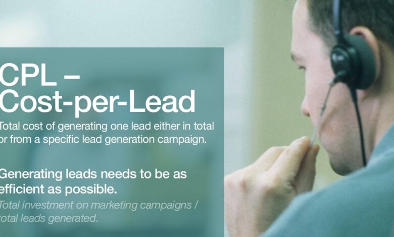
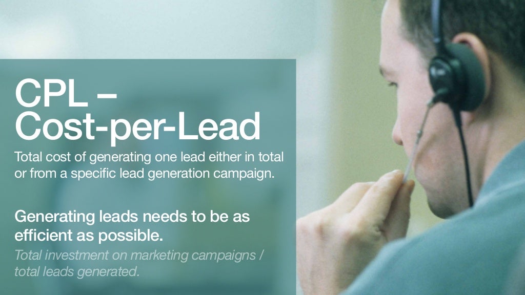
CPL (Cost Per Lead) Model
The Cost Per Lead (CPL) model is a performance-based marketing metric that focuses on generating leads rather than direct sales. This model is particularly valuable for businesses aiming to build their customer base and nurture potential clients over time. Understanding CPL is crucial for optimizing marketing spend and achieving maximum return on investment (ROI) in lead generation campaigns.The CPL model measures the cost associated with acquiring a single lead.
Performance-based marketing, focusing on metrics like CPA and CPL, is all about getting the most bang for your buck. A great example of optimizing those metrics is the SEO and CRO case study, seo cro case study increase new users , showcasing how strategic improvements can directly impact new user acquisition. Ultimately, understanding these strategies is key to successful performance-based marketing campaigns.
This differs significantly from the Cost Per Acquisition (CPA) model, where the focus is on the total cost to complete a sale. In CPL campaigns, the emphasis is on building a qualified list of potential customers who can then be nurtured into paying customers through further marketing efforts. For example, a company might offer a free trial or a downloadable resource in exchange for contact information, and the cost to acquire that lead would be tracked.
How CPL Works
The CPL model essentially tracks the cost incurred for each qualified lead generated through a marketing campaign. It calculates the total cost of the campaign divided by the total number of leads acquired. For instance, if a marketing campaign costs $10,000 and generates 5,000 leads, the CPL is $2.00. This metric helps businesses evaluate the effectiveness of their lead generation strategies and make necessary adjustments to maximize their return on investment.
Significance of Lead Generation in CPL Campaigns
Lead generation is paramount in CPL campaigns. A robust lead generation strategy ensures a continuous influx of qualified prospects, driving future sales and revenue. High-quality leads are crucial to the success of CPL campaigns, as they are more likely to convert into paying customers. A well-structured lead generation process is essential for building a strong pipeline of potential customers who can be nurtured over time.
For example, if a company runs a CPL campaign for a webinar, the leads generated represent a potential customer base who can be targeted for future products or services.
Strategies to Increase Lead Quality and Quantity
Several strategies can be employed to enhance both the quality and quantity of leads in a CPL campaign. These include:
- Targeted Advertising: Focusing advertising efforts on specific demographics and interests will attract prospects who are more likely to be interested in the offered products or services. For instance, running ads on platforms frequented by a target audience can help identify and attract the most relevant leads.
- High-Value Incentives: Offering compelling incentives, such as exclusive discounts or early access to new products, can encourage more prospects to provide their contact information. A strong incentive, like a substantial discount on a new product, could significantly increase lead volume and quality.
- Compelling Content: Creating engaging and valuable content, such as informative blog posts or downloadable resources, can attract a larger pool of potential customers. High-quality content can attract the attention of the target audience, increase engagement, and enhance lead generation.
Importance of Lead Nurturing in the CPL Model
Lead nurturing is critical in the CPL model. Nurturing involves engaging with leads through various touchpoints to guide them through the sales funnel. This includes sending targeted emails, providing helpful resources, and connecting with leads on social media platforms. Effective lead nurturing increases the chances of converting leads into paying customers, thereby maximizing the return on investment (ROI) from the CPL campaign.
Metrics to Evaluate CPL Campaign Effectiveness
Several key metrics are crucial for evaluating the success of a CPL campaign. These metrics include:
- CPL: The cost incurred per lead generated, as previously discussed. Tracking this metric helps identify areas for improvement and optimize campaign performance.
- Conversion Rate: The percentage of leads that convert into paying customers. Monitoring this rate is vital to understanding the effectiveness of nurturing efforts.
- Customer Lifetime Value (CLTV): The predicted revenue a customer will generate throughout their relationship with the company. A high CLTV indicates a successful CPL campaign.
CPA vs. CPL Models
| Feature | CPA Model | CPL Model |
|---|---|---|
| Focus | Direct sales conversion | Lead generation |
| Metrics | Cost per acquisition, conversion rate, ROI | Cost per lead, conversion rate, customer lifetime value |
| Goal | Maximize revenue from sales | Build a qualified lead pool for future sales |
| Timeframe | Short-term, focused on immediate sales | Long-term, focused on building a customer base |
Choosing the Right Model (CPA vs. CPL)
Deciding between Cost Per Acquisition (CPA) and Cost Per Lead (CPL) models is crucial for optimizing your performance-based marketing campaigns. Each model offers unique advantages and disadvantages, influencing your return on investment (ROI) and campaign effectiveness. Understanding the factors that differentiate these models is key to selecting the best approach for your specific business goals.The fundamental difference lies in the point at which you’re charged.
CPA models pay for tangible results – a completed sale or conversion. CPL models, on the other hand, pay for generating potential customers, or leads, regardless of whether they ultimately convert. This distinction has significant implications for campaign design, target audience, and anticipated ROI.
Factors to Consider When Choosing Between CPA and CPL
Several factors play a critical role in determining the optimal model for your campaign. These include the nature of your product or service, your target audience, and your marketing objectives. Understanding the nuances of each model allows you to align your marketing strategies effectively.
- Product/Service Complexity: Complex products or services often require nurturing leads through multiple touchpoints before conversion. In these cases, a CPL model might be more appropriate to generate qualified leads. For instance, a software company offering a complex product might utilize CPL campaigns to identify and qualify potential clients who have expressed interest through webinars or online assessments.
- Target Audience Characteristics: A campaign targeting a highly engaged and ready-to-purchase audience might benefit from a CPA model, where immediate conversions are prioritized. Conversely, a campaign aimed at a broader, less engaged audience might find CPL more suitable to identify and engage potential customers.
- Marketing Objectives: If the primary objective is driving immediate sales, CPA might be the preferred model. If the objective is to build brand awareness and generate a substantial lead pool, CPL might be more appropriate.
- Budget Constraints: The budget available for your campaign is a crucial factor. If the budget is limited, a CPL model could be a more cost-effective approach to identify leads at a lower cost per lead.
Comparing Potential ROI
The ROI potential of CPA and CPL models varies significantly depending on the campaign’s effectiveness and conversion rates. A CPA model typically offers a higher ROI when conversions are highly likely. However, a CPL model can yield a higher ROI in the long run if it successfully nurtures leads into paying customers.
A successful CPL campaign, coupled with a robust sales funnel, can lead to significantly higher ROI over time.
Situations Where Each Model Might Be More Suitable
The choice between CPA and CPL depends on the specific situation.
- CPA is generally better suited for: Products or services with a high perceived value, a low cost of acquisition, or a high conversion rate. Examples include high-ticket items like luxury cars or premium software.
- CPL is more appropriate for: Products or services with a longer sales cycle, a lower cost of acquisition, or a broader target audience. For example, lead generation for a real estate agency targeting first-time homebuyers.
Analyzing Data for Model Selection
Thorough analysis of campaign data is essential for informed decisions. Key metrics to track include conversion rates, cost per acquisition, and cost per lead.
- Conversion Rate Analysis: High conversion rates suggest a strong fit with the CPA model, while lower conversion rates might indicate a need for a CPL approach.
- Cost Per Acquisition (CPA) Tracking: Monitoring CPA helps understand the cost of acquiring a customer. Lower CPA values are generally favorable.
- Cost Per Lead (CPL) Monitoring: Tracking CPL provides insights into the cost of generating a potential customer. Lower CPL values are generally desirable.
Typical Target Audience for CPA and CPL Campaigns
| Campaign Model | Target Audience |
|---|---|
| CPA | Highly engaged, ready-to-purchase audience. Customers with a demonstrated need for the product or service. |
| CPL | Broader audience, potentially less engaged. Individuals expressing interest in a product or service but not yet ready to purchase. |
Tools and Technologies for Performance-Based Marketing
Performance-based marketing relies heavily on sophisticated tools to track, manage, and optimize campaigns. These tools automate many tedious tasks, enabling marketers to focus on strategy and maximizing return on investment (ROI). Effective tools provide real-time insights into campaign performance, allowing for quick adjustments and improvements. This section delves into the essential tools and technologies driving successful performance-based campaigns.
Key Tracking and Management Tools
Performance-based marketing campaigns necessitate precise tracking and management to ensure efficiency and effectiveness. A variety of tools provide comprehensive solutions for campaign monitoring, from ad creation and placement to conversion tracking. These tools offer a centralized platform to analyze various data points, leading to informed decisions and adjustments.
- Advertising Platforms: Platforms like Google Ads, Bing Ads, and social media advertising platforms (Facebook Ads, Instagram Ads, etc.) offer robust tools for campaign creation, management, and performance tracking. These platforms often provide detailed analytics, including click-through rates (CTR), conversion rates, and cost per acquisition (CPA). The platforms often allow for A/B testing different ad creatives, targeting parameters, and bidding strategies to optimize campaign performance.
For example, a campaign manager can test different ad copy variations to see which performs best, leading to improved conversions.
- Conversion Tracking Pixels/Tags: Conversion tracking pixels or tags are crucial for accurately measuring conversions. These tools, often integrated with advertising platforms, track user actions on websites or mobile apps that signify a conversion, such as a purchase, sign-up, or lead submission. Precise conversion tracking is essential for accurate performance calculations and for understanding which marketing channels are driving the most valuable results.
- Marketing Automation Platforms: These platforms (e.g., HubSpot, Marketo, Pardot) automate repetitive marketing tasks, such as email marketing, lead nurturing, and social media posting. They often integrate with other performance-based marketing tools, providing a holistic view of campaign performance and customer journeys. Automation can streamline processes, freeing up marketers’ time to focus on strategic initiatives.
Automation Features and Integration
Automation is a key component of modern performance-based marketing. Tools integrate to streamline processes, allowing for real-time adjustments and optimized campaign management. For example, if a particular ad copy performs exceptionally well, automated tools can dynamically allocate more budget to that ad, maximizing its impact.
- Automated Bidding Strategies: Tools like those in Google Ads allow for automated bidding strategies, optimizing bids in real-time based on performance data. This can significantly reduce manual effort and often improve campaign ROI.
- Real-time Reporting and Analytics: Advanced tools provide real-time dashboards and reports, enabling marketers to monitor key performance indicators (KPIs) and make data-driven decisions quickly. Real-time insights are crucial for responding to campaign fluctuations and adjusting strategies.
- API Integrations: Many performance-based marketing tools integrate via Application Programming Interfaces (APIs), enabling seamless data exchange between different platforms. This consolidated data stream provides a comprehensive view of campaign performance across various channels.
Optimizing Campaign Performance with Tools
Utilizing these tools effectively involves understanding their functionalities and features. This involves tracking campaign performance metrics, identifying areas for improvement, and making informed adjustments to the strategy.
- A/B Testing: Tools facilitate A/B testing different ad creatives, targeting options, and landing pages to optimize campaign performance. This iterative approach helps identify the most effective versions and improve conversions.
- Budget Allocation: Based on performance data, tools can dynamically adjust budget allocation across different campaigns or ad groups. This ensures resources are directed toward the most profitable channels.
- Audience Segmentation: Tools enable precise audience segmentation, allowing marketers to tailor campaigns to specific demographics, interests, and behaviors. Targeted messaging is essential for maximizing engagement and conversions.
Top Performance-Based Marketing Tools
| Tool | Key Features |
|---|---|
| Google Ads | Campaign management, research, bidding strategies, A/B testing, detailed reporting |
| Facebook Ads | Targeted advertising, audience insights, campaign optimization, conversion tracking |
| Bing Ads | Search advertising, audience targeting, campaign management, reporting |
| HubSpot | Marketing automation, CRM, lead nurturing, sales tracking, reporting |
| Marketo | Marketing automation, lead management, email marketing, customer journey management, analytics |
Campaign Measurement and Analysis: Performance Based Marketing Cpa And Cpl
Performance-based marketing relies heavily on meticulous tracking and analysis of campaign data. Understanding how your campaigns are performing is crucial for optimizing strategies, identifying areas for improvement, and maximizing ROI. This process allows marketers to refine their approach, ensuring future campaigns are more effective and profitable.
Methods for Tracking and Analyzing Campaign Performance Data
Campaign performance data is a wealth of information, providing insights into user behavior and campaign effectiveness. Effective tracking methods involve using a combination of tools and techniques. A critical step is setting up clear, measurable goals for each campaign. These goals are often tied to specific KPIs like conversion rates, click-through rates, or cost-per-acquisition. Tracking these metrics allows for a comprehensive view of campaign performance, enabling you to monitor progress and make necessary adjustments.
Tools like Google Analytics and dedicated marketing platforms provide the necessary infrastructure for tracking user interactions with your campaigns.
Data Visualization Techniques for Performance Analysis, Performance based marketing cpa and cpl
Visualizing campaign performance data is crucial for quickly identifying trends and patterns. Data visualization techniques, such as charts and graphs, transform complex data into easily digestible formats. Bar graphs can effectively display the performance of different ad groups or variations, highlighting which are performing better than others. Line graphs are ideal for tracking the progress of a campaign over time, showcasing fluctuations in key metrics like conversion rates or click-through rates.
Pie charts illustrate the distribution of conversions across different channels or sources, revealing where your most valuable leads are coming from. Interactive dashboards offer a comprehensive view of campaign performance, allowing for real-time monitoring and analysis.
Interpreting Data Insights to Identify Areas for Improvement
Analyzing campaign performance data provides actionable insights. Identifying areas for improvement is a crucial aspect of refining your marketing strategy. High bounce rates from a particular landing page, for example, could indicate a need for optimization. A low conversion rate on a specific ad group might suggest the need for refining the ad copy or targeting. Tracking and analyzing user behavior on your landing pages, such as which pages are being abandoned, can provide valuable insights into what aspects of your funnel need improvement.
Performance-based marketing, focusing on CPA and CPL, is all about getting the most bang for your buck. But to truly optimize those metrics, you need to understand how to leverage cross-channel audiences for hyper-improved targeting, like in this guide how to leverage cross channel audiences for hyper improved targeting. By precisely targeting the right people across various channels, you can significantly increase your conversion rates and ultimately drive down your CPA and CPL costs, making your performance-based marketing strategy even more profitable.
A thorough understanding of customer journey and user interaction allows you to refine and optimize each step for better results.
Refining Strategies for Future Campaigns
Data-driven insights are essential for optimizing future campaigns. Analyzing data from past campaigns helps in developing more effective strategies for future efforts. If a particular ad creative consistently performed well, it can be used as a template for future ads. Data from successful campaigns can provide valuable learnings and insights into what works best for your target audience, allowing for a more strategic approach.
If a particular channel is not generating leads, you can strategically reduce your investment in that channel and allocate resources to channels performing better. Understanding your audience is key to crafting effective campaigns.
Metrics for Measuring Campaign Success
| Metric | Description | Importance |
|---|---|---|
| Conversion Rate | Percentage of visitors who complete a desired action (e.g., purchase, sign-up). | Crucial for measuring campaign effectiveness in driving desired outcomes. |
| Click-Through Rate (CTR) | Percentage of impressions that result in a click. | Indicates the effectiveness of ad copy and targeting. |
| Cost Per Acquisition (CPA) | Cost incurred to acquire a customer. | Key metric for evaluating the profitability of campaigns. |
| Cost Per Lead (CPL) | Cost incurred to generate a lead. | Important for campaigns focused on lead generation. |
| Return on Ad Spend (ROAS) | Ratio of revenue generated to ad spend. | Crucial for evaluating the profitability of campaigns and for calculating return on investment. |
| Average Order Value (AOV) | Average value of orders placed. | Important for understanding the average revenue generated per customer. |
Best Practices for Success

Performance-based marketing campaigns thrive on a foundation of meticulous planning, strategic execution, and ongoing optimization. Successful campaigns are not a one-and-done affair; they require continuous monitoring, adaptation, and a willingness to pivot based on real-time data. A/B testing, consistent analysis, and adaptability are cornerstones of achieving desired outcomes in this dynamic environment.
Achieving Desired Outcomes
Achieving desired outcomes in performance-based campaigns necessitates a multifaceted approach. Understanding the target audience, defining clear objectives, and meticulously tracking progress are paramount. The selection of the appropriate KPI’s (Key Performance Indicators) directly impacts the success of the campaign. For instance, focusing solely on clicks without considering conversions might lead to a false sense of success if the conversion rate remains low.
Importance of A/B Testing
A/B testing is crucial for optimizing performance-based campaigns. By systematically testing different variations of ads, landing pages, and other marketing materials, marketers can identify the elements that resonate most strongly with the target audience. This iterative process of experimentation allows for continuous refinement and improvement of campaign performance. For example, testing different headlines, call-to-actions, or images on a landing page can significantly impact conversion rates.
Importance of Consistent Monitoring and Analysis
Consistent monitoring and analysis of performance data is essential for maintaining a healthy campaign. Regularly reviewing key metrics, such as click-through rates (CTR), conversion rates, and cost-per-acquisition (CPA), allows marketers to identify trends, pinpoint areas for improvement, and make necessary adjustments in real-time. Tools like Google Analytics provide invaluable insights into user behavior and campaign performance, facilitating informed decision-making.
Adapting to Changing Market Conditions and Trends
The digital marketing landscape is constantly evolving. Market conditions and trends can shift rapidly, impacting campaign performance. Marketers must stay informed about these changes and be prepared to adapt their strategies accordingly. This includes staying abreast of new technologies, platforms, and audience preferences. For instance, the emergence of new social media platforms or changes in search engine algorithms necessitates a flexible approach to maintain campaign effectiveness.
Key Best Practices for Performance-Based Marketing
| Best Practice | Description |
|---|---|
| Clearly Defined Objectives | Establish specific, measurable, achievable, relevant, and time-bound (SMART) goals. |
| Thorough Audience Research | Deeply understand the target audience’s needs, preferences, and online behavior. |
| Strategic Budget Allocation | Allocate budget effectively across different channels and campaigns based on projected ROI. |
| Comprehensive A/B Testing | Systematically test variations of marketing materials to optimize performance. |
| Continuous Monitoring & Analysis | Regularly track key performance indicators and identify areas for improvement. |
| Adaptability to Market Trends | Remain flexible and responsive to changes in market conditions and emerging trends. |
Final Thoughts
In conclusion, mastering performance-based marketing, particularly CPA and CPL, empowers businesses to drive measurable results and optimize marketing investments. Choosing the right model and utilizing the appropriate tools are crucial steps in achieving profitability. This detailed analysis of CPA and CPL models provides a roadmap for strategic decision-making and campaign optimization. Remember that consistent monitoring and adaptation to market trends are key to long-term success in performance-based marketing.