
Mobile Subdomain SEO A Comprehensive Guide
Mobile subdomain seo – Mobile subdomain is crucial for a successful mobile strategy. This in-depth guide explores the intricacies of structuring, optimizing, and measuring the performance of a dedicated mobile subdomain. From technical to content strategy, we’ll cover everything you need to know to boost your mobile site’s visibility and user experience.
Understanding mobile-first indexing and its implications for your subdomain is key. We’ll also dive into best practices for creating mobile-friendly content, optimizing for specific queries, and handling redirects and canonicalization. Learn how to craft a compelling content strategy and implement technical strategies to ensure your mobile subdomain performs well in search results.
Mobile Subdomain Structure and Design
Optimizing mobile websites for search engines and user experience is crucial in today’s digital landscape. A well-structured mobile subdomain plays a vital role in achieving this. This section delves into various approaches to mobile subdomain design, exploring their impact on , user experience, and performance.A thoughtfully crafted mobile subdomain can significantly improve a website’s mobile-first approach. It allows for specialized content and design tailored to mobile devices, ultimately leading to enhanced user satisfaction and improved search engine rankings.
Mobile Subdomain Approaches
Different strategies exist for implementing mobile subdomains. Understanding the nuances of each approach is essential for selecting the best fit for a specific website.
- Separate Subdomain: A dedicated subdomain, such as m.example.com, caters specifically to mobile users. This approach often allows for customized design and functionality. It separates mobile-specific content from the desktop version, providing a dedicated experience for mobile users.
- Subdirectory: A subdirectory, such as example.com/mobile, houses mobile-optimized content within the existing website structure. This approach often integrates seamlessly with the existing website and is a simpler implementation compared to a separate subdomain.
Comparison of Approaches
The table below compares and contrasts separate subdomains and subdirectories, considering crucial factors for mobile website optimization.
| Feature | Separate Subdomain (e.g., m.example.com) | Subdirectory (e.g., example.com/mobile) |
|---|---|---|
| URL Structure | Distinct domain, potentially shorter URLs | Part of existing domain, longer URLs |
| Implications | Can potentially benefit from separate indexing, allowing for mobile-specific optimization. | Content can be optimized, but may face challenges in separating indexing from the desktop site. |
| User Experience | Can provide a distinct and optimized mobile experience. | Can be integrated into the existing user experience, but may not be as easily distinguishable. |
| Development Effort | May require more development effort initially | Potentially easier to implement and maintain. |
| Maintenance | Requires separate content updates and maintenance | Content updates are managed with the existing website |
Role of Subdomains in Performance and User Experience
Subdomains play a critical role in enhancing mobile website performance and user experience. A dedicated mobile subdomain enables specialized design choices that enhance responsiveness. Mobile-first design principles, such as optimized images and faster loading times, are facilitated by dedicated mobile subdomains. This results in a more seamless and enjoyable browsing experience.
Examples of Well-Structured Mobile Subdomains
Numerous websites successfully leverage mobile subdomains. A notable example is Twitter. Twitter’s mobile-specific design, accessed via m.twitter.com, prioritizes responsiveness and ease of use on mobile devices. This enhances the user experience for mobile users, leading to increased engagement.
Organizing Mobile Subdomain Content
Organizing content within a mobile subdomain for optimal accessibility and usability is essential. Mobile-optimized content should be clear, concise, and easy to navigate. Use clear navigation menus, simplified layouts, and intuitive design choices to ensure effortless user interactions. Prioritize content loading speed and mobile-friendly image sizes to maintain a seamless user experience.
Mobile subdomain SEO is crucial for a seamless user experience, but it’s also about more than just technical tweaks. Think about how influencer marketing can amplify your reach – a solid influencer marketing guide how to work with influencers will help you leverage that power. Ultimately, a strong mobile subdomain strategy is key to attracting and retaining your audience in today’s digital landscape.
Mobile Subdomain Best Practices

Mobile subdomains offer a dedicated space for optimizing the mobile experience, but their requires specific strategies. Proper implementation ensures your mobile site ranks well in search results, improving user experience and ultimately driving conversions. A mobile-first approach is now crucial for visibility, especially with Google’s mobile-first indexing.Mobile-first indexing prioritizes the mobile version of your website for indexing and ranking.
Mobile subdomain SEO is crucial for reaching a wider audience, but it’s also about more than just technical optimization. To truly excel, you need to understand your target market and identify key players. Learning how to identify industry influencers, like those found at how to identify industry influencers , can significantly boost your SEO efforts. By engaging with these influencers, you can increase brand visibility and drive more organic traffic to your mobile subdomain, ultimately improving your overall SEO performance.
This means a mobile subdomain optimized for speed, usability, and relevant content directly impacts search engine results. Failure to address this can lead to lower rankings and decreased visibility compared to sites that have a mobile-first strategy.
Mobile-First Indexing Importance
Mobile-first indexing is critical for mobile subdomains. Google prioritizes mobile versions for ranking, meaning a subdomain specifically optimized for mobile will have a better chance of appearing higher in search results for mobile users. This strategy focuses on the user experience and performance, which directly impacts the search ranking.
Mobile-Friendly Content Creation
Creating content tailored for the mobile subdomain requires a user-centric approach. Focus on concise, easily digestible content with clear headings, short paragraphs, and high-quality images optimized for mobile screens. This ensures a positive user experience and improves engagement, crucial factors for ranking higher.
Query-Specific Optimization
Optimizing the mobile subdomain for specific search queries involves research tailored to mobile searches. Analyze search queries specific to mobile users and incorporate relevant s naturally into the content, page titles, and meta descriptions. This ensures the content directly addresses user needs and search intent.
Sitemaps for Mobile Subdomains
Sitemaps are essential for mobile subdomains, guiding search engines through the site’s structure. A dedicated mobile sitemap ensures that Google’s crawlers can easily find and index all the content on the mobile subdomain, boosting visibility. This should be a separate sitemap from the desktop sitemap.
Redirects and Canonicalization
Proper redirects and canonicalization are essential for . Use 301 redirects for permanent moves from the desktop site to the mobile subdomain, maintaining the authority and value. Correct canonicalization prevents duplicate content issues and ensures that Google understands which version is the primary one, maximizing the benefits of mobile . This prevents penalties and keeps the site’s reputation intact.
Technical for Mobile Subdomains
Optimizing mobile subdomains for search engines requires a deep dive into technical aspects beyond just great content and user experience. Proper technical ensures search engine crawlers can easily access, understand, and index your mobile site, leading to better rankings and higher visibility. This crucial step often gets overlooked, but it’s essential for success in the mobile-first world.Technical for mobile subdomains is about making sure search engines can easily find, understand, and index your content.
This involves addressing issues with site structure, code, and server configuration that can prevent crawlers from accessing or interpreting your mobile content effectively. Addressing these issues proactively is key to avoiding penalties and ensuring your mobile subdomain receives the visibility it deserves.
Common Technical Issues
Technical problems can significantly impact mobile subdomain performance in search results. These problems range from slow loading times to issues with crawlability and indexing. Addressing these issues directly can significantly improve search engine rankings.
Potential Technical Problems and Solutions for Mobile Subdomains
| Problem | Solution |
|---|---|
| Slow loading times | Optimize images, leverage browser caching, minimize HTTP requests, and utilize a Content Delivery Network (CDN). |
| Mobile-unfriendly design | Ensure responsive design to adapt seamlessly to various screen sizes and orientations. Utilize Accelerated Mobile Pages (AMP) where appropriate. |
| Crawlability issues | Submit a sitemap specifically for the mobile subdomain to search engines. Ensure proper robots.txt configuration for mobile content. |
| Indexing issues | Check for errors in the mobile sitemap, ensure canonicalization is correct for mobile content, and use search console to monitor indexing progress. |
| Duplicate content | Implement canonical tags effectively to avoid duplicate content issues, especially if there’s overlap with the desktop site. |
| HTTPS issues | Ensure the mobile subdomain is using HTTPS for security and better search rankings. |
Mobile-Friendly Design and Loading Speed
A mobile-friendly design is paramount for optimal user experience and search engine rankings. A site that’s difficult to navigate on a mobile device will have poor user engagement, leading to lower rankings. Optimizing loading speed is equally crucial. Slow loading times directly correlate with higher bounce rates, impacting .Mobile-first indexing prioritizes the mobile version of your website, making a fast-loading, responsive design essential.
Utilizing techniques like image optimization, efficient code, and caching significantly improves loading times, improving user experience and search engine rankings.
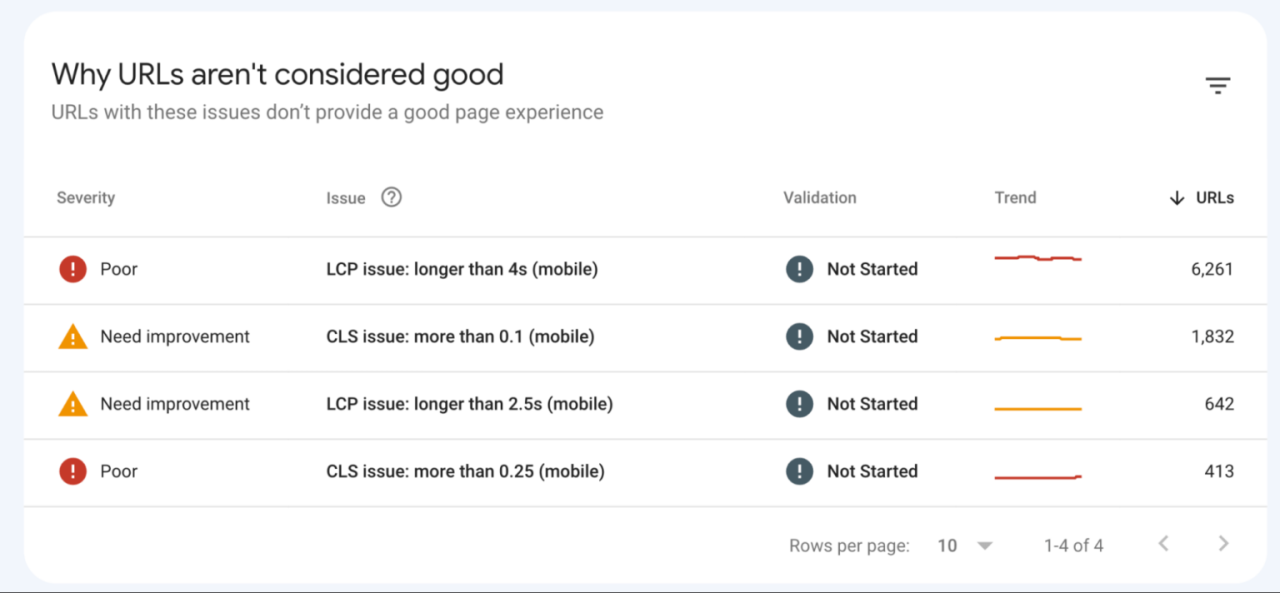
Crawlability and Indexing Issues
Ensuring crawlability and proper indexing for your mobile subdomain is vital for search engine visibility. Search engine crawlers need clear pathways to access and interpret your content.Robots.txt files should clearly specify which parts of your mobile subdomain are accessible to crawlers, while sitemaps provide an organized structure for crawling. Regularly checking your sitemap for errors and using search console tools will help identify and resolve crawlability or indexing issues quickly.
Mobile-Specific Tools
Various tools can aid in analyzing mobile subdomains for purposes. These tools provide valuable insights into user experience, technical issues, and overall performance.
- Google Search Console: Provides valuable data on indexing, crawl errors, and mobile usability. It’s a free and indispensable tool for any website.
- PageSpeed Insights: Analyzes page loading times and offers suggestions for improvement, specifically for mobile devices.
- Mobile-Friendly Test: Google’s tool to verify if your site is mobile-friendly, identifying areas for improvement.
- SEMrush/Ahrefs/Moz: Provide comprehensive audits, including mobile-specific data and analysis, though these are often paid tools.
Content Strategy for Mobile Subdomains
A mobile subdomain, dedicated to the mobile experience, demands a unique content strategy that prioritizes user needs and mobile-first principles. It’s not just about mirroring desktop content; it’s about crafting experiences tailored to touchscreens, smaller screens, and the specific way users interact with a site on their phones. This strategy ensures that the mobile site is not just functional but also engaging and informative for the mobile user.Mobile users often have different goals and search intentions than desktop users.
They might be looking for quick answers, directions, product details, or ways to interact with your services instantly. Understanding these varying intents is key to creating effective content for a mobile subdomain.
Targeting Mobile-Specific User Intent
Mobile users frequently search for location-based information, product details, and immediate actions. This contrasts with desktop users who might be more interested in detailed articles or comprehensive research. Therefore, content needs to be concise, actionable, and readily accessible on a smaller screen. Mobile-specific queries often include terms like “near me,” “directions,” “order now,” “product reviews,” and “store hours.”
Categorizing Content for Mobile Subdomains
A well-structured content categorization system helps ensure that users quickly find the information they need. The following table illustrates how to categorize content for mobile subdomains based on user needs:
| User Need | Content Category | Example Content |
|---|---|---|
| Finding local information | Location-based content | Store locator, nearby services, event listings |
| Product information and details | Product details | Detailed product descriptions, images, specifications, reviews |
| Making a purchase or booking | Action-oriented content | Order now, book appointment, contact us, live chat |
| Finding directions or maps | Navigation content | Interactive maps, driving directions, public transit options |
| Accessing support or help | Support content | Frequently asked questions, contact forms, troubleshooting guides |
Creating Unique and Engaging Content
Mobile-first content isn’t just about shortening text. It’s about creating a completely different experience. Mobile users expect content to be easily scannable, interactive, and visually appealing. The design and presentation should emphasize clear calls to action, easily accessible navigation, and high-quality images and videos. Think about how you can make the user experience as intuitive and easy as possible.
Effective Content Formats for Mobile Subdomains
Various content formats can cater to mobile users’ needs:
- List-based content: Short, scannable lists (e.g., top 5 tips, quick guides) are ideal for mobile. They are quick to consume and highly effective in conveying information concisely. Consider using bullet points, numbered lists, or short paragraphs.
- Visual content: High-quality images and videos are crucial for capturing attention and conveying information effectively. Ensure images are optimized for mobile devices to prevent slow loading times.
- Interactive content: Quizzes, calculators, and interactive maps can enhance user engagement and provide valuable information in an entertaining way.
- Location-based content: Content based on a user’s current location, such as nearby services, events, or stores, is extremely valuable on mobile. This requires careful integration of location services.
- Actionable content: Content that directly encourages user interaction, such as booking appointments, making purchases, or requesting information, is paramount. Ensure that these calls to action are clear, prominent, and easy to access.
Mobile Subdomain Measurement and Analysis
Tracking and analyzing the performance of a mobile subdomain is crucial for optimizing user experience and achieving goals. Understanding key metrics, user behavior, and performance against the overall website is vital for making informed decisions about resource allocation and strategy adjustments. A robust measurement strategy ensures the mobile subdomain remains aligned with business objectives and provides a valuable return on investment.Effective measurement and analysis of a mobile subdomain are not simply about tracking traffic; it’s about understandingwhy* certain patterns emerge.
Analyzing user behavior on the mobile subdomain uncovers insights into areas of strength and weakness, enabling targeted improvements to the site’s structure, content, and overall user experience. By understanding the correlation between mobile subdomain performance and the broader site performance, you can create a more comprehensive picture of your website’s effectiveness.
Crucial Metrics for Mobile Subdomain Performance
Understanding the key performance indicators (KPIs) is essential for assessing the health and effectiveness of your mobile subdomain. These metrics provide a comprehensive view of user engagement, technical performance, and effectiveness.
- Mobile-Specific Traffic Sources: Analyzing the channels driving traffic to the mobile subdomain (e.g., organic search, social media, direct traffic) reveals which platforms are most effective for reaching your target audience on mobile. This information helps prioritize marketing efforts and optimize campaigns for mobile devices.
- Bounce Rate and Session Duration: A high bounce rate on the mobile subdomain could indicate issues with content relevance, navigation, or mobile usability. A shorter session duration might suggest users aren’t finding what they need quickly or easily. These metrics are vital for identifying usability issues and improving the overall user experience.
- Conversion Rate: The conversion rate on the mobile subdomain reflects how effectively users complete desired actions (e.g., purchases, sign-ups) on mobile. A low conversion rate could indicate issues with the checkout process, mobile-friendliness of the purchase flow, or the lack of mobile-optimized calls to action.
- Error Rate and Load Time: High error rates and slow load times directly impact user experience and rankings. A mobile subdomain that frequently encounters errors or takes a long time to load will discourage users and negatively affect engagement and performance.
- Mobile-Specific Search Rankings: Tracking the mobile subdomain’s rankings for targeted s reveals its effectiveness specifically on mobile devices. This provides insight into the subdomain’s visibility to mobile users and allows for adjustments to optimize its ranking.
Analyzing User Behavior on the Mobile Subdomain
Understanding user behavior on the mobile subdomain is critical for tailoring the user experience to meet specific needs. Examining user journeys, identifying common entry points, and pinpointing exit points provides valuable insights into areas for improvement.
- User Journey Mapping: Creating user journey maps for the mobile subdomain reveals the steps users take from initial entry to final interaction. This helps identify bottlenecks and areas where users may drop off, enabling adjustments to streamline the process and improve engagement.
- Common Entry and Exit Points: Identifying the most common entry and exit points of users on the mobile subdomain highlights pages that are frequently accessed and pages where users leave the site. This analysis can reveal usability issues, content gaps, or navigational problems.
- Session Flow Analysis: Analyzing the flow of users through different pages on the mobile subdomain helps understand how users interact with the content. This information can reveal patterns in user behavior, allowing for targeted optimization to improve user experience and conversion rates.
Tracking Mobile Subdomain Traffic and User Engagement
Implementing a structured method for tracking mobile subdomain traffic and user engagement is essential for evaluating performance and making informed decisions.
- Utilizing Analytics Platforms: Employing platforms like Google Analytics (GA) provides valuable data on mobile subdomain traffic, user behavior, and engagement. GA allows for detailed tracking and analysis, facilitating identification of patterns and trends.
- Custom Event Tracking: Setting up custom event tracking in GA allows for specific monitoring of user actions (e.g., button clicks, form submissions) on the mobile subdomain. This deeper level of tracking provides a clearer understanding of user interactions.
- Regular Reporting: Generating regular reports on mobile subdomain performance provides a consistent overview of key metrics and allows for identification of trends. This data can inform strategies for improvement and optimization.
Analyzing Mobile Subdomain Performance
Assessing the mobile subdomain’s performance relative to the overall site performance is crucial for comprehensive evaluation. It requires a comparative analysis of the mobile subdomain’s metrics against those of the main site.
Mobile subdomain SEO is crucial for reaching your target audience. Understanding your audience is key, and that’s where target audience marketing explained comes in. By focusing on the specific needs and preferences of your mobile users, you can optimize your subdomain for maximum visibility and conversions. Knowing your audience through target audience marketing explained will help your mobile subdomain rank higher in search results and ultimately drive more traffic.
This is vital for a successful mobile SEO strategy.
- Comparative Analysis: Comparing the mobile subdomain’s performance metrics with those of the main site provides a relative assessment of their effectiveness. This allows for identification of discrepancies and areas needing improvement.
- Key Performance: Analyzing the mobile subdomain’s performance for targeted s provides insight into its visibility to mobile users. Comparing these rankings to those of the main site can reveal opportunities for optimization.
- Mobile-Specific Ranking Factors: Understanding how mobile-specific ranking factors (e.g., site speed, mobile-friendliness) influence the mobile subdomain’s performance is critical for informed optimization strategies.
Monitoring Mobile Subdomain Search Rankings
Regular monitoring of mobile subdomain search rankings is essential for maintaining visibility and optimizing for search engines. A comprehensive approach involves utilizing the appropriate tools and methods.
- Rank Tracking Tools: Employing rank tracking tools (e.g., SEMrush, Ahrefs) enables regular monitoring of the mobile subdomain’s rankings for target s. These tools provide valuable data for informed adjustments.
- Regular Ranking Checks: Regularly checking search rankings for the mobile subdomain allows for early identification of ranking fluctuations. This proactive approach allows for swift interventions to maintain visibility.
- Analysis: Analyzing performance on the mobile subdomain provides insight into user search queries and enables adjustments to optimize content and targeting.
Mobile-Specific User Experience Considerations
A mobile subdomain’s success hinges on providing a seamless and intuitive user experience. Users expect websites to adapt flawlessly to their smaller screens and limited bandwidth, and a poor mobile experience can quickly lead to frustration and lost conversions. This section dives deep into crafting a mobile-friendly user experience that fosters engagement and drives positive outcomes.A well-designed mobile subdomain prioritizes speed, ease of navigation, and visual clarity, all crucial for user satisfaction and ultimately, success.
By addressing the unique needs of mobile users, businesses can significantly improve their chances of attracting and retaining customers on their mobile subdomain.
Importance of a Seamless Mobile User Experience
A seamless mobile user experience is critical for a mobile subdomain’s success. Mobile users expect websites to load quickly, navigate easily, and display content clearly on their smaller screens. A positive experience fosters trust and encourages repeat visits. Conversely, a poor experience can deter users, leading to a higher bounce rate and negatively impacting . Seamlessness translates into a more enjoyable experience for the user, increasing their time spent on the site and the likelihood of them returning for future interactions.
Key UX Factors for Mobile Subdomain Design
User experience (UX) hinges on several critical factors when designing a mobile subdomain. Prioritizing these elements ensures that the mobile subdomain effectively caters to mobile users.
- Fast Loading Speed: Mobile users have limited patience for slow-loading websites. Optimize images, leverage browser caching, and minimize HTTP requests to drastically improve loading times. A fast-loading site directly impacts user satisfaction and . For instance, a website taking more than 3 seconds to load can result in a significant drop in user engagement and conversion rates.
- Intuitive Navigation: Create a simple and logical navigation structure that allows users to easily find the information they need. Minimize the number of clicks required to access content. Clear and concise labels are essential for understanding and utilizing the site’s functionalities. This reduces frustration and ensures users can quickly find what they’re looking for.
- Clear Visual Hierarchy: Employ clear visual cues to guide users through the content. Use contrasting colors, appropriate font sizes, and compelling visuals to create a visually appealing and user-friendly interface. Properly organized content helps users understand the site’s structure and allows them to quickly grasp the information they’re seeking.
- Mobile-Friendly Content: Optimize content for mobile devices by using short paragraphs, concise headings, and high-quality images that load quickly. Ensure text is readable at different zoom levels and avoids overly complex layouts that may be difficult to navigate on smaller screens.
- Touch-Friendly Design: Design the interface with touch interactions in mind. Ensure buttons, links, and other interactive elements are large enough and spaced appropriately for easy tapping. Buttons and interactive elements should be easily distinguishable and provide clear visual feedback when tapped.
Creating a Mobile-Friendly Navigation Structure
A well-structured navigation is essential for a positive mobile user experience. It allows users to easily find the information they need, reducing frustration and increasing engagement.
- Simplified Navigation Menu: Use a concise and easily accessible menu. Avoid overwhelming users with too many options. Use a hamburger menu or a clearly defined tab structure for easier navigation.
- Clear Call-to-Actions: Ensure clear and concise call-to-actions (CTAs) are visible and easily accessible on every page. Use visually appealing buttons and clear language to encourage user engagement and conversions.
- Logical Page Hierarchy: Organize pages in a logical hierarchy, mirroring the site’s overall structure. Use breadcrumbs to help users understand their location within the site and easily navigate back to previous pages.
Improving Mobile Subdomain Accessibility, Mobile subdomain seo
Accessibility is vital for all users, including those with disabilities. A mobile subdomain should be designed with accessibility in mind to ensure everyone can easily access and use the site.
- Alt Text for Images: Use descriptive alt text for all images to improve accessibility for users who use screen readers. This helps to ensure that all users can understand the context and purpose of each image.
- Keyboard Navigation: Ensure that all interactive elements can be accessed and used using a keyboard. This is crucial for users who cannot use a mouse or touch screen.
- Sufficient Color Contrast: Use sufficient color contrast between text and background colors to ensure readability for users with visual impairments. Ensure that text is easily readable and that there are sufficient visual differences between elements to distinguish them easily.
Responsive Design and its Impact on Mobile Subdomain
Responsive design is crucial for a successful mobile subdomain. It ensures the site adapts seamlessly to different screen sizes, providing an optimal viewing experience across all devices. This flexibility improves user experience and has a significant impact on .
- Enhanced User Experience: Responsive design ensures a consistent and high-quality experience across all devices, improving user satisfaction and engagement.
- Improved Performance: Search engines favor mobile-friendly websites. Responsive design helps websites rank higher in mobile search results, boosting visibility and organic traffic.
- Reduced Development Costs: Responsive design often requires less development effort compared to creating separate mobile and desktop versions. This results in more efficient use of resources and lower maintenance costs.
Epilogue: Mobile Subdomain Seo
In conclusion, effectively implementing mobile subdomain is a multi-faceted approach. By understanding the structure, optimizing for mobile-first indexing, crafting tailored content, and meticulously analyzing performance, you can maximize your mobile site’s visibility and user engagement. This guide provides a robust framework for success. Remember, a well-optimized mobile subdomain contributes significantly to a positive user experience and overall site performance.


