Color Psychology Marketing Your Visual Guide
Color psychology marketing is a powerful tool for businesses looking to connect with consumers on a deeper level. It delves into how colors evoke specific emotions and influence purchasing decisions. Understanding the nuances of color associations across cultures and demographics is crucial for effective marketing strategies. This guide explores the fundamental principles, historical context, and practical applications of color psychology in modern marketing.
From brand identity to product design and website aesthetics, color plays a significant role in shaping brand perception and driving sales. This exploration will unpack the secrets behind effective color combinations and highlight the ethical considerations of color usage in marketing, emphasizing inclusivity and accessibility.
Introduction to Color Psychology in Marketing
Color psychology plays a significant role in shaping consumer perceptions and influencing purchasing decisions. Understanding how different colors evoke specific emotions and associations is crucial for marketers aiming to create a strong brand identity and resonate with their target audience. From the subtle nuances of a logo to the vibrant hues of packaging, colors can subtly communicate a brand’s personality and values.Color psychology delves into the intricate relationship between colors and human responses.
It recognizes that colors trigger emotional responses, impacting feelings of trust, excitement, or even anxiety. These subconscious reactions can significantly influence purchasing decisions. By understanding the underlying psychological mechanisms, marketers can strategically utilize color to create a powerful impact on consumers.
Fundamental Principles of Color Psychology
Color psychology rests on the foundation of associating colors with specific emotions and cultural contexts. Different cultures may hold varying interpretations of color meaning. This nuanced understanding is vital for marketers to avoid misinterpretations and ensure their color choices align with their target audience’s expectations. For example, white represents purity in Western cultures, but it can signify mourning in some Eastern traditions.
Careful consideration of cultural context is essential.
How Colors Affect Consumer Behavior
Colors significantly influence consumer behavior. A warm color like red can evoke feelings of urgency and excitement, often employed in promotional campaigns. Conversely, cool colors like blue often inspire feelings of trust and reliability, making them a popular choice for financial institutions and brands aiming for a sense of security. The interplay of colors and their emotional impact shapes consumer perception, leading to purchasing decisions.
Color psychology plays a huge role in marketing, influencing consumer perception and brand recognition. A great example of this is Dara Treseder, CMO at Peloton, recognized as Marketer of the Week , who expertly utilizes color palettes to create a specific brand identity. Understanding how color affects purchasing decisions is key in today’s competitive market.
Historical Context of Color Usage in Marketing
The strategic use of color in marketing has evolved over time. Early examples showcase the deliberate application of color to evoke specific feelings. The use of vibrant colors in advertising and packaging became more sophisticated as marketing techniques advanced, reflecting the growing understanding of color psychology. For instance, the use of gold and silver in luxury brands communicates exclusivity and sophistication.
Examples of Brands Successfully Utilizing Color Psychology
Many successful brands effectively leverage color psychology. Coca-Cola’s iconic red evokes feelings of excitement and energy, consistently connecting with its target audience. Similarly, McDonald’s golden arches instantly communicate a sense of warmth and familiarity. These examples demonstrate the power of color in establishing brand identity and creating a lasting impression.
Color Associations
Understanding the common associations with different colors is key to strategic color application. This knowledge allows marketers to consciously align their brand image with desired consumer perceptions. The table below provides a concise overview of different colors and their typical associations.
| Color | Common Associations |
|---|---|
| Red | Energy, excitement, passion, urgency, danger |
| Orange | Creativity, enthusiasm, warmth, friendliness, energy |
| Yellow | Happiness, optimism, cheerfulness, creativity, caution |
| Green | Nature, growth, harmony, balance, tranquility, freshness |
| Blue | Trust, security, calmness, stability, loyalty, intelligence |
| Purple | Luxury, royalty, creativity, mystery, spirituality, sophistication |
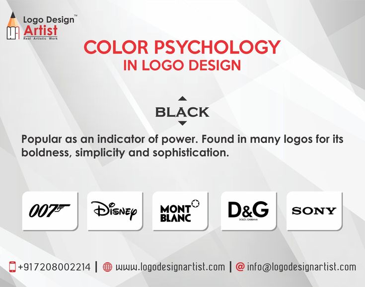
| Black | Sophistication, elegance, power, formality, mystery, authority |
| White | Purity, cleanliness, simplicity, innocence, calmness, spaciousness |
Color Associations and Cultural Nuances
Color psychology in marketing isn’t just about universal preferences; it’s deeply intertwined with cultural contexts. Understanding how different cultures perceive and associate colors is crucial for effective campaigns. A shade that evokes positivity in one region might carry a negative connotation in another, leading to misinterpretations and potentially damaging your brand image. This section delves into the fascinating world of cross-cultural color associations, highlighting potential pitfalls and offering insights into adapting your color choices for global reach.Color associations aren’t fixed; they’re shaped by a complex interplay of history, tradition, and societal values.
The meaning of a color can shift drastically between cultures, impacting how consumers interpret your brand message. For example, while white often symbolizes purity and innocence in Western cultures, it can signify mourning in some Eastern traditions. Understanding these subtle yet significant differences is essential for successful global marketing.
Cultural Variations in Color Perception, Color psychology marketing
Different cultures often assign diverse meanings to colors. This stems from historical events, religious beliefs, and social norms. For example, the color red can symbolize good luck and prosperity in China, while it might evoke danger or passion in other parts of the world. This highlights the importance of conducting thorough research before selecting colors for your marketing materials.
A color that resonates positively with one demographic might be offensive to another.
Impact of Cultural Background on Color Perception
A consumer’s cultural background profoundly impacts their perception of color. This understanding is crucial for businesses aiming for global success. Marketing campaigns should acknowledge the diversity of color associations across cultures to avoid misinterpretations and ensure the message resonates effectively. A brand perceived favorably in one country might face negative connotations in another if the color associations are not carefully considered.
Potential Pitfalls of Misinterpreting Color Meanings
Misinterpreting color meanings can lead to significant marketing blunders. A seemingly harmless color choice can inadvertently offend a particular demographic or undermine the intended brand message. The consequences can range from a diminished market share to a complete loss of trust. For instance, using a color associated with mourning in a promotional campaign aimed at a particular culture could damage the brand’s reputation irreparably.
Comparing and Contrasting Color Preferences in Different Demographics
Color preferences vary across different demographics, encompassing factors like age, gender, and socioeconomic status. While certain colors might appeal to a younger generation, they may not resonate with older audiences. Moreover, the same color can have different connotations for men and women. Understanding these nuances is vital for creating targeted and effective marketing campaigns. A marketing campaign focusing on a specific demographic should consider their cultural background, age, and gender, along with their color preferences.
Color Connotations in Various Countries
| Country | Color | Connotation |
|---|---|---|
| China | Red | Good luck, prosperity, happiness |
| Japan | White | Purity, mourning |
| Mexico | Green | Symbol of hope and nature |
| Brazil | Yellow | Cheerfulness, optimism, creativity |
| India | Orange | Energy, enthusiasm, warmth |
This table illustrates a small sample of color connotations across different countries. A comprehensive understanding requires extensive research into specific cultural contexts. It is crucial to avoid generalizations and adapt your color choices based on the specific target audience.
Color Psychology in Brand Identity
Color is more than just a visual element; it’s a powerful tool in the world of branding. Brands strategically utilize color to create a distinct visual identity, influencing consumer perception and driving brand recognition. Understanding the psychology behind color choices is crucial for businesses aiming to connect with their target audience and build lasting brand loyalty.Brands employ a carefully considered approach to color selection, aligning hues with their core values and target market.
This deliberate approach extends beyond aesthetics, impacting how consumers perceive and remember the brand. Consistent color usage across various platforms is essential to solidify brand identity and build recognition.
Color psychology in marketing is fascinating, isn’t it? Choosing the right hues can really impact how consumers perceive a brand. For example, the Solange Jacobs Randolph FGM Suite solange jacobs randolph fgm suite likely utilizes specific color palettes to evoke certain feelings and drive sales. Ultimately, understanding these subtle cues is key to effective marketing strategies.
Color as a Unique Brand Identifier
Color acts as a primary visual cue, instantly conveying brand personality and values. A recognizable brand color palette establishes a visual shorthand for consumers, making identification quicker and more intuitive. This immediate recognition stems from repeated exposure, creating a mental association between the color and the brand. A well-chosen color palette can differentiate a brand from competitors, establishing a unique identity that resonates with the target audience.
Role of Color in Brand Recognition and Recall
Color plays a vital role in brand recall and recognition. Repeated exposure to a specific color associated with a brand strengthens the memory connection. This familiarity fosters a sense of trust and recognition, making the brand more memorable and easily identifiable among competitors. Think about the iconic red of Coca-Cola or the vibrant blue of Twitter; these colors have become deeply ingrained in consumer memory.
Influence of Color on Brand Perception
Color evokes specific emotions and associations in consumers. These emotional responses directly impact brand perception. For instance, warm colors like red and orange often convey energy and excitement, while cool colors like blue and green evoke calmness and trustworthiness. The subtle yet significant impact of color on perception is a crucial element in branding strategies. The association between color and emotion is often culturally influenced, highlighting the importance of considering cultural nuances in color selection.
Importance of Consistent Color Usage Across Platforms
Consistency in color usage across all platforms is critical for building a strong brand identity. A consistent brand color palette reinforces brand recognition and fosters a cohesive brand experience. Whether on a website, social media, packaging, or advertising, the color scheme should remain consistent to maintain a unified brand image. This reinforces the brand’s identity and builds trust.
Examples of Brand Color Usage
| Brand | Primary Color(s) | Brand Perception |
|---|---|---|
| Coca-Cola | Red | Energy, excitement, youthfulness |
| McDonald’s | Yellow, red | Joy, fun, childhood |
| Blue | Trust, reliability, innovation | |
| Target | Red, yellow, green | Value, affordability, fun |
| Starbucks | Green | Nature, calmness, relaxation |
This table demonstrates how different brands strategically use color to establish a distinct identity and influence consumer perception. The specific colors chosen reflect the brand’s desired image and target market.
Color Impact on Product Design and Packaging
Color is more than just aesthetic appeal in product design and packaging; it’s a powerful tool that influences consumer perception and purchasing decisions. Understanding how color affects consumers is crucial for marketers aiming to create products that resonate with their target audience and stand out in a competitive market. The right color combination can significantly enhance a product’s appeal and drive sales, while the wrong one can have the opposite effect.The psychology of color plays a vital role in shaping consumer behavior.
Different colors evoke different emotions and associations, which can be leveraged to create a desired brand image and influence purchasing decisions. From the vibrant hues on a cereal box to the calming tones of a skincare product, color communicates a message beyond the product itself. Color is a critical component in conveying brand personality, product attributes, and target audience appeal.
Color Effects on Product Appeal
Color significantly impacts how a product is perceived. Red, for example, is often associated with energy and excitement, making it suitable for products aimed at stimulating a quick response, such as fast food or energy drinks. Blue, on the other hand, evokes feelings of trust and reliability, which makes it a popular choice for financial institutions and technology products.
Green often symbolizes nature and health, making it effective for organic foods and environmental products. These associations are not arbitrary but are rooted in cultural norms and learned experiences.
Role of Color in Purchasing Decisions
Color plays a critical role in influencing purchasing decisions. A study by [insert reliable source here, e.g., a reputable marketing research firm] demonstrated a correlation between specific colors and increased purchase intent. The color of a product packaging can subconsciously communicate information about the product’s qualities, such as taste, texture, or even ingredients. This subconscious communication influences consumer perception and ultimately impacts their decision to buy.
For example, a vibrant, eye-catching package might make a customer more likely to pick a particular product from a crowded shelf.
Color Use in Product Packaging
Color is strategically employed in product packaging to enhance marketability. The color scheme should align with the brand identity and target audience. For example, a luxury brand might use sophisticated colors like gold or deep blues to project an image of exclusivity, while a more playful brand might opt for brighter, bolder colors. The color combination should be harmonious and visually appealing, creating a positive impression on the consumer.
Significance of Color Contrast
Effective color contrast is essential for product design and packaging. High contrast between the product and its background ensures that the product stands out and is easily visible. This is especially important in cluttered environments like grocery stores or retail shelves. A clear contrast between the product and its background makes it easier for consumers to quickly identify and choose the product.
Color Choices Across Product Categories
| Product Category | Typical Color Choices | Rationale |
|---|---|---|
| Food (Snacks) | Bright, appetizing colors (reds, yellows, oranges) | Evokes feelings of hunger, excitement, and desirability. |
| Health & Beauty | Calming, natural colors (greens, blues, purples) | Conveys a sense of health, trust, and relaxation. |
| Technology | Modern, sophisticated colors (blues, grays, blacks) | Projects an image of innovation, reliability, and professionalism. |
| Toys | Vibrant, playful colors (reds, yellows, greens) | Appeals to children’s senses and evokes feelings of fun and excitement. |
This table highlights the typical color choices used across various product categories. Each category employs specific colors to communicate certain associations and create a desired consumer response. Choosing appropriate colors is crucial for creating a positive brand image and increasing product visibility.
Color Application in Website and Digital Marketing
Color plays a crucial role in shaping user experience and driving conversions in the digital realm. Websites are no longer just static pages of information; they’re interactive environments designed to engage users and guide them towards desired actions. Effective color application is key to achieving this goal. From subtle background hues to prominent call-to-action buttons, every color choice communicates a message and influences the user’s perception of the site and its offerings.Careful consideration of color psychology principles is paramount for creating a website that resonates with its target audience and achieves its marketing objectives.
This includes understanding how color affects emotions, perceptions, and ultimately, purchasing decisions. Color choices should align with brand identity, enhance the user experience, and contribute to a seamless journey for the visitor.
Impact on User Experience
Color significantly influences the overall user experience on a website. Warm colors like red and orange can evoke feelings of excitement and urgency, suitable for promoting time-sensitive offers or sales. Cool colors like blue and green inspire trust and calmness, making them ideal for building credibility and establishing a sense of security, often seen in financial institutions or healthcare websites.
The judicious use of color can guide users through the site’s navigation, highlight key information, and create a visually appealing and intuitive interface. The consistent use of a specific color palette for branding further enhances user familiarity and strengthens brand recognition.
Impact on Conversion Rates
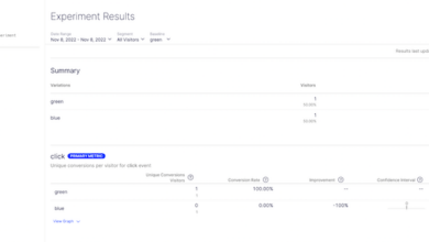
Color choices directly affect conversion rates in online stores. A well-designed color scheme can attract attention, guide users towards purchase decisions, and create a sense of trust. By understanding the psychological impact of color, businesses can design websites that subtly influence user behavior, ultimately increasing sales. For example, a study showed that using green in the checkout process boosted conversion rates by 16%.
This is because green is often associated with nature, growth, and financial security, thus enhancing the perceived safety of online transactions.
Color Choices for Call-to-Action Buttons
Call-to-action (CTA) buttons are crucial for driving conversions. The color of these buttons needs to stand out, be noticeable, and effectively communicate the desired action. High contrast between the button and its surrounding elements is essential for clear visibility. For example, a bright, contrasting color like orange or yellow against a neutral background draws attention and encourages clicks.
Conversely, a button color that blends in with the background is likely to be overlooked. The color selection should be aligned with the overall brand identity and the desired user experience.
Accessibility and Color Contrast
Accessibility is paramount in website design. Ensuring sufficient color contrast between text and background is vital for users with visual impairments, particularly those with color blindness. Web Content Accessibility Guidelines (WCAG) provide specific recommendations for color contrast ratios to ensure readability and usability for all users. Failing to adhere to these guidelines can result in exclusion and negatively impact the user experience for a significant portion of the online population.
Meeting accessibility standards is not just ethically sound; it’s also a legal requirement in many jurisdictions.
Effective Website Design Color Palettes
| Color Palette | Description | Suitable Use Cases |
|---|---|---|
| Brand Focus: Blue-based (e.g., #007bff, #2196F3) | Trustworthy, professional, dependable | Financial institutions, tech companies, corporate websites |
| Emphasis on Action: Red-orange-based (e.g., #FF4500, #FFA500) | Energetic, engaging, attention-grabbing | E-commerce sites, sales promotions, time-sensitive offers |
| Natural & Peaceful: Green-based (e.g., #28a745, #90ee90) | Growth, nature, calm, trust | Eco-friendly brands, organic products, real estate websites |
| Modern & Minimalist: Gray-based (e.g., #808080, #d3d3d3) | Sophistication, neutrality, simplicity | Design-focused businesses, minimalist brands, corporate websites |
Color palettes should be chosen carefully to ensure consistency with brand identity and to enhance the overall user experience.
Color Combinations for Marketing Success
Color combinations are more than just aesthetics in marketing; they are powerful tools that can evoke specific emotions, build brand recognition, and ultimately drive sales. Understanding how different colors interact and the impact they have on consumers is crucial for creating effective marketing materials. From website designs to product packaging, carefully chosen color palettes can significantly influence a consumer’s perception and purchasing decisions.
Effective Color Combinations in Marketing Materials
Effective color combinations are a key component of a successful marketing campaign. By thoughtfully selecting colors, marketers can create a visual identity that resonates with the target audience. These combinations can influence brand recognition, evoke desired emotions, and guide consumer perception. For example, a company selling organic products might use earthy tones like greens and browns to convey a sense of naturalness and health.
Conversely, a technology company might employ vibrant blues and sleek blacks to project innovation and sophistication.
Principles of Complementary, Analogous, and Triadic Color Schemes
Color schemes are categorized based on their relationships on the color wheel. Understanding these schemes is essential for creating visually appealing and effective marketing materials.
- Complementary Colors: These colors sit opposite each other on the color wheel, such as red and green, or blue and orange. The high contrast between complementary colors creates a bold and vibrant effect, often used to grab attention and emphasize key elements in marketing materials.
- Analogous Colors: These colors are adjacent to each other on the color wheel, such as blue, blue-green, and green. Analogous color schemes create a harmonious and cohesive look, often used to convey a sense of calmness, stability, and familiarity. A company selling natural products might use analogous colors like green, teal, and blue-green to create a relaxing and reassuring atmosphere.
- Triadic Colors: These colors are evenly spaced around the color wheel, forming an equilateral triangle. Triadic schemes offer a balance between contrast and harmony, often used to create a visually stimulating and memorable effect. For instance, a company promoting a new product line might use a triadic combination of red, yellow, and blue to grab attention and create excitement.
Importance of Color Harmony in Creating Visual Appeal
Color harmony is crucial in achieving a visually appealing design. A harmonious color palette creates a sense of balance and order, which can positively influence the consumer experience. When colors complement each other, the design feels more cohesive and aesthetically pleasing, fostering trust and enhancing the brand’s image. A disharmonious color palette, on the other hand, can create a chaotic and unpleasant visual experience, potentially driving customers away.
How Color Combinations Influence Mood and Emotion
Color combinations play a significant role in influencing the emotions and moods of consumers. Different colors evoke different psychological responses. For example, warm colors like red and orange can create feelings of excitement and energy, while cool colors like blue and green can evoke feelings of calmness and tranquility. This understanding of color psychology is vital for marketers to strategically choose colors that align with their brand’s message and desired consumer response.
Table of Color Combinations and Their Emotional Impact
The following table illustrates various color combinations and their associated emotional impact. This information is valuable for marketers to understand the potential emotional responses triggered by different color palettes.
| Color Combination | Emotional Impact |
|---|---|
| Red & Black | Bold, powerful, aggressive |
| Blue & White | Trustworthy, calming, clean |
| Green & Brown | Natural, earthy, organic |
| Orange & Yellow | Energetic, cheerful, playful |
| Purple & Gold | Luxury, sophistication, regal |
Ethical Considerations in Color Marketing: Color Psychology Marketing
Color psychology plays a crucial role in marketing, influencing consumer perception and purchasing decisions. However, the power of color choices extends beyond aesthetic appeal; it encompasses ethical considerations that must be carefully addressed. Understanding potential biases, ensuring inclusivity, and adhering to accessibility standards are paramount for responsible and effective color marketing.Choosing colors thoughtfully requires awareness of the potential for unintended consequences.
Color associations can be deeply rooted in cultural contexts and personal experiences, making it essential to consider the impact of these associations on various demographics and groups. A seemingly innocuous color choice could inadvertently alienate or marginalize certain audiences, ultimately harming a brand’s reputation.
Potential Biases Associated with Color Choices
Color associations are often deeply ingrained and influenced by cultural contexts and personal experiences. Certain colors might evoke strong positive or negative emotions in different cultures. For example, while white often symbolizes purity and innocence in Western cultures, it can signify mourning or death in some Eastern traditions. Marketers must be mindful of these diverse interpretations to avoid misrepresenting their brand or alienating potential customers.
A comprehensive understanding of cultural nuances surrounding color usage is crucial for building trust and fostering inclusivity in marketing campaigns.
Importance of Inclusivity in Color Selection
Inclusivity in color selection requires a proactive approach to understanding and representing diverse audiences. Brands should actively seek input from various demographic groups and consider the potential impact of color choices on individuals from different backgrounds. For instance, a brand focusing on a specific age group or gender might want to explore how colors associated with that group are perceived by others.
Color psychology plays a huge role in marketing, influencing consumer perception and buying decisions. A great example of this is seen in Bozoma Saint John, the CMO at Netflix, highlighted as the Ignite Marketer of the Week here. Her strategic use of color in Netflix’s branding and marketing campaigns likely contributed to their success. Understanding these subtle cues is key for any effective marketing strategy centered around color psychology.
By proactively addressing potential biases, brands can foster a more welcoming and inclusive environment for all consumers.
Need for Considering Accessibility and Color Contrast Guidelines
Accessibility is a critical factor in color marketing, particularly for users with visual impairments. Adherence to color contrast guidelines ensures that content is easily readable and navigable for all users. Poor color choices can significantly hinder accessibility for individuals with color blindness or other visual conditions. Ensuring sufficient contrast between text and background colors is essential for ensuring inclusivity and upholding accessibility standards.
This practice not only meets ethical obligations but also broadens the potential customer base.
Impact of Color on Various Demographics and Groups
The impact of color on different demographics and groups is multifaceted and complex. Certain colors can evoke specific emotions or associations within particular communities. Understanding these nuances is essential for developing targeted marketing campaigns that resonate with diverse audiences. For example, understanding the cultural associations of colors with particular demographics or ethnicities allows for more inclusive and impactful marketing campaigns.
By considering the emotional responses and associations linked to color choices, marketers can ensure that their message effectively reaches all potential customers.
Examples of Inclusive and Exclusive Color Choices
| Color Choice | Potential Audience Impact | Description |
|---|---|---|
| Monochromatic Palette (e.g., various shades of blue) | Inclusive, calming, and sophisticated | Appeals to a broad audience seeking a professional and sophisticated image. |
| Bright, saturated colors (e.g., neon pink, lime green) | Potentially exclusive; may alienate those seeking a more subdued aesthetic | May be more engaging for a younger demographic but can be overwhelming or unappealing to others. |
| Colors associated with specific cultures (e.g., red in China) | Can be inclusive or exclusive depending on the cultural context | Should be used carefully and with thorough understanding to avoid misrepresentation or misinterpretation. |
| Gender-stereotypical colors (e.g., pink for women, blue for men) | Potentially exclusive; reinforces gender norms | Careful consideration of color associations is needed to avoid perpetuating harmful stereotypes. |
Future Trends in Color Psychology Marketing
Color psychology in marketing is constantly evolving, mirroring broader societal shifts and technological advancements. Understanding these emerging trends is crucial for brands looking to stay ahead of the curve and connect effectively with their target audiences. The future of color marketing isn’t just about choosing the right hues; it’s about crafting nuanced experiences that resonate with evolving cultural values and technological influences.
Emerging Trends in Color Preferences
Color preferences are influenced by numerous factors, including cultural shifts, generational differences, and personal experiences. These influences are constantly in flux, impacting how colors are perceived and utilized in marketing campaigns. For instance, the rise of minimalism in design is reflected in a preference for muted, neutral palettes, while the embrace of inclusivity is leading to more diverse and representative color choices.
Understanding these nuances is essential for tailoring marketing strategies to specific audiences.
Innovative Approaches to Leveraging Color
Beyond traditional color palettes, innovative approaches are emerging. These include using color in interactive and dynamic ways, such as responsive color schemes that adjust to user behavior or environment, or personalized color recommendations based on individual preferences. Brands are also experimenting with the use of color in augmented reality (AR) experiences, creating immersive and memorable interactions for customers.
Color Evolution in Different Sectors
The fashion industry is leading the charge in adopting new color trends, reflecting shifts in societal preferences and cultural trends. Sustainability and ethical sourcing are driving the adoption of natural tones and earth-friendly color palettes. In the tech sector, brands are increasingly using vibrant, futuristic hues to convey innovation and cutting-edge technology. The healthcare sector, meanwhile, is employing calming colors to foster a sense of well-being and trust.
Role of Technology in Influencing Color Preferences
Technology plays a pivotal role in shaping color preferences and perceptions. Social media platforms, for instance, expose individuals to a constant stream of color-rich visuals, impacting their preferences and creating new trends. Virtual reality (VR) and augmented reality (AR) experiences offer unique opportunities for experimenting with color and creating immersive brand experiences. The use of color in personalized digital experiences, including tailored website designs and app interfaces, is another crucial factor.
Future Predictions for Color Usage in Marketing
| Year | Predicted Trend | Sector Examples |
|---|---|---|
| 2024-2025 | Increased use of personalized color recommendations. | E-commerce platforms recommending color palettes based on customer purchase history. |
| 2026-2027 | Integration of dynamic color schemes responsive to user environment. | Websites adapting their color palettes based on the time of day or user location. |
| 2028-2029 | Expansion of immersive color experiences through VR/AR. | Interactive product demos that use AR to show customers how products will look in their homes, using customizable colors. |
| 2030-2031 | Focus on sustainable and ethically sourced color palettes. | Fashion brands showcasing eco-friendly dye processes and using colors derived from natural sources. |
Wrap-Up

In conclusion, color psychology marketing offers a wealth of insights for businesses seeking to leverage the power of color to boost their brand image and drive sales. By understanding the intricate relationship between color and consumer behavior, marketers can craft compelling visual experiences that resonate with their target audience and ultimately achieve their marketing goals. The future of color psychology marketing is bright, as innovative approaches and emerging technologies continue to shape the way we use color to connect with consumers.