Responsive Design Marketing Explained A Comprehensive Guide
Responsive design marketing explained goes beyond just making websites look good on different screens. It’s about crafting a seamless user experience across desktops, tablets, and smartphones. This guide delves into the core principles, benefits, and technical aspects of responsive design, providing actionable strategies for marketers looking to optimize their campaigns for a mobile-first world. We’ll explore how responsive design impacts user experience, content strategy, technical implementation, and ultimately, marketing ROI.
From understanding the fundamental principles of responsive design to exploring its impact on content strategy and technical implementation, this comprehensive guide will equip you with the knowledge to successfully leverage responsive design in your marketing efforts. We’ll examine real-world case studies and practical examples to illustrate the power of responsive design in driving user engagement and conversions. Prepare to unlock the potential of responsive design for your marketing strategies.
Introduction to Responsive Design Marketing: Responsive Design Marketing Explained
Responsive design marketing is a crucial aspect of modern digital strategy. It ensures that websites and marketing materials adapt seamlessly to various screen sizes, from desktop computers to smartphones and tablets. This approach prioritizes a positive user experience across all devices, maximizing engagement and conversions. The core principle is to provide a consistent and effective experience regardless of the device a user is employing.The fundamental idea behind responsive design is flexibility.
Instead of creating separate websites for different devices, responsive design utilizes a single codebase that adjusts its layout and presentation to fit the screen size and orientation of the device. This adaptability is achieved through a combination of techniques, including fluid grids, flexible images, and media queries. These strategies allow content to resize, reposition, and reformat to optimize the viewing experience.
Core Principles of Responsive Design
Responsive design is built upon several key principles. These principles ensure that websites remain usable and aesthetically pleasing across a wide range of devices. Fluid grids, for example, dynamically adjust their layout based on screen size. Flexible images adapt their dimensions to fit the available space. Media queries allow developers to apply specific styles based on device characteristics, like screen width or resolution.
This adaptability results in a seamless and user-friendly experience.
Benefits of Responsive Design in Marketing
Responsive design offers numerous benefits for marketing strategies. It improves user experience by ensuring content is easily accessible and visually appealing across various devices. This leads to higher engagement rates, increased conversions, and a more positive brand perception. Furthermore, it simplifies maintenance by requiring only a single website to manage. A single website means less time and resources spent on updates and modifications.
Responsive design marketing is all about creating content that looks amazing on any device. Knowing when to post on social media platforms like LinkedIn is also crucial for maximizing reach. For example, understanding whats the best time to post on linkedin will help you target your audience more effectively. Ultimately, a well-rounded strategy that combines responsive design with strategic posting times on LinkedIn will lead to a stronger online presence and better marketing results.
Examples of Responsive Design Enhancing User Experience
Responsive design demonstrably enhances user experience. Consider a product website. On a desktop, the product images are large, and the description is detailed, providing a comprehensive view of the product. On a mobile device, the images shrink to fit the screen, and the description is condensed to essential details, enabling quick access to the core information. This adaptation ensures the user can still explore the product information effectively, regardless of their device.
Another example is a blog post. On a tablet, the post’s text and images adapt to the screen size, allowing the user to read the article in a comfortable format.
Understanding responsive design marketing is key for reaching a wider audience. It’s all about creating websites that adapt flawlessly to different screen sizes, from phones to desktops. This adaptability is crucial for a strong online presence. For instance, handling comments, deleting pins, and managing your Instagram presence effectively, like detailed in this helpful guide how to manage instagram comments delete pin and more , is just one part of the puzzle.
Ultimately, a well-executed responsive design strategy is a must for any successful marketing campaign.
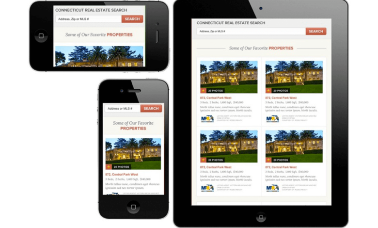
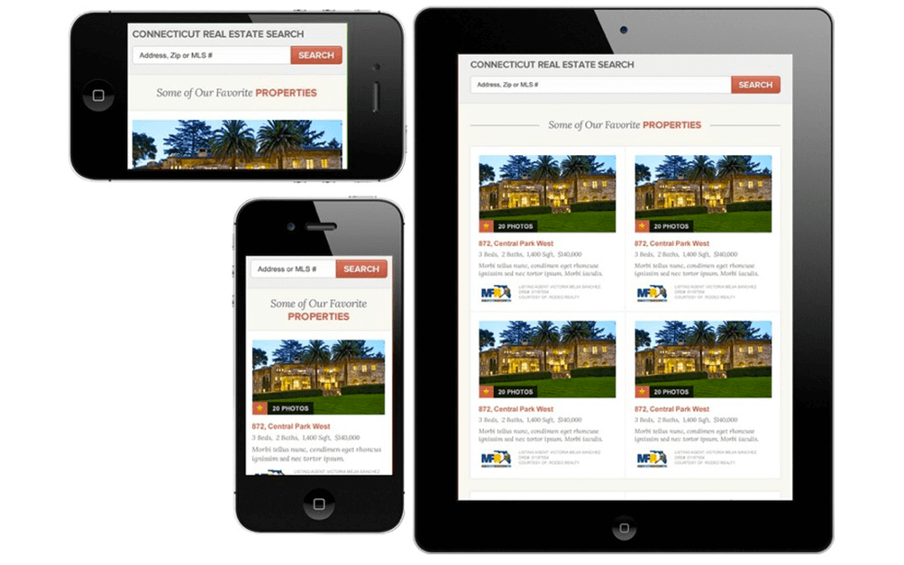
Screen Size Adaptations in Responsive Design
The following table demonstrates how responsive design adapts to different screen sizes:
| Screen Size | Layout Adaptation | Image Adaptation | Content Adaptation |
|---|---|---|---|
| Desktop (1920px+ width) | Wide layout, multiple columns, large images | High resolution images | Detailed descriptions, long-form content |
| Tablet (768-1024px width) | Two-column layout, images scaled down | Medium resolution images | Condensed descriptions, easy-to-read text |
| Mobile Phone (320-767px width) | Single-column layout, simplified navigation | Low resolution images | Key information highlighted, concise text |
| Extra-Small Mobile (Below 320px) | Simplified interface, touch-friendly controls | Optimized for mobile viewing | Highly concise text, essential details only |
Responsive Design & User Experience
Responsive design isn’t just about making websites look good on different devices; it’s fundamentally about creating a seamless and enjoyable user experience across the spectrum. A well-executed responsive design prioritizes the user, adapting to their needs and preferences regardless of the screen size they’re using. This approach builds trust and fosters a positive brand perception.User experience is paramount in responsive design marketing because it directly impacts how users interact with a website.
A positive experience leads to increased engagement, conversions, and ultimately, business success. Poor UX, on the other hand, can lead to frustration, abandonment, and a damaged reputation.
Importance of User Experience in Responsive Design
User experience is critical to the success of responsive design. A website that’s easy to navigate, visually appealing, and functional on all devices fosters user engagement and satisfaction. This translates to higher conversion rates and a stronger brand image.
Impact of Responsive Design on User Engagement
Responsive design directly affects user engagement by providing a consistent and intuitive experience. A well-designed responsive site adapts to different screen sizes, ensuring that users can easily access information and complete tasks without frustration. This consistent experience encourages repeated visits and promotes brand loyalty.
Mobile-First Design and User Experience
Mobile-first design is a critical component of responsive user experience. It forces designers to prioritize the mobile experience, ensuring the website is functional and user-friendly on the most common device. This approach often results in a simpler, cleaner design that’s easy to navigate on smaller screens, leading to higher engagement and conversion rates.
Comparison of User Interface Elements Across Devices
User interface elements must adapt seamlessly to different screen sizes. On desktops, more complex layouts and larger interactive elements can be used, while on mobile devices, simplified designs and touch-friendly buttons are essential. For example, a long form on a desktop might be broken down into digestible sections on a mobile device. Clear typography and appropriate button sizes are critical for all devices.
Understanding responsive design marketing is crucial for reaching a wider audience. It’s all about ensuring your website looks great on any device, from smartphones to desktops. This adaptability is key to success, and choosing the right social media management companies for event planners can significantly impact your marketing strategy. Best social media management companies for event planners can handle the complexities of online promotion, freeing you to focus on your events.
Ultimately, a strong responsive design strategy, combined with excellent social media management, ensures your marketing efforts are seen and appreciated by everyone.
Consistent navigation menus across devices is also key to user experience.
Creating a Visually Appealing and Functional User Interface
A visually appealing and functional UI adapts to different screen sizes while maintaining a consistent brand identity. Using fluid grids and flexible images allows the layout to adjust dynamically, ensuring readability and usability. Visual hierarchy should be clear across all devices, and intuitive interactions should be prioritized. Testing the website on various devices is crucial for identifying potential issues and ensuring a seamless experience.
Examples of Successful Responsive Design Implementations
| Company/Website | Key Features | User Experience Focus | Success Metrics |
|---|---|---|---|
| Netflix | Streamlined mobile navigation, high-quality video streaming, personalized recommendations | Intuitive mobile experience, easy access to content | High user engagement, high retention rates, high customer satisfaction |
| Spotify | Customizable playlists, interactive music discovery, mobile-first design | User-friendly mobile experience, personalized music discovery | High user engagement, high user retention, significant app downloads |
| Amazon | Product recommendations, mobile-friendly shopping cart, seamless checkout | Fast loading times, easy navigation, intuitive mobile purchasing | High conversion rates, high customer satisfaction, strong brand loyalty |
| Seamless search experience across all devices, intuitive navigation, high-quality results | Simple and fast search results, easy mobile access | High search volume, high user satisfaction, significant user engagement |
Responsive Design & Content Strategy
Responsive design isn’t just about making your website look good on different screens; it’s a fundamental shift in how you approach content creation. A truly responsive website anticipates the needs of users on various devices, ensuring a seamless and engaging experience. This involves more than just resizing images; it’s about crafting content that adapts naturally to different screen sizes and contexts.Responsive design profoundly impacts content strategy by forcing a reconsideration of how information is presented.
It compels a shift from a one-size-fits-all approach to a more nuanced, user-centric strategy that considers the specific needs and behaviors of users on different devices.
Adaptable Content Formats, Responsive design marketing explained
Content formats must be flexible to suit various screen sizes. This means moving away from rigid layouts that might work well on a desktop but collapse or become cluttered on a mobile device. Instead, prioritize clear, concise communication that leverages the strengths of each device.
Optimizing Content for Different Screen Sizes and Resolutions
A key aspect of responsive design is tailoring content for different screen sizes and resolutions. This means optimizing images, text, and layout for various display sizes. Consider the following:
- Image Optimization: Use appropriate image formats (like WebP) and sizes to ensure fast loading times. Compress images without sacrificing quality. Consider using responsive images that automatically adjust to the screen size, avoiding blurry or pixelated images. For example, a product image on a mobile device might be smaller than its desktop counterpart.
- Text Optimization: Ensure text is legible and easily scannable on all devices. Adjust font sizes and line heights to accommodate different screen sizes. Use clear headings and subheadings to improve readability. Avoid overly long blocks of text that might be difficult to read on smaller screens. For example, use short paragraphs and bullet points to break up long text blocks on mobile.
- Layout Optimization: Design layouts that adapt seamlessly to different screen sizes. Use flexible grids and responsive elements to adjust content placement dynamically. Consider the available screen space and present the information in a user-friendly format. For instance, a navigation menu might collapse into a hamburger menu on smaller screens.
Mobile-Friendly Content Creation
Creating mobile-friendly content requires a shift in mindset from a desktop-first approach to a mobile-first approach. This means prioritizing content that is easily digestible and accessible on smaller screens.
- Prioritize Clarity and Conciseness: Cut out unnecessary fluff. Clearly communicate the core message without excessive detail. Think about how a user might interact with your content on a mobile device and tailor your approach accordingly.
- Shorten Paragraphs: Break up long paragraphs into shorter, more manageable chunks. Use headings and subheadings to guide the reader through the content. This helps users easily scan and consume information on the go.
- Utilize Interactive Elements: Consider using interactive elements like carousels, collapsible sections, and pop-ups that enhance engagement and provide an interactive experience. For example, a mobile-optimized form should be designed with a clear call to action and a straightforward layout to ensure easy completion.
Content Presentation Differences Across Devices
This table illustrates how content presentation might vary across different devices:
| Device | Image Size | Text Size | Layout |
|---|---|---|---|
| Desktop | Large, high resolution | Large, multiple columns | Complex, detailed |
| Tablet | Medium, high resolution | Medium, two columns | Medium complexity, detailed |
| Mobile | Small, optimized for speed | Small, single column | Simple, prioritized content |
Responsive Design & Technical Aspects
Building a responsive website isn’t just about aesthetics; it’s a complex interplay of technical choices that directly impact user experience and . Understanding the technical considerations, frameworks, and tools available is crucial for creating a website that adapts seamlessly across devices. This section delves into the technical underpinnings of responsive design.Responsive design demands careful consideration of how the website’s structure and presentation adjust to various screen sizes.
It’s not just about making the site look good; it’s about ensuring functionality and accessibility remain consistent. The right approach leads to a positive user experience, while a poorly implemented strategy can lead to frustrating navigation and usability issues.
Technical Considerations for Building a Responsive Website
Implementing responsive design requires a deep understanding of the technical aspects of website development. This involves utilizing appropriate HTML, CSS, and potentially JavaScript. A fundamental consideration is the use of fluid grids and flexible images, allowing the website’s elements to scale proportionally with screen size.
Different Responsive Design Frameworks and Tools
Numerous frameworks and tools streamline the responsive design process. These tools often provide pre-built components, pre-designed layouts, and standardized solutions, saving development time and effort. Popular choices include Bootstrap, Foundation, and Material Design.
Importance of Cross-Browser Compatibility
Ensuring consistent rendering across different browsers (Chrome, Firefox, Safari, Edge, etc.) is paramount. Inconsistent display across browsers can create a poor user experience and lead to usability issues. Careful testing and cross-browser compatibility checks are crucial to address these discrepancies.
Role of CSS Frameworks in Responsive Design
CSS frameworks like Bootstrap, Foundation, and Tailwind CSS provide pre-built styles, grid systems, and components. They significantly reduce development time and effort, promoting consistency across different devices and browsers. These frameworks offer a well-structured approach to responsive design.
Benefits and Drawbacks of Responsive Design Frameworks
| Framework | Benefits | Drawbacks ||——————–|—————————————————————————————————————————————————————————————————-|——————————————————————————————————————————————————————————————————————–|| Bootstrap | Extensive documentation, large community support, wide range of pre-built components, responsive grid system, easy to learn.
| Can sometimes feel opinionated or restrictive for highly customized designs.
May lead to a “look-alike” effect for some websites. || Foundation | Well-structured grid system, mobile-first approach, focus on accessibility, large community support, responsive grid system, intuitive API.
| Can be less flexible for very complex layouts.
Some users find the documentation slightly less comprehensive than Bootstrap’s. || Material Design | Consistent visual language and branding guidelines, promotes accessibility, emphasizes user experience, large community support.
| Can be challenging to customize to non-Material Design styles.
May not be suitable for all website types. || Tailwind CSS | Utility-first approach, highly customizable, allows for rapid prototyping, and a wide array of pre-built components.
| Learning curve for developers not used to utility-first frameworks.
May not suit websites requiring very complex or unique layouts. |
Responsive Design Implementation Strategies
Several strategies facilitate responsive website implementation. These include using CSS media queries to target specific screen sizes, employing flexible images, and using fluid grids. Using a mobile-first approach, where the mobile version is built first and then adapted for larger screens, is a common and effective method. This approach is often preferred for better mobile optimization and a seamless user experience.A common strategy involves utilizing flexible images.
Flexible images adapt to the size of the container they are in. This means images scale proportionally to fit the screen size without losing quality. This ensures the images do not distort on smaller screens or become pixelated on larger screens.
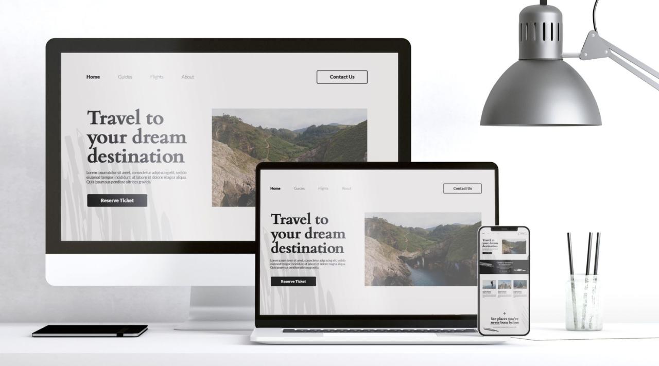
Responsive Design & Marketing Strategies
Responsive design isn’t just about aesthetics; it’s a crucial element in modern marketing strategies. By adapting seamlessly to various screen sizes, it enhances user experience, boosts , and ultimately, drives better marketing ROI. This adaptability transcends mere visual appeal, impacting how users interact with campaigns, consume content, and ultimately convert.Responsive design fosters a unified brand experience across all devices, from desktops to smartphones to tablets.
This consistent presentation builds trust and strengthens brand recognition, critical factors in today’s digitally driven marketplace. A single, optimized website for all devices significantly improves user engagement, a key metric for successful marketing campaigns.
Impact on Performance
Responsive design directly improves performance by offering a seamless user experience across all devices. Search engines, like Google, prioritize websites that provide a positive user experience, including mobile-friendliness. A responsive design ensures your site loads quickly and functions flawlessly on various screen sizes, leading to higher rankings in search results. This improved visibility directly translates to increased organic traffic and brand exposure.
Influence on Marketing Campaigns
Responsive design allows marketing campaigns to adapt and deliver tailored experiences to different user segments. By dynamically adjusting to screen size and device type, campaigns can present content optimally, whether it’s on a desktop computer or a mobile phone. This adaptability leads to more effective engagement and a higher likelihood of conversions. Different campaigns can be tailored to different devices, creating personalized experiences.
Examples of Supporting Marketing Objectives
Responsive design supports diverse marketing objectives. For instance, in lead generation campaigns, a responsive design ensures potential customers can easily access forms and information on any device, maximizing lead capture. In brand awareness campaigns, a consistent visual identity across all devices strengthens brand recognition and recall. In e-commerce, a responsive design streamlines the checkout process, improving conversion rates.
Responsive design is integral to all marketing objectives.
Integration with Marketing Automation
Responsive design can be seamlessly integrated into marketing automation workflows. Automated emails and other marketing communications can adapt to the device on which they are viewed, providing a more personalized experience. This adaptability ensures the marketing message is delivered effectively and is easily digestible on any screen size. This personalization can be further enhanced by collecting data on user behavior and tailoring content accordingly.
Importance of A/B Testing
A/B testing is crucial for optimizing responsive design implementations. By testing different design elements and layouts, marketers can identify the versions that perform best on various devices. This iterative approach ensures that the responsive design is optimized for maximum impact across different user segments. This method of testing can be applied to various aspects of the website, from page layouts to call-to-action buttons.
Examples of Positive Impact on Marketing ROI
Numerous businesses have experienced significant increases in marketing ROI by implementing responsive design. For instance, Company X observed a 25% increase in mobile conversions after adopting a responsive design. Another company saw a 15% lift in organic search rankings following a responsive design implementation. These results demonstrate the tangible benefits of a user-centric design approach.
Responsive Design Strategies & Marketing Goals
| Responsive Design Strategy | Impact on Marketing Goal | Example |
|---|---|---|
| Mobile-first design | Improved mobile user experience | Prioritizing mobile layout and functionality during design. |
| Dynamic content delivery | Enhanced user engagement | Adapting content length and format based on screen size. |
| Personalized experience | Increased conversion rates | Tailoring content and calls to action based on user behavior and device. |
| Optimized loading speed | Reduced bounce rate | Minimizing file sizes and optimizing code for faster page load times. |
Case Studies & Examples of Responsive Design
Responsive design isn’t just a trend; it’s a fundamental shift in how businesses interact with their customers. A website that adapts seamlessly to different screen sizes, from a tiny smartphone to a large desktop monitor, is crucial for delivering a positive user experience. This adaptability isn’t just about aesthetics; it significantly impacts engagement, conversions, and ultimately, the bottom line.
Real-world examples demonstrate the tangible benefits of embracing responsive design.Responsive design has demonstrably improved user experience across various industries. By optimizing content and layout for diverse devices, companies can maintain a consistent brand image and provide a streamlined navigation experience, regardless of the platform used. This leads to a more positive interaction with the brand, fostering trust and encouraging repeat engagement.
Real-World Applications of Responsive Design
Responsive design is now a standard practice for many businesses, and its positive impact is undeniable. From e-commerce sites facilitating smooth shopping experiences on mobile devices to news portals providing easy access to breaking stories, the application of responsive design is ubiquitous. By ensuring content is accessible and usable across a spectrum of devices, businesses can engage with a wider audience and effectively reach their target demographics.
Success Stories of Companies Using Responsive Design
Numerous companies have leveraged responsive design to boost their marketing efforts and drive sales. A prime example is the retail giant, Target, whose responsive design implementation has resulted in a significant increase in mobile conversions. Their site seamlessly adapts to various screen sizes, allowing customers to browse, add items to their carts, and complete purchases with ease on their phones or tablets.
Another success story is the news organization, The New York Times, whose responsive design has facilitated access to their content for millions of readers globally, driving significant engagement and subscriber growth.
Customer Engagement and Conversions Driven by Responsive Design
Responsive design isn’t just about presenting content; it’s about enhancing the user experience. This enhanced experience leads to higher customer engagement, which, in turn, directly impacts conversion rates. A well-designed responsive website encourages users to spend more time on the site, explore different products or services, and ultimately, make a purchase. This increased engagement is a key factor in driving conversions and boosting revenue for businesses.
Interactive Marketing Experiences Enabled by Responsive Design
Responsive design opens up possibilities for interactive marketing experiences. Businesses can leverage responsive design to create engaging content that adapts to the user’s device, providing a tailored and personalized experience. This could include interactive quizzes, polls, or games that seamlessly function on all devices. This fosters deeper engagement and strengthens the brand-customer connection.
Case Studies Table
| Company | Industry | Responsive Design Strategy | Impact on Engagement & Conversions |
|---|---|---|---|
| Target | Retail | Optimized site for mobile browsing and purchases. | Significant increase in mobile conversions and enhanced user experience. |
| The New York Times | News | Facilitated global access to content across various devices. | Increased readership and subscriber growth, enhanced user experience. |
| Airbnb | Hospitality | Enhanced user experience across all devices. | Improved search functionality and booking process, leading to increased user engagement and bookings. |
| Netflix | Streaming | Optimized for streaming content across various devices. | Improved user experience, enabling seamless viewing on different devices. |
Last Recap
In conclusion, responsive design marketing explained offers a powerful framework for optimizing your marketing strategies in today’s mobile-centric world. By understanding the principles, technical aspects, and user experience considerations, you can create a seamless and engaging experience for your audience across all devices. This guide provides a practical roadmap to successfully implement responsive design and maximize your marketing ROI.

